
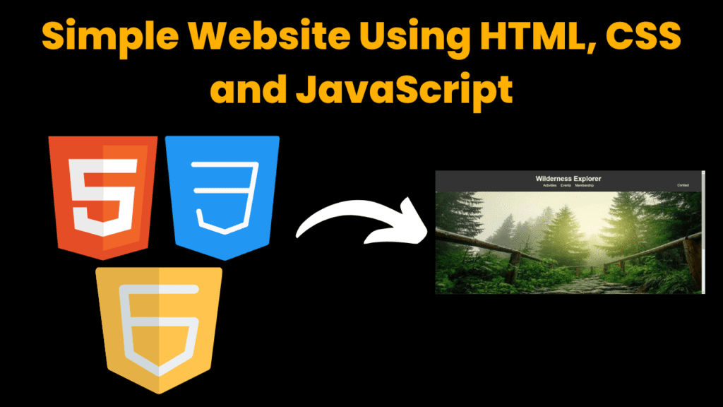
Create Responsive Website Using HTML, CSS & JS With Source Code
Introduction :
In this project, we’ve utilized HTML, CSS, and JavaScript to create “Wilderness Explorer” – a user-friendly website catering to outdoor enthusiasts. With captivating visuals and seamless navigation, visitors can explore various sections like activities, events, membership, and contact effortlessly. From responsive design to interactive elements, every detail is meticulously crafted to inspire exploration and connection with nature. Welcome to Wilderness Explorer – your gateway to adventure!
HTML (Hypertext Markup Language) and CSS (Cascading Style Sheets) form the backbone of modern web development, empowering creators to design and structure captivating websites. HTML serves as the structural framework, defining the elements and content of a webpage, while CSS provides the visual styling, enhancing the presentation and aesthetics. Together, they enable developers to craft seamless and visually appealing online experiences that engage and captivate users.
Steps to create a responsive website
Plan Your Layout: Begin by sketching out the layout of your website, including the sections and elements you want to include. Consider how your site will look on different devices, such as desktops, tablets, and smartphones.
Set Up Your Project: Create a new folder on your computer to store your website files. Inside this folder, create separate files for your HTML, CSS, and JavaScript code. You can name the HTML file something like “index.html”.
Write HTML Markup: Open your HTML file and start writing the basic structure of your website using HTML tags. Include elements such as
<header>,<nav>,<main>,<section>,<footer>, etc., to structure your content logically.Add CSS Styling: Open your CSS file and begin adding styles to your HTML elements. Use CSS rules to define the appearance of various elements, including colors, fonts, margins, padding, and layout properties like
display,float,position, etc. Consider using media queries to make your design responsive.Make it Responsive: Utilize media queries in your CSS to make your website responsive. Media queries allow you to apply different styles based on the device’s screen size, orientation, and resolution. Test your website on different devices and adjust the styles as needed to ensure it looks good across various screen sizes.
Enhance with JavaScript: If needed, add interactivity to your website using JavaScript. You can use JavaScript to create dynamic effects, handle user input, and make your website more engaging. Common JavaScript tasks include form validation, image sliders, navigation menus, and more.
Optimize for Performance: Optimize your website for performance by minifying your CSS and JavaScript files, compressing images, and using techniques like lazy loading to improve loading times. This ensures a smooth user experience, especially on slower internet connections and mobile devices.
Test and Debug: Thoroughly test your website on different browsers and devices to ensure compatibility and responsiveness. Use browser developer tools to debug any issues and make necessary adjustments to your code.
Deploy Your Website: Once you’re satisfied with your website, you can deploy it to a web hosting service to make it accessible to the public. Choose a reliable web hosting provider and follow their instructions to upload your files and make your website live on the internet.
Continuously Update: Keep your website up to date by regularly updating content, fixing bugs, and adding new features based on user feedback and changing requirements.
Exploring Wilderness Explorer Website
Now, let’s take a closer look at the Wilderness Explorer website, dissecting each element to understand its role and functionality. Following the systematic steps outlined above, we’ll embark on refining and enhancing the website’s design and performance. From structuring the layout to fine-tuning responsiveness, every aspect of the website will be meticulously crafted to ensure a seamless user experience.
Explanation :
HTML
index.html
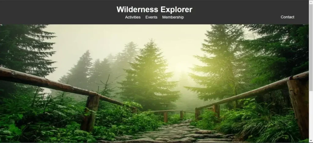
Let’s start by exploring the homepage, the very first page users encounter when visiting our website. To craft this important page, we’ve created the “index.html” file. This file forms the backbone of our site, containing key elements like the header, navigation menu, eye-catching images, and informative content.
In the <head> section, we include metadata such as character encoding, viewport settings for responsiveness, and the title “Wilderness Explorer.” Additionally, we link an external stylesheet (style.css) to apply styles to our webpage.
Moving to the <body> section, we begin with the <header> element, encapsulating the branding and navigation components of the website. The header contains the Wilderness Explorer logo (represented by the <h1> element) and a navigation menu (<nav>) with links to different sections of the site, including “Activities,” “Events,” “Membership,” and “Contact.” Notably, the “Membership” link is designated with the id attribute “membership,” while the “Contact” link has the id “contact-button.”
Following the header, we have an <img> element displaying an image showcasing the wilderness scenery, providing visual appeal and context to the website.
The <section> element with the class “hero” presents a captivating introduction to Wilderness Explorer, featuring a welcoming message (“Welcome to Wilderness Explorer”) and a brief description of the adventurous experience it offers.
Lastly, the <footer> section contains contact information for Wilderness Explorer, including email and phone details. Additionally, it includes a copyright notice indicating ownership of the content. The footer is given the id “contact-info” for potential JavaScript interaction.
Finally, the <script> tag at the bottom references an external JavaScript file (script.js), suggesting the inclusion of dynamic functionalities to the webpage, such as handling user interactions and enhancing the user experience.
activities.html
The focal point of Wilderness Explorer’s activities page lies within the <div> element with the id “slideshow-container,” showcasing a captivating slideshow of outdoor adventures. This immersive feature invites visitors to delve into the diverse array of experiences offered by the organization, including hiking, canoeing, and camping. In the <head> section, metadata such as character encoding and viewport settings are defined. The title of the page is set to “Wilderness Explorer – Activities,” providing a descriptive title for search engine optimization. Additionally, an external stylesheet (style.css) is linked to apply consistent styles across the webpage.
In the <body> section, the webpage features a <header> element housing the Wilderness Explorer logo and a navigation menu with links to essential sections like “Events” and “Membership,” alongside the “Home” link for easy redirection. Beneath, a <div> with the class “container” contains the main content, including a slideshow of activity images within another <div> named “slideshow-container.”
These images, showcasing activities like hiking, canoeing, and camping, are presented using <img> elements with descriptive alt attributes. Concluding the page, a <footer> section provides copyright details within a styled <div> container. Additionally, a <script> tag references an external JavaScript file, hinting at dynamic functionalities for improved user engagement, such as managing the slideshow.
events.html
The events page of Wilderness Explorer serves as a hub for showcasing upcoming outdoor events and activities. Visitors can expect to find a curated list of exciting opportunities to immerse themselves in nature and adventure. The page layout maintains consistency with the rest of the website, featuring the Wilderness Explorer logo in the header, along with navigation links for seamless exploration. The main content area, represented by the <section> element with the class “events,” promises to deliver information on upcoming events. Finally, the footer section provides essential details and copyright information, ensuring a cohesive user experience.
membership.html
The membership page of Wilderness Explorer serves as a platform for users to express their interest in becoming members of the organization. This page features a membership form where individuals can input their name and email address to register. The layout maintains consistency with the rest of the website, including the Wilderness Explorer branding in the header and navigation links for easy access to other sections. The form (<form> tag) includes input fields for the user’s name and email address, each labeled appropriately with <label> elements. Both input fields are marked as required to ensure that users provide necessary information. A submit button allows users to submit the form. Additionally, the footer provides copyright information and is styled to remain fixed at the bottom of the page for consistency.
CSS Styling
- The provided CSS code defines the styling rules for the Wilderness Explorer website, ensuring a consistent and visually appealing layout across its pages.
- The Global Styles section sets the base styles for the entire website. It defines the font family, removes default margins and padding from the body, and ensures proper overflow handling. The .container class is used to center content and control its width across different screen sizes.
- The #contact-info and #contact-button selectors define the styles for the contact information footer and its associated button. The footer is initially positioned outside the viewport and transitions into view when activated. The header styling (header and nav selectors) ensures a cohesive look for the top navigation section, with centered branding and links.
- The Section Styles section contains styles specific to different sections of the website. For example, .hero defines the styling for the hero section, .activities, .events, and .membership define the styling for their respective sections. Each section has its own padding and text alignment to create visual separation and maintain readability.
- The .activity class defines the styling for individual activities displayed on the activities page. It sets a background color, padding, and margin to create a card-like appearance for each activity item. The .hover-cursor class ensures that the cursor changes to a pointer when hovering over clickable elements, enhancing user interaction.
- The #slideshow-container and .slide selectors style the slideshow container and its images on the activities page. The slideshow container is set to have a maximum width, while individual slides are hidden by default and displayed as needed.
- Lastly, the styling for forms (form, .form-group, label, input[type=”text”], input[type=”email”], button) ensures a consistent and user-friendly appearance for membership forms. Input fields and buttons have defined widths, padding, borders, and backgrounds, with hover effects for buttons to indicate interactivity.
- Overall, the CSS code provides a structured and visually appealing layout for the Wilderness Explorer website, enhancing user experience and engagement with its content.
script.js
This JavaScript code provides several functionalities to enhance user interaction and functionality on the Wilderness Explorer website:
- Membership Form Submission Handling:
The code adds an event listener to the membership form (membershipForm) to capture form submission.
Upon form submission, the submit event is intercepted using event.preventDefault() to prevent the default form submission behavior.
The user’s input values for name and email are retrieved from the form fields.
An alert message is displayed, thanking the user for their membership request and confirming that their details have been received.
- Contact Button Toggle:
The script targets the contact button (contactButton) and the contact info footer (contactInfo).
It adds an event listener to the contact button to toggle the visibility of the contact info footer.
When the contact button is clicked, the click event triggers the addition or removal of the visible class from the contact info footer, toggling its display.
- Image Slideshow:
The code initializes a slideshow of images on the webpage.
It sets a slideIndex variable to keep track of the current image being displayed.
The showSlides() function iterates through each image in the slideshow and toggles its display.
The setTimeout() function is used to automatically change the displayed image every 2 seconds, creating a slideshow effect.
Overall, these JavaScript functionalities enhance user engagement and interactivity on the Wilderness Explorer website by providing seamless form submission handling, dynamic contact info display, and an attractive image slideshow feature.
Source Code :
Get Discount on Top Educational Courses
HTML (index.html)
<title>Wilderness Explorer</title>
<header>
<div class="container">
<h1>Wilderness Explorer</h1>
<nav>
<a href="activities.html" target="_blank">Activities</a>
<a href="events.html" target="_blank">Events</a>
<a href="membership.html" id="membership">Membership</a>
<a id="contact-button" href="#">Contact</a>
</nav>
</div>
</header>
<img data-lazyloaded="1" src="data:image/svg+xml;base64,PHN2ZyB4bWxucz0iaHR0cDovL3d3dy53My5vcmcvMjAwMC9zdmciIHdpZHRoPSIxMjYzIiBoZWlnaHQ9IjUwMCIgdmlld0JveD0iMCAwIDEyNjMgNTAwIj48cmVjdCB3aWR0aD0iMTAwJSIgaGVpZ2h0PSIxMDAlIiBzdHlsZT0iZmlsbDojY2ZkNGRiO2ZpbGwtb3BhY2l0eTogMC4xOyIvPjwvc3ZnPg==" loading="lazy" decoding="async" data-src="w.jpg" width="1263" height="500">
<section class="hero">
<div class="container">
<h2>Welcome to Wilderness Explorer</h2>
<p>Experience the thrill of the great outdoors!</p>
</div>
</section>
<footer id="contact-info">
<div class="container">
<p>Contact us at:</p>
<p>Email: info@wildernessexplorers.com</p>
<p>Phone: +1 (123) 456-7890</p>
<p>© 2024 Wilderness Explorer. All rights reserved.</p>
</div>
</footer>
HTML (activities.html)
<title>Wilderness Explorer - Activities</title>
<header>
<div class="container">
<h1>Wilderness Explorer</h1>
<nav>
<a href="index.html">Home</a>
<a href="events.html" target="_blank">Events</a>
<a href="membership.html" id="membership">Membership</a>
</nav>
</div>
</header>
<div class="container">
<div id="slideshow-container">
<img data-lazyloaded="1" src="data:image/gif;base64,R0lGODdhAQABAPAAAMPDwwAAACwAAAAAAQABAAACAkQBADs=" decoding="async" class="slide" data-src="hiking.jpg" alt="Hiking">
<img data-lazyloaded="1" src="data:image/gif;base64,R0lGODdhAQABAPAAAMPDwwAAACwAAAAAAQABAAACAkQBADs=" decoding="async" class="slide" data-src="canoeing.jpg" alt="Canoeing">
<img data-lazyloaded="1" src="data:image/gif;base64,R0lGODdhAQABAPAAAMPDwwAAACwAAAAAAQABAAACAkQBADs=" decoding="async" class="slide" data-src="camping.jpg" alt="Camping">
</div>
</div>
<footer>
<div class="container">
<p>© 2024 Wilderness Explorer. All rights reserved.</p>
</div>
</footer>
HTML (events.html)
<title>Wilderness Explorer - Events</title>
<header>
<div class="container">
<h1>Wilderness Explorer</h1>
<nav>
<a href="index.html">Home</a>
<a href="activities.html" target="_blank">Activities</a>
<a href="membership.html" id="membership">Membership</a>
</nav>
</div>
</header>
<img data-lazyloaded="1" src="data:image/gif;base64,R0lGODdhAQABAPAAAMPDwwAAACwAAAAAAQABAAACAkQBADs=" decoding="async" data-src="up.jpg">
<section class="events">
<div class="container">
<p>Upcoming events will be listed here.</p>
</div>
</section>
<footer>
<div class="container">
<p>© 2024 Wilderness Explorer. All rights reserved.</p>
</div>
</footer>
HTML (membership.html)
<title>Wilderness Explorer - Membership</title>
<header>
<div class="container">
<h1>Wilderness Explorer</h1>
<nav>
<a href="index.html">Home</a>
<a href="activities.html" target="_blank">Activities</a>
<a href="events.html" target="_blank">Events</a>
</nav>
</div>
</header>
<div class="container">
<h2>Membership Form</h2>
<div class="form-group">
<label for="name">Name:</label>
</div>
<div class="form-group">
<label for="email">Email:</label>
</div>
<button type="submit">Submit</button>
</div>
<footer style="position:fixed;bottom:0;width:100%">
<div class="container">
<p>© 2024 Wilderness Explorer. All rights reserved.</p>
</div>
</footer>
CSS (style.css)
					/* Global Styles */
body {
    font-family: Arial, sans-serif;
    margin: 0;
    padding: 0;
    overflow: auto;
}

.container {
    width: 80%;
    margin: 0 auto;
}

#contact-info {
    position: fixed;
    bottom: -100%; /* Initially position the footer outside the viewport */
    left: 0;
    width: 100%;
    background-color: #333;
    color: #fff;
    padding: 20px 0;
    text-align: center;
    transition: bottom 0.3s ease; /* Add smooth transition for animation */
}

#contact-info.visible {
    bottom: 0; /* Move the footer into view */
}
#contact-button {
    position: fixed;
    top: 50px;
    right: 30px;
    background-color: #333;
    color: #fff;
    padding: 10px 20px;
    border-radius: 5px;
    cursor: pointer;
}
header {
    background-color: #333;
    padding: 20px 0;
    color: #fff;
    z-index: 1000;
}

header h1 {
    margin: 0;
    text-align: center;
    padding-bottom: 4px;
}

nav {
    display: flex;
    justify-content: center;
}

nav a {
    color: #fff;
    text-decoration: none;
    margin: 0 10px;
}

footer {
    background-color: #333;
    padding: 20px 0;
    text-align: center;
    color: #fff;
}

/* Section Styles */
.hero {
    background-size: cover;
    background-position: center;
    color: #fff;
    text-align: center;
    padding: 100px 0;
}

.activities, .events, .membership {
    padding: 50px 0;
    text-align: center;
}

.activities h2, .events h2, .membership h2 {
    font-size: 2em;
    margin-bottom: 20px;
}
.activity {
    background-color: #f4f4f4;
    padding: 20px;
    margin-bottom: 20px;
    border-radius: 5px;
}

.activity h3 {
    margin-top: 0;
}

.activity img {
    height: auto;
    margin-bottom: 10px;
    border-radius: 5px;
    cursor: pointer;
    max-width: 100%;
}
/* Add cursor style for hover effect */
.hover-cursor {
    cursor: pointer; /* Change cursor to pointer on hover */
}

/* Ensure consistent dimensions for slideshow images */
#slideshow-container {
    max-width:100%;
    position: relative;
    width:1200;
    height:500;
    margin: auto;
}

.slide {
    display: none;
    max-width: 100%;
    height:800;
}


.container {
    max-width: 400px;
    margin: 0 auto;
}

h2 {
    text-align: center;
}

form {
    background-color: #f2f2f2;
    padding: 20px;
    border-radius: 8px;
}

.form-group {
    margin-bottom: 20px;
}

label {
    display: block;
    margin-bottom: 5px;
}

input[type="text"],
input[type="email"],
button {
    width: 100%;
    padding: 10px;
    border: 1px solid #ccc;
    border-radius: 5px;
    box-sizing: border-box;
}

button {
    background-color: #4CAF50;
    color: white;
    border: none;
    cursor: pointer;
}

button:hover {
    background-color: #45a049;
}


/* Active Navigation Link */
nav a.active {
    font-weight: bold;
    color: #ffd700;
}
JS (script.js)
					document.addEventListener('DOMContentLoaded', function() {
    const membershipForm = document.getElementById('membership-form');

    // Add event listener to the membership form
    membershipForm.addEventListener('submit', function(event) {
        event.preventDefault(); // Prevent form submission

        // Get user input
        const name = document.getElementById('name').value;
        const email = document.getElementById('email').value;

        // Show alert with user details
        alert(`Thank you, ${name}! Your membership request has been received.`);
    });
});


document.addEventListener('DOMContentLoaded', function() {
    const contactButton = document.getElementById('contact-button');
    const contactInfo = document.getElementById('contact-info');

    // Add event listener to the contact button
    contactButton.addEventListener('click', function() {
        // Toggle the visibility of the contact info footer
        contactInfo.classList.toggle('visible');
    });
});

document.addEventListener('DOMContentLoaded', function() {
    let slideIndex = 0;
    showSlides();

    function showSlides() {
        const slides = document.getElementsByClassName("slide");
        for (let i = 0; i  slides.length) {slideIndex = 1}
        slides[slideIndex-1].style.display = "block";
        setTimeout(showSlides, 2000); // Change image every 2 seconds
    }
});
Output :

Find More Projects

URL Shortener Using Python Django Introduction: Long URLs can be shortened into short, shareable links with the help of the URL Shortener …

User Authentication System Using Python Django Introduction: The implementation of safe and adaptable user authentication in Django is the main goal of …

The E-Learning System using Java with a Graphical User Interface (GUI) Introduction The E-Learning System is developed using Java (with a Graphical …

Weather App Using Python Django Introduction: When a user enters the name of a city, the Weather App retrieves current weather information. …

Quiz App Using Python Django Introduction: Users can take quizzes in a variety of subjects, see their results, and monitor their progress …

resume screener in python using python introduction The hiring process often begins with reviewing numerous resumes to filter out the most suitable …
More HTML CSS JS Projects

Get Huge Discounts