
NETFLIX Clone using HTML CSS & JavaScript With Source Code
Introduction :
The Netflix clone project is a web application developed using HTML, CSS, and JavaScript, aiming to replicate the user interface and some features of the popular streaming service, Netflix. Let’s break down the project into its key components and functionalities. This project is implemented using a combination of three fundamental web technologies: HTML (Hypertext Markup Language), CSS (Cascading Style Sheets), and JavaScript. Each of these technologies plays a crucial role in defining the structure, styling, and interactivity of the web application. To enhance user interaction, the JavaScript file introduces dynamic elements to the project. A key feature is the implementation of accordions within the FAQ section. Each FAQ title functions as a toggle switch, expanding or collapsing the corresponding answer upon user click. Furthermore, a visual indicator in the form of an icon dynamically changes between a plus and a times symbol to signify the current state of each accordion. This JavaScript functionality adds a layer of user engagement and interactivity to the project. In essence, the Netflix Clone project encapsulates the convergence of HTML, CSS, and JavaScript to create a compelling and responsive user interface. It successfully emulates the design philosophy and some interactive elements of Netflix, providing users with a familiar yet distinct experience. This endeavor showcases the capabilities of web technologies in recreating sophisticated interfaces and underscores the importance of a well-structured, styled, and interactive web presence.
Introduction
As part of my journey to learn web development, I undertook a project to create a basic Netflix clone using HTML, CSS, and JavaScript. This project demonstrates my skills in front-end development, specifically in building responsive web applications that fetch data from external sources using APIs. By integrating the TMDB (The Movie Database) API and the YouTube Search API, I built a simple yet functional clone that displays a collection of movies and TV shows, allowing users to search for specific titles and view trailers.
Tech Stack
- HTML5: Used for creating the structure of the web pages.
- CSS3: Applied for styling the user interface, ensuring a visually appealing design.
- JavaScript: Implemented to handle interactivity, API requests, and dynamic content rendering.
Features of the Netflix Clone
Movie and TV Show Data:
The project uses the TMDB API to fetch movie and TV show data. It displays a collection of popular movies and TV shows on the homepage, and users can search for specific titles using the search bar. Additionally, the YouTube Search API is used to fetch and display trailers for the selected movies or TV shows.User-Friendly Interface:
The interface is designed to be simple, clean, and easy to navigate. The layout mimics the look and feel of Netflix, making it intuitive for users to browse through content. The use of hover effects, smooth transitions, and minimalistic design elements enhances the overall user experience.Responsive Design:
The Netflix clone is built with a responsive design approach, ensuring it works seamlessly across all devices, including desktops, laptops, tablets, and smartphones. CSS media queries are used to adapt the layout, font sizes, and image scales to different screen sizes.API Integration:
The project showcases skills in API integration by using the TMDB API to fetch movie and TV show data, such as titles, descriptions, posters, and ratings. It also integrates the YouTube Search API to fetch trailers based on the selected titles, demonstrating how to work with external data sources.Front-End Development:
The clone is built using core front-end technologies (HTML, CSS, and JavaScript). HTML forms the backbone of the structure, CSS adds style and layout, and JavaScript brings interactivity by dynamically fetching data from the APIs and rendering it on the web page.Project Management:
The project is managed using version control (Git) to keep track of changes, ensure proper organization, and maintain a clean codebase. Best practices for file organization, code formatting, and documentation are followed to ensure the project is easy to understand and extend.
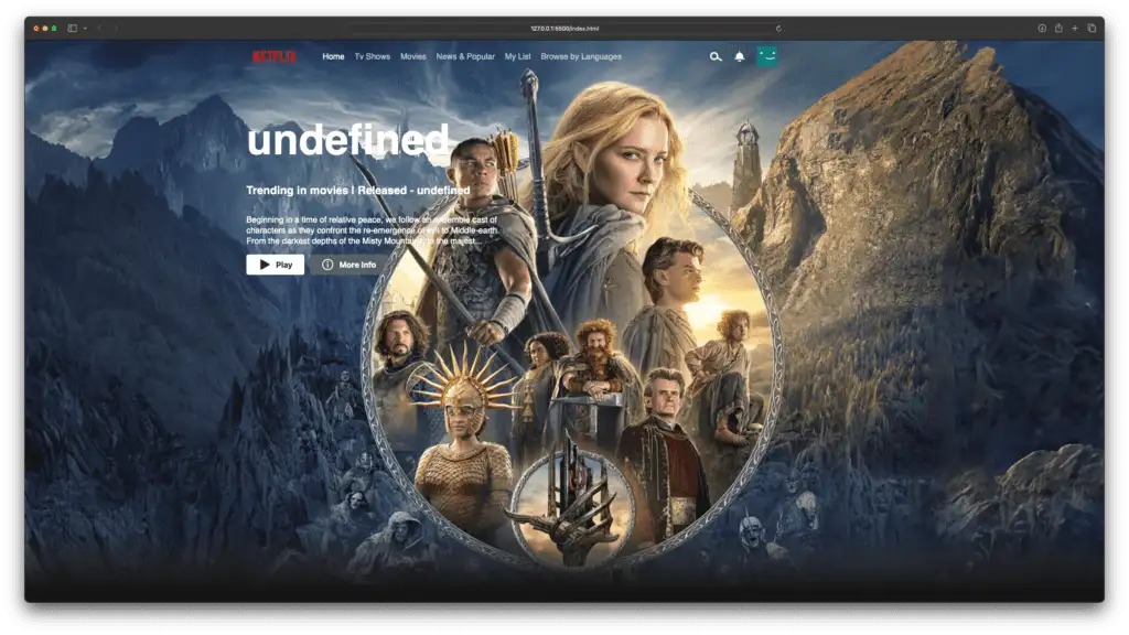
How the Netflix Clone Works
1. HTML Structure
The foundation of the project is built using HTML. The main components include:
- Header Section: Contains the Netflix-like logo, search bar, and navigation menu.
- Main Content: Displays rows of movies and TV shows fetched from the TMDB API. Each row is dynamically created using JavaScript based on the genre or category.
- Footer: Includes additional information or links.
Explanation :
HTML Structure:
The HTML file defines the structure of the web page, including the header, main content sections, and footer. Notable elements include:
- Header: Contains the Netflix logo, language dropdown, and a “Sign in” button.
- Main Sections: Divided into a hero section, features section, frequently asked questions (FAQ) section, and a “Get Started” email section.
- Footer: Comprising multiple rows with links and information, including a language dropdown and Netflix India details.
CSS Styling:
The CSS file is responsible for styling the HTML elements, providing a visually appealing and responsive layout. Some key styling aspects include:
- Global Styling: Resets default margin and padding, sets the background color, and defines the font family.
- Navbar Styling: Ensures the navigation bar is positioned at the top, styled the logo, language dropdown, and “Sign in” button.
- Hero Section Styling: Creates an overlay on the hero background image, styles the hero card with the title, subtitle, and email form.
- Feature Section Styling: Styles individual feature cards with details and images, including the background videos and GIFs.
- FAQ Section Styling: Styles FAQ accordions, making them visually appealing and ensuring smooth transitions.
JavaScript Interactivity:
The JavaScript file adds interactivity to the project, particularly to the FAQ section. Key JavaScript functionalities include:
- Accordions: Enables the toggle functionality for FAQ accordions. Clicking on a question expands or collapses the corresponding answer, and the icon changes between a plus and a times symbol accordingly.
- Event Listeners: Attaches click event listeners to each FAQ title, triggering the accordion functionality.
Project Responsiveness:
The project incorporates media queries to ensure responsiveness across different screen sizes. Notable breakpoints include adjustments for larger screens, such as tablets and desktops, to enhance the user experience.
Get Discount on Top Educational Courses
Source Code 1: Netflix Working Clone
HTML (index.html)
					<!DOCTYPE html>
<html lang="en">
<head>
    <meta charset="UTF-8">
    <meta http-equiv="X-UA-Compatible" content="IE=edge">
    <meta name="viewport" content="width=device-width, initial-scale=1.0">
    <title>Netflix clone</title>
    <link rel="icon" type="image/x-icon" href="favicon.ico">
    <link data-asynced="1" as="style" onload="this.onload=null;this.rel='stylesheet'"  rel="preload" href="index.css"> <script src="index.js" defer></script> </head>
<body>

    <header id="header" class="">
        <div class="header-cont container">
            <div class="left-cont">
                <img data-lazyloaded="1" src="data:image/gif;base64,R0lGODdhAQABAPAAAMPDwwAAACwAAAAAAQABAAACAkQBADs=" decoding="async" class="header-brand" data-src="https://images.ctfassets.net/4cd45et68cgf/7LrExJ6PAj6MSIPkDyCO86/542b1dfabbf3959908f69be546879952/Netflix-Brand-Logo.png?w=684&h=456" alt="">
                <ul class="main-nav">
                    <li class="nav-item active">Home</li>
                    <li class="nav-item">Tv Shows</li>
                    <li class="nav-item">Movies</li>
                    <li class="nav-item">News & Popular</li>
                    <li class="nav-item">My List</li>
                    <li class="nav-item">Browse by Languages</li>
                </ul>
            </div>
            <div class="right-cont">
                <svg width="24" height="24" viewBox="0 0 24 24" fill="none" xmlns="http://www.w3.org/2000/svg" class="search-icon"><path fill-rule="evenodd" clip-rule="evenodd" d="M13 11C13 13.7614 10.7614 16 8 16C5.23858 16 3 13.7614 3 11C3 8.23858 5.23858 6 8 6C10.7614 6 13 8.23858 13 11ZM14.0425 16.2431C12.5758 17.932 10.4126 19 8 19C3.58172 19 0 15.4183 0 11C0 6.58172 3.58172 3 8 3C12.4183 3 16 6.58172 16 11C16 11.9287 15.8417 12.8205 15.5507 13.6497L24.2533 18.7028L22.7468 21.2972L14.0425 16.2431Z" fill="currentColor"></path></svg>
                <svg width="24" height="24" viewBox="0 0 24 24" fill="none" xmlns="http://www.w3.org/2000/svg" class="Hawkins-Icon Hawkins-Icon-Standard"><path fill-rule="evenodd" clip-rule="evenodd" d="M13 4.57092C16.3922 5.05624 18.9998 7.9736 18.9998 11.5V15.2538C20.0486 15.3307 21.0848 15.4245 22.107 15.5347L21.8926 17.5232C18.7219 17.1813 15.409 17 11.9998 17C8.59056 17 5.27764 17.1813 2.10699 17.5232L1.89258 15.5347C2.91473 15.4245 3.95095 15.3307 4.99978 15.2538V11.5C4.99978 7.97345 7.6076 5.05599 11 4.57086V2H13V4.57092ZM8.62568 19.3712C8.6621 20.5173 10.1509 22 11.9993 22C13.8477 22 15.3365 20.5173 15.373 19.3712C15.38 19.1489 15.1756 19 14.9531 19H9.04555C8.82308 19 8.61862 19.1489 8.62568 19.3712Z" fill="currentColor"></path></svg>
                <img decoding="async" src="data:image/png;base64,iVBORw0KGgoAAAANSUhEUgAAAOEAAADhCAMAAAAJbSJIAAAAjVBMVEUNfoD///8Ae30AeHoAdXcAdnl6q6z2+/vo8vLx+Ph1sbIAdHfu9PQHfH8AgYPl8vI7kJKRvr+hx8jO4+PJ3d4eioxppqja6eni7OxdoqRSnqC42dqXxsaw09Ntra8ph4l/uLmGtrdapqeozc02lZdMmZuuzM3A2NnU4+SRvL2fy8xSmZpEkZO+1NV1qaqNxlfBAAAEIElEQVR4nO3bXXeiOhQGYNgJg6AiiIiggtbP0U7//8+beJzjoCYtSAQ7630uetVmvZuEEOnWMAAAAAAAAAAAAAAAAAAAAAAAAAAAAAAAAAAAvjNi3Ii8rkWtpuiLGCyKxA/dOchIZ3FPmGc5tVckGf4iPMUIA9/QGYNoEZr/c4Y+0zh2FSydX2KY00RfDDJ2ZlEnbadEa+EUYziBrlkkPzav2W4rJc5vYphzTQPTbYGixBZmkc/uYphDPTG29yObHb/p7YYSSQxzqSEGJbZs6FX9kavJQ1mMQV6/RDaVjWzaDU8i/ZDGMBf116knH1nH0FUoLrQ5qR2D3hQVhl0dwUvjihh2VHctsZVqaC3By6K1IoaZ1a2Qj5QXr68leznKpWQu6y5Tfv8wbKXC7HkV7hQjN1xh+rQKmeQkca6w0acFRaoKa9+HyosXci3Ry7Kk5w4de6lhKCps+nl4d+w+q/88VD0uHA3HpSpoLJ/ErH6FdHRkIw+b3GdOPOljK841DE2yvWaiYflXjLGWTKLtaolB9w8Me938uxq+uC8x0LMZUHRboqNh9T+QY3lb4ErXrUL92dXli6N23tPwt04xRsfV+MCi5O+Hl8Gy4W20EMMvXOrhRut1Jsrd+WQy2c82Wt9TVo7hpatY5FhlhvbXtsQsLmh/11w9x0vEAAAAAAAAAAAAAAAAgH8KMc/4l/8HRXyz3e2GLf07uqD/nO+fkLHZ2eeWgnZnkVi0ifSvJOLJpUXKTtoskfxdp9fZb7TWSETprtA50XCD3RWW/Qky19dUQCx3b7r2PV1jV+dd+sU6M88iDc0v1I2Cu5bextuzLqyrdrGgdhOHmL6xrGM/0hP3EfurIM42YY/fkMRYOpR2ZDvt3Yfe/iaLPVn4j7TBiL0l9xexooe24UbXIkvWL7n7uSGryh1JjEfjofQrQefV/7T8X2OuNFIvnq3FmisxlyR+zYoWo4Fi9oRB1kAhapbyytvT4OM9OpUpr1PUZhnR8SOYqosT4sxq99AmHvifxBuEo2G2iXiXc1bEeddYp8vtaN/55K9P9bntH0qJZV+kFHrh9HAI3P8sDodVqL7nCuzwrc0Wwr9YFEjbxGuy5+MWv1F+jcgPPr2XHtAL3l9j/v4Qny+CUguvHGfnvt7n3r44LSu+IFnVIDgarW8vUsSjmepQUnr24iB65dZZYt54NXi8vtEw9V64vDOx/fmHuPre6vSmWa6/r/s5xDls7W7D8lU64fZn6vFvUt4ZMcrfk2D69VnAmQbj95xefm3KiHMn73prN/g1CuO441zm1HacQRyHo19Btva6vMz5/JWd6jQ83z8mx48fZ8kx2fi5R9++tiKiPl1rOxEAAAAAAAAAAAAAAAAAAAAAAAAAAAAAAAAAAAAAAAAAAAAAALy43/ipMgzSotaqAAAAAElFTkSuQmCC" alt="">
            </div>
        </div>
    </header>


    <div class="banner-section" id="banner-section">
        <div class="banner_fadeBottom"></div>
    </div>


    <div class="movies-cont container" id="movies-cont">
    </div>
     <script data-no-optimize="1">window.lazyLoadOptions=Object.assign({},{threshold:300},window.lazyLoadOptions||{});!function(t,e){"object"==typeof exports&&"undefined"!=typeof module?module.exports=e():"function"==typeof define&&define.amd?define(e):(t="undefined"!=typeof globalThis?globalThis:t||self).LazyLoad=e()}(this,function(){"use strict";function e(){return(e=Object.assign||function(t){for(var e=1;e<arguments.length;e++){var n,a=arguments[e];for(n in a)Object.prototype.hasOwnProperty.call(a,n)&&(t[n]=a[n])}return t}).apply(this,arguments)}function o(t){return e({},at,t)}function l(t,e){return t.getAttribute(gt+e)}function c(t){return l(t,vt)}function s(t,e){return function(t,e,n){e=gt+e;null!==n?t.setAttribute(e,n):t.removeAttribute(e)}(t,vt,e)}function i(t){return s(t,null),0}function r(t){return null===c(t)}function u(t){return c(t)===_t}function d(t,e,n,a){t&&(void 0===a?void 0===n?t(e):t(e,n):t(e,n,a))}function f(t,e){et?t.classList.add(e):t.className+=(t.className?" ":"")+e}function _(t,e){et?t.classList.remove(e):t.className=t.className.replace(new RegExp("(^|\\s+)"+e+"(\\s+|$)")," ").replace(/^\s+/,"").replace(/\s+$/,"")}function g(t){return t.llTempImage}function v(t,e){!e||(e=e._observer)&&e.unobserve(t)}function b(t,e){t&&(t.loadingCount+=e)}function p(t,e){t&&(t.toLoadCount=e)}function n(t){for(var e,n=[],a=0;e=t.children[a];a+=1)"SOURCE"===e.tagName&&n.push(e);return n}function h(t,e){(t=t.parentNode)&&"PICTURE"===t.tagName&&n(t).forEach(e)}function a(t,e){n(t).forEach(e)}function m(t){return!!t[lt]}function E(t){return t[lt]}function I(t){return delete t[lt]}function y(e,t){var n;m(e)||(n={},t.forEach(function(t){n[t]=e.getAttribute(t)}),e[lt]=n)}function L(a,t){var o;m(a)&&(o=E(a),t.forEach(function(t){var e,n;e=a,(t=o[n=t])?e.setAttribute(n,t):e.removeAttribute(n)}))}function k(t,e,n){f(t,e.class_loading),s(t,st),n&&(b(n,1),d(e.callback_loading,t,n))}function A(t,e,n){n&&t.setAttribute(e,n)}function O(t,e){A(t,rt,l(t,e.data_sizes)),A(t,it,l(t,e.data_srcset)),A(t,ot,l(t,e.data_src))}function w(t,e,n){var a=l(t,e.data_bg_multi),o=l(t,e.data_bg_multi_hidpi);(a=nt&&o?o:a)&&(t.style.backgroundImage=a,n=n,f(t=t,(e=e).class_applied),s(t,dt),n&&(e.unobserve_completed&&v(t,e),d(e.callback_applied,t,n)))}function x(t,e){!e||0<e.loadingCount||0<e.toLoadCount||d(t.callback_finish,e)}function M(t,e,n){t.addEventListener(e,n),t.llEvLisnrs[e]=n}function N(t){return!!t.llEvLisnrs}function z(t){if(N(t)){var e,n,a=t.llEvLisnrs;for(e in a){var o=a[e];n=e,o=o,t.removeEventListener(n,o)}delete t.llEvLisnrs}}function C(t,e,n){var a;delete t.llTempImage,b(n,-1),(a=n)&&--a.toLoadCount,_(t,e.class_loading),e.unobserve_completed&&v(t,n)}function R(i,r,c){var l=g(i)||i;N(l)||function(t,e,n){N(t)||(t.llEvLisnrs={});var a="VIDEO"===t.tagName?"loadeddata":"load";M(t,a,e),M(t,"error",n)}(l,function(t){var e,n,a,o;n=r,a=c,o=u(e=i),C(e,n,a),f(e,n.class_loaded),s(e,ut),d(n.callback_loaded,e,a),o||x(n,a),z(l)},function(t){var e,n,a,o;n=r,a=c,o=u(e=i),C(e,n,a),f(e,n.class_error),s(e,ft),d(n.callback_error,e,a),o||x(n,a),z(l)})}function T(t,e,n){var a,o,i,r,c;t.llTempImage=document.createElement("IMG"),R(t,e,n),m(c=t)||(c[lt]={backgroundImage:c.style.backgroundImage}),i=n,r=l(a=t,(o=e).data_bg),c=l(a,o.data_bg_hidpi),(r=nt&&c?c:r)&&(a.style.backgroundImage='url("'.concat(r,'")'),g(a).setAttribute(ot,r),k(a,o,i)),w(t,e,n)}function G(t,e,n){var a;R(t,e,n),a=e,e=n,(t=Et[(n=t).tagName])&&(t(n,a),k(n,a,e))}function D(t,e,n){var a;a=t,(-1<It.indexOf(a.tagName)?G:T)(t,e,n)}function S(t,e,n){var a;t.setAttribute("loading","lazy"),R(t,e,n),a=e,(e=Et[(n=t).tagName])&&e(n,a),s(t,_t)}function V(t){t.removeAttribute(ot),t.removeAttribute(it),t.removeAttribute(rt)}function j(t){h(t,function(t){L(t,mt)}),L(t,mt)}function F(t){var e;(e=yt[t.tagName])?e(t):m(e=t)&&(t=E(e),e.style.backgroundImage=t.backgroundImage)}function P(t,e){var n;F(t),n=e,r(e=t)||u(e)||(_(e,n.class_entered),_(e,n.class_exited),_(e,n.class_applied),_(e,n.class_loading),_(e,n.class_loaded),_(e,n.class_error)),i(t),I(t)}function U(t,e,n,a){var o;n.cancel_on_exit&&(c(t)!==st||"IMG"===t.tagName&&(z(t),h(o=t,function(t){V(t)}),V(o),j(t),_(t,n.class_loading),b(a,-1),i(t),d(n.callback_cancel,t,e,a)))}function $(t,e,n,a){var o,i,r=(i=t,0<=bt.indexOf(c(i)));s(t,"entered"),f(t,n.class_entered),_(t,n.class_exited),o=t,i=a,n.unobserve_entered&&v(o,i),d(n.callback_enter,t,e,a),r||D(t,n,a)}function q(t){return t.use_native&&"loading"in HTMLImageElement.prototype}function H(t,o,i){t.forEach(function(t){return(a=t).isIntersecting||0<a.intersectionRatio?$(t.target,t,o,i):(e=t.target,n=t,a=o,t=i,void(r(e)||(f(e,a.class_exited),U(e,n,a,t),d(a.callback_exit,e,n,t))));var e,n,a})}function B(e,n){var t;tt&&!q(e)&&(n._observer=new IntersectionObserver(function(t){H(t,e,n)},{root:(t=e).container===document?null:t.container,rootMargin:t.thresholds||t.threshold+"px"}))}function J(t){return Array.prototype.slice.call(t)}function K(t){return t.container.querySelectorAll(t.elements_selector)}function Q(t){return c(t)===ft}function W(t,e){return e=t||K(e),J(e).filter(r)}function X(e,t){var n;(n=K(e),J(n).filter(Q)).forEach(function(t){_(t,e.class_error),i(t)}),t.update()}function t(t,e){var n,a,t=o(t);this._settings=t,this.loadingCount=0,B(t,this),n=t,a=this,Y&&window.addEventListener("online",function(){X(n,a)}),this.update(e)}var Y="undefined"!=typeof window,Z=Y&&!("onscroll"in window)||"undefined"!=typeof navigator&&/(gle|ing|ro)bot|crawl|spider/i.test(navigator.userAgent),tt=Y&&"IntersectionObserver"in window,et=Y&&"classList"in document.createElement("p"),nt=Y&&1<window.devicePixelRatio,at={elements_selector:".lazy",container:Z||Y?document:null,threshold:300,thresholds:null,data_src:"src",data_srcset:"srcset",data_sizes:"sizes",data_bg:"bg",data_bg_hidpi:"bg-hidpi",data_bg_multi:"bg-multi",data_bg_multi_hidpi:"bg-multi-hidpi",data_poster:"poster",class_applied:"applied",class_loading:"litespeed-loading",class_loaded:"litespeed-loaded",class_error:"error",class_entered:"entered",class_exited:"exited",unobserve_completed:!0,unobserve_entered:!1,cancel_on_exit:!0,callback_enter:null,callback_exit:null,callback_applied:null,callback_loading:null,callback_loaded:null,callback_error:null,callback_finish:null,callback_cancel:null,use_native:!1},ot="src",it="srcset",rt="sizes",ct="poster",lt="llOriginalAttrs",st="loading",ut="loaded",dt="applied",ft="error",_t="native",gt="data-",vt="ll-status",bt=[st,ut,dt,ft],pt=[ot],ht=[ot,ct],mt=[ot,it,rt],Et={IMG:function(t,e){h(t,function(t){y(t,mt),O(t,e)}),y(t,mt),O(t,e)},IFRAME:function(t,e){y(t,pt),A(t,ot,l(t,e.data_src))},VIDEO:function(t,e){a(t,function(t){y(t,pt),A(t,ot,l(t,e.data_src))}),y(t,ht),A(t,ct,l(t,e.data_poster)),A(t,ot,l(t,e.data_src)),t.load()}},It=["IMG","IFRAME","VIDEO"],yt={IMG:j,IFRAME:function(t){L(t,pt)},VIDEO:function(t){a(t,function(t){L(t,pt)}),L(t,ht),t.load()}},Lt=["IMG","IFRAME","VIDEO"];return t.prototype={update:function(t){var e,n,a,o=this._settings,i=W(t,o);{if(p(this,i.length),!Z&&tt)return q(o)?(e=o,n=this,i.forEach(function(t){-1!==Lt.indexOf(t.tagName)&&S(t,e,n)}),void p(n,0)):(t=this._observer,o=i,t.disconnect(),a=t,void o.forEach(function(t){a.observe(t)}));this.loadAll(i)}},destroy:function(){this._observer&&this._observer.disconnect(),K(this._settings).forEach(function(t){I(t)}),delete this._observer,delete this._settings,delete this.loadingCount,delete this.toLoadCount},loadAll:function(t){var e=this,n=this._settings;W(t,n).forEach(function(t){v(t,e),D(t,n,e)})},restoreAll:function(){var e=this._settings;K(e).forEach(function(t){P(t,e)})}},t.load=function(t,e){e=o(e);D(t,e)},t.resetStatus=function(t){i(t)},t}),function(t,e){"use strict";function n(){e.body.classList.add("litespeed_lazyloaded")}function a(){console.log("[LiteSpeed] Start Lazy Load"),o=new LazyLoad(Object.assign({},t.lazyLoadOptions||{},{elements_selector:"[data-lazyloaded]",callback_finish:n})),i=function(){o.update()},t.MutationObserver&&new MutationObserver(i).observe(e.documentElement,{childList:!0,subtree:!0,attributes:!0})}var o,i;t.addEventListener?t.addEventListener("load",a,!1):t.attachEvent("onload",a)}(window,document);</script><script data-no-optimize="1">window.litespeed_ui_events=window.litespeed_ui_events||["mouseover","click","keydown","wheel","touchmove","touchstart"];var urlCreator=window.URL||window.webkitURL;function litespeed_load_delayed_js_force(){console.log("[LiteSpeed] Start Load JS Delayed"),litespeed_ui_events.forEach(e=>{window.removeEventListener(e,litespeed_load_delayed_js_force,{passive:!0})}),document.querySelectorAll("iframe[data-litespeed-src]").forEach(e=>{e.setAttribute("src",e.getAttribute("data-litespeed-src"))}),"loading"==document.readyState?window.addEventListener("DOMContentLoaded",litespeed_load_delayed_js):litespeed_load_delayed_js()}litespeed_ui_events.forEach(e=>{window.addEventListener(e,litespeed_load_delayed_js_force,{passive:!0})});async function litespeed_load_delayed_js(){let t=[];for(var d in document.querySelectorAll('script[type="litespeed/javascript"]').forEach(e=>{t.push(e)}),t)await new Promise(e=>litespeed_load_one(t[d],e));document.dispatchEvent(new Event("DOMContentLiteSpeedLoaded")),window.dispatchEvent(new Event("DOMContentLiteSpeedLoaded"))}function litespeed_load_one(t,e){console.log("[LiteSpeed] Load ",t);var d=document.createElement("script");d.addEventListener("load",e),d.addEventListener("error",e),t.getAttributeNames().forEach(e=>{"type"!=e&&d.setAttribute("data-src"==e?"src":e,t.getAttribute(e))});let a=!(d.type="text/javascript");!d.src&&t.textContent&&(d.src=litespeed_inline2src(t.textContent),a=!0),t.after(d),t.remove(),a&&e()}function litespeed_inline2src(t){try{var d=urlCreator.createObjectURL(new Blob([t.replace(/^(?:<!--)?(.*?)(?:-->)?$/gm,"$1")],{type:"text/javascript"}))}catch(e){d="data:text/javascript;base64,"+btoa(t.replace(/^(?:<!--)?(.*?)(?:-->)?$/gm,"$1"))}return d}</script><script data-no-optimize="1">var litespeed_vary=document.cookie.replace(/(?:(?:^|.*;\s*)_lscache_vary\s*\=\s*([^;]*).*$)|^.*$/,"");litespeed_vary||(sessionStorage.getItem("litespeed_reloaded")?console.log("LiteSpeed: skipping guest vary reload (already reloaded this session)"):fetch("/wp-content/plugins/litespeed-cache/guest.vary.php",{method:"POST",cache:"no-cache",redirect:"follow"}).then(e=>e.json()).then(e=>{console.log(e),e.hasOwnProperty("reload")&&"yes"==e.reload&&(sessionStorage.setItem("litespeed_docref",document.referrer),sessionStorage.setItem("litespeed_reloaded","1"),window.location.reload(!0))}));</script><script data-optimized="1" type="litespeed/javascript" data-src="https://codewithcurious.com/wp-content/litespeed/js/3448d782c66426cd01f825fbdcedab12.js?ver=37c43"></script></body>
</html>
CSS (styles.css)
					/* Normalise css */
html,body{
    background-color: #141414;
    padding:0;
    margin: 0;
    font-family: Helvetica,Arial ,sans-serif;
}
.container{
    width: 100%;
    max-width: 1250px;
    margin: 0 auto;
}
*{
    box-sizing: border-box;
}
*::-webkit-scrollbar{
    display: none;
}

/* Header Css */
header{
    background-color: transparent;
    position: fixed;
    z-index: 100;
    left:0;
    top: 0;
    width: 100%;
    transition: all ease 600ms;
}
header.black-bg{
    background-color: rgb(20, 20, 20);
}
.header-cont{
    display: flex;
    flex-direction: row;
    justify-content: space-between;
}

.left-cont, .right-cont{
    display: flex;
    flex-direction: row;
    align-items: center;
}
.header-brand{
    max-width: 110px;
}
.main-nav{
    list-style: none;
    display: inline-flex;
    flex-direction: row;
}
.nav-item{
    margin-right: 20px;
    color: #e5e5e5;
    opacity: .83;
}
.nav-item.active{
    color: white;
    opacity: 1;
    font-weight: 500;
}
.right-cont svg,  .right-cont img{
    margin-right: 22px;
    cursor: pointer;
}
.right-cont svg{
    color: white;
}
.right-cont img{
    max-width:40px;
}


/* Movies Section CSS */
.movies-section{
    margin: 41px 0;
}
.movie-section-heading{
    font-size: 20px;
    font-weight: 700;
    line-height: 1.2;
    color: white;
    cursor: pointer;
    margin-bottom: 10px;
}
.explore-nudge{
    color: #54b9c5;
    font-size: 12px;
    display: none;
}
.movie-section-heading:hover .explore-nudge{
    display: inline-block;
}
.movies-row{
    display: flex;
    flex-direction: row;
    align-items: center;
    flex-wrap: nowrap;
    overflow-x:auto;
    overflow-y: hidden;
}
.movie-item{
    width: 245px;
    object-fit: contain;
    margin-right: 6px;
    border-radius: 4px;
    position: relative;
}
.move-item-img{
    width: inherit;
}
.movie-item .iframe-wrap{
    position: absolute;
    top: 0;
    left: 0;
    width: 100%;
    height: 100%;
    z-index: 10;
    display: none;
    border: none;
    outline: none;
}
.movie-item:hover .iframe-wrap{
    display: block;
}
.movie-item:hover{
    transform: scale(1.3);
    transition: transform linear 300ms;
}


/* Banner Section */
.banner-section{
    background-repeat: no-repeat;
    background-size: cover;
    min-height: 98vh;
    padding-top: 80px;
    position: relative;
}
.banner-content{
    display: flex;
    flex-direction: column;
    padding-top: 70px;
}
.banner__title{
    color: white;
    font-size: 84px;
    line-height: 1.1;
    margin: 0;
    margin-bottom: 16px;
    max-width: 40%;
}
.banner__info{
    margin-bottom: 14px;
    font-size: 22px;
    font-weight: 700;
    line-height: 1.5;
    color: white;
}
.banner__overview{
    font-size: 16.4px;
    color: white;
    line-height: 1.3;
    max-width: 40%;
}
.action-buttons-cont{
    display: flex;
    flex-direction: row;
    align-items: center;
}
.action-button{
    border:none;
    background-color: white;
    padding: 8px 23px;
    margin-right: 11px;
    border-radius: 4px;
    display: flex;
    align-items: center;
    flex-direction: row;
    font-size: 16px;
    font-weight: 700;
    cursor:pointer;
}
.action-button:last-child{
    background-color: rgba(109, 109, 110, 0.7);
    color:white;
}
.banner_fadeBottom{
    height: 120px;
    background:linear-gradient(180deg,
        transparent,
        rgba(37,37,37,.61),
        #141414
    );
    position: absolute;
    left:0;
    bottom: 0;
    width: 100%;
}


/* RESPONSIVE CSS */
@media (max-width:767px) {
    .main-nav{
        display: none;
    }
    .banner__overview, .banner__title{
        max-width: 100%;
    }
}
JavaScript (index.js)
// Consts
const apikey = "e950e51d5d49e85f7c2f17f01eb23ba3";
const apiEndpoint = "https://api.themoviedb.org/3"
const imgPath = "https://image.tmdb.org/t/p/original";
const apiPaths = {
fetchAllCategories: `${apiEndpoint}/genre/movie/list?api_key=${apikey}`,
fetchMoviesList: (id) => `${apiEndpoint}/discover/movie?api_key=${apikey}&with_genres=${id}`,
fetchTrending:`${apiEndpoint}/trending/all/day?api_key=${apikey}&language=en-US`,
searchOnYoutube: (query) => `https://www.googleapis.com/youtube/v3/search?part=snippet&q=${query}&key=AIzaSyA_eZ5WJhmYhRQOM8-jAyVIzzdfWUlp_P0`
}
// Boots up the app
function init() {
fetchTrendingMovies();
fetchAndBuildAllSections();
}
function fetchTrendingMovies(){
fetchAndbuildMovieSection(apiPaths.fetchTrending, 'Trending Now')
.then(list => {
const randomIndex = parseInt(Math.random() * list.length);
buildBannerSection(list[randomIndex]);
}).catch(err=>{
console.error(err);
});
}
function buildBannerSection(movie){
const bannerCont = document.getElementById('banner-section');
bannerCont.style.backgroundImage = `url('${imgPath}${movie.backdrop_path}')`;
const div = document.createElement('div');
div.innerHTML = `
<h2 class="banner__title">${movie.title}</h2>
<p class="banner__info">Trending in movies | Released - ${movie.release_date} </p>
<p class="banner__overview">${movie.overview && movie.overview.length > 200 ? movie.overview.slice(0,200).trim()+ '...':movie.overview}</p>
<div class="action-buttons-cont">
<button class="action-button"><svg width="24" height="24" viewBox="0 0 24 24" fill="none" xmlns="http://www.w3.org/2000/svg" class="Hawkins-Icon Hawkins-Icon-Standard"><path d="M4 2.69127C4 1.93067 4.81547 1.44851 5.48192 1.81506L22.4069 11.1238C23.0977 11.5037 23.0977 12.4963 22.4069 12.8762L5.48192 22.1849C4.81546 22.5515 4 22.0693 4 21.3087V2.69127Z" fill="currentColor"></path></svg> Play</button>
<button class="action-button"><svg width="24" height="24" viewBox="0 0 24 24" fill="none" xmlns="http://www.w3.org/2000/svg" class="Hawkins-Icon Hawkins-Icon-Standard"><path fill-rule="evenodd" clip-rule="evenodd" d="M12 3C7.02944 3 3 7.02944 3 12C3 16.9706 7.02944 21 12 21C16.9706 21 21 16.9706 21 12C21 7.02944 16.9706 3 12 3ZM1 12C1 5.92487 5.92487 1 12 1C18.0751 1 23 5.92487 23 12C23 18.0751 18.0751 23 12 23C5.92487 23 1 18.0751 1 12ZM13 10V18H11V10H13ZM12 8.5C12.8284 8.5 13.5 7.82843 13.5 7C13.5 6.17157 12.8284 5.5 12 5.5C11.1716 5.5 10.5 6.17157 10.5 7C10.5 7.82843 11.1716 8.5 12 8.5Z" fill="currentColor"></path></svg> More Info</button>
</div>
`;
div.className = "banner-content container";
bannerCont.append(div);
}
function fetchAndBuildAllSections(){
fetch(apiPaths.fetchAllCategories)
.then(res => res.json())
.then(res => {
const categories = res.genres;
if (Array.isArray(categories) && categories.length) {
categories.forEach(category => {
fetchAndbuildMovieSection(
apiPaths.fetchMoviesList(category.id),
category.name
);
});
}
// console.table(movies);
})
.catch(err=>console.error(err));
}
function fetchAndbuildMovieSection(fetchUrl, categoryName){
console.log(fetchUrl,categoryName);
return fetch(fetchUrl)
.then(res => res.json())
.then(res => {
// console.table(res.results);
const movies = res.results;
if (Array.isArray(movies) && movies.length) {
buildMoviesSection(movies.slice(0,6), categoryName);
}
return movies;
})
.catch(err=>console.error(err))
}
function buildMoviesSection(list, categoryName){
console.log(list, categoryName);
const moviesCont = document.getElementById('movies-cont');
const moviesListHTML = list.map(item => {
return `
<div class="movie-item" onmouseenter="searchMovieTrailer('${item.title}', 'yt${item.id}')">
<img decoding="async" class="move-item-img" src="${imgPath}${item.backdrop_path}" alt="${item.title}" />
<div class="iframe-wrap" id="yt${item.id}"></div>
</div>`;
}).join('');
const moviesSectionHTML = `
<h2 class="movie-section-heading">${categoryName} <span class="explore-nudge">Explore All</span></span></h2>
<div class="movies-row">
${moviesListHTML}
</div>
`
const div = document.createElement('div');
div.className = "movies-section"
div.innerHTML = moviesSectionHTML;
// append html into movies container
moviesCont.append(div);
}
function searchMovieTrailer(movieName, iframId) {
if (!movieName) return;
fetch(apiPaths.searchOnYoutube(movieName))
.then(res => res.json())
.then(res => {
const bestResult = res.items[0];
const elements = document.getElementById(iframId);
console.log(elements, iframId);
const div = document.createElement('div');
div.innerHTML = `<iframe data-lazyloaded="1" src="about:blank" width="245px" height="150px" data-litespeed-src="https://www.youtube.com/embed/${bestResult.id.videoId}?autoplay=1&controls=0"></iframe>`
// window.open(youtubeUrl,'_blank');
elements.append(div);
})
.catch(err=>console.log(err));
}
window.addEventListener('load',function() {
init();
window.addEventListener('scroll', function(){
// header ui update
const header = document.getElementById('header');
if (window.scrollY > 5) header.classList.add('black-bg')
else header.classList.remove('black-bg');
})
})
Output:

Source Code 2: Netflix Landing Page Clone
HTML (index.html)
					<html>
  <head>
    <meta name="description" content="Hello this is my first web page!." />
    <meta name="viewport" content="width=device-width, initial-scale=1.0" />
    <link data-asynced="1" as="style" onload="this.onload=null;this.rel='stylesheet'"  rel="preload" href="src/styles.css" />
    <link
      rel="stylesheet"
      href="https://pro.fontawesome.com/releases/v5.10.0/css/all.css"
      integrity="sha384-AYmEC3Yw5cVb3ZcuHtOA93w35dYTsvhLPVnYs9eStHfGJvOvKxVfELGroGkvsg+p"
      crossorigin="anonymous"
    />
    <link rel="preconnect" href="https://fonts.googleapis.com" />
    <link rel="preconnect" href="https://fonts.gstatic.com" crossorigin />
    <link
      href="https://fonts.googleapis.com/css2?family=Poppins:ital,wght@0,100;0,200;0,300;0,400;0,500;0,600;0,700;0,800;0,900;1,100;1,200;1,300;1,400;1,500;1,600;1,700;1,800;1,900&display=swap"
      rel="stylesheet"
    />
    <title>Netflix India - Watch TV Shows Online, Watch Movies Online</title>
    <link
      rel="icon"
      href="http://pngimg.com/uploads/netflix/small/netflix_PNG15.png"
    />
  </head>
  <body>
    <header>
      <nav class="navbar">
        <div class="navbar__brand">
          <img data-lazyloaded="1" src="data:image/svg+xml;base64,PHN2ZyB4bWxucz0iaHR0cDovL3d3dy53My5vcmcvMjAwMC9zdmciIHdpZHRoPSIyMjA4IiBoZWlnaHQ9IjY4NCIgdmlld0JveD0iMCAwIDIyMDggNjg0Ij48cmVjdCB3aWR0aD0iMTAwJSIgaGVpZ2h0PSIxMDAlIiBzdHlsZT0iZmlsbDojY2ZkNGRiO2ZpbGwtb3BhY2l0eTogMC4xOyIvPjwvc3ZnPg==" decoding="async" data-src="https://www.freepnglogos.com/uploads/netflix-logo-0.png"
            alt="logo"
            class="brand__logo"
           width="2208" height="684" />
        </div>

        <div class="navbar__nav__items">
          <div class="nav__item">
            <div class="dropdown__container">
              <i class="fas fa-globe"></i>
              <select
                name="languages"
                id="languagesSelect"
                class="language__drop__down"
              >
                <option value="english" selected style="color: black;">English</option>
                <option value="hindi" style="color: black;">हिन्दी</option>
              </select>
            </div>
          </div>

          <div class="nav__item">
            <button class="signin__button">Sign in</button>
          </div>
        </div>
      </nav>
    </header>

    <main>
      <section class="hero">
        <div class="hero__bg__image__container">
          <img data-lazyloaded="1" src="data:image/svg+xml;base64,PHN2ZyB4bWxucz0iaHR0cDovL3d3dy53My5vcmcvMjAwMC9zdmciIHdpZHRoPSIyMDAwIiBoZWlnaHQ9IjExMjUiIHZpZXdCb3g9IjAgMCAyMDAwIDExMjUiPjxyZWN0IHdpZHRoPSIxMDAlIiBoZWlnaHQ9IjEwMCUiIHN0eWxlPSJmaWxsOiNjZmQ0ZGI7ZmlsbC1vcGFjaXR5OiAwLjE7Ii8+PC9zdmc+" decoding="async" data-src="https://assets.nflxext.com/ffe/siteui/vlv3/9c5457b8-9ab0-4a04-9fc1-e608d5670f1a/710d74e0-7158-408e-8d9b-23c219dee5df/IN-en-20210719-popsignuptwoweeks-perspective_alpha_website_small.jpg"
            alt="BG hero image"
            class="hero__bg__image"
           width="2000" height="1125" />
        </div>
        <div class="hero__bg__overlay"></div>

        <div class="hero__card">
          <h1 class="hero__title">
            Unlimited Movies TV,<br />
            Shows and More.
          </h1>
          <p class="hero__subtitle">Watch anywhere and cancel anytime.</p>
          <p class="hero__description">
            Ready to watch? Enter your email to create or restart your
            membership .
          </p>

          <div class="email__form__container">
            <div class="form__container">
              <input type="email" class="email__input" placeholder=" " />
              <label class="email__label">Email Address</label>
            </div>
            <button class="primary__button">
              Get Started <i class="fal fa-chevron-right"></i>
            </button>
          </div>
        </div>
      </section>
      <section class="features__container">

        <div class="feature">
          <div class="feature__details">
            <h3 class="feature__title">Enjoy on your TV.</h3>
            <h5 class="feature__sub__title">
              Watch on smart TVs, PlayStation, Xbox, Chromecast, Apple TV,
              Blu-ray players and more.
            </h5>
          </div>
          <div class="feature__image__container">
            <img data-lazyloaded="1" src="data:image/svg+xml;base64,PHN2ZyB4bWxucz0iaHR0cDovL3d3dy53My5vcmcvMjAwMC9zdmciIHdpZHRoPSI2NDAiIGhlaWdodD0iNDgwIiB2aWV3Qm94PSIwIDAgNjQwIDQ4MCI+PHJlY3Qgd2lkdGg9IjEwMCUiIGhlaWdodD0iMTAwJSIgc3R5bGU9ImZpbGw6I2NmZDRkYjtmaWxsLW9wYWNpdHk6IDAuMTsiLz48L3N2Zz4=" decoding="async" data-src="https://assets.nflxext.com/ffe/siteui/acquisition/ourStory/fuji/desktop/tv.png"
              alt="Feature image"
              class="feature__image"
             width="640" height="480" />
            <div class="feature__backgroud__video__container">
              <video
                autoplay=""
                loop=""
                muted=""
                class="feature__backgroud__video"
              >
                <source
                  src="https://assets.nflxext.com/ffe/siteui/acquisition/ourStory/fuji/desktop/video-tv-in-0819.m4v"
                  type="video/mp4"
                />
              </video>
            </div>
          </div>
        </div>

        <div class="feature">
          <div class="feature__details">
            <h3 class="feature__title">
              Download your shows to watch offline.
            </h3>
            <h5 class="feature__sub__title">
              Save your favourites easily and always have something to watch.
            </h5>
          </div>
          <div class="feature__image__container">
            <img data-lazyloaded="1" src="data:image/svg+xml;base64,PHN2ZyB4bWxucz0iaHR0cDovL3d3dy53My5vcmcvMjAwMC9zdmciIHdpZHRoPSI2NDAiIGhlaWdodD0iNDgwIiB2aWV3Qm94PSIwIDAgNjQwIDQ4MCI+PHJlY3Qgd2lkdGg9IjEwMCUiIGhlaWdodD0iMTAwJSIgc3R5bGU9ImZpbGw6I2NmZDRkYjtmaWxsLW9wYWNpdHk6IDAuMTsiLz48L3N2Zz4=" decoding="async" data-src="https://assets.nflxext.com/ffe/siteui/acquisition/ourStory/fuji/desktop/mobile-0819.jpg"
              alt="Feature image"
              class="feature__image"
             width="640" height="480" />
            <div class="feature__2__poster__container">
              <div class="poster__container">
                <img data-lazyloaded="1" src="data:image/svg+xml;base64,PHN2ZyB4bWxucz0iaHR0cDovL3d3dy53My5vcmcvMjAwMC9zdmciIHdpZHRoPSIxNTAiIGhlaWdodD0iMjEwIiB2aWV3Qm94PSIwIDAgMTUwIDIxMCI+PHJlY3Qgd2lkdGg9IjEwMCUiIGhlaWdodD0iMTAwJSIgc3R5bGU9ImZpbGw6I2NmZDRkYjtmaWxsLW9wYWNpdHk6IDAuMTsiLz48L3N2Zz4=" decoding="async" data-src="https://assets.nflxext.com/ffe/siteui/acquisition/ourStory/fuji/desktop/boxshot.png"
                  alt="poster"
                  class="poster"
                 width="150" height="210" />
              </div>
              <div class="poster__details">
                <h4>Stranger Things</h4>
                <h6>Downloading...</h6>
              </div>
              <div class="download__gif__container">
                <img data-lazyloaded="1" src="data:image/svg+xml;base64,PHN2ZyB4bWxucz0iaHR0cDovL3d3dy53My5vcmcvMjAwMC9zdmciIHdpZHRoPSIxMDAiIGhlaWdodD0iMTAwIiB2aWV3Qm94PSIwIDAgMTAwIDEwMCI+PHJlY3Qgd2lkdGg9IjEwMCUiIGhlaWdodD0iMTAwJSIgc3R5bGU9ImZpbGw6I2NmZDRkYjtmaWxsLW9wYWNpdHk6IDAuMTsiLz48L3N2Zz4=" decoding="async" data-src="https://assets.nflxext.com/ffe/siteui/acquisition/ourStory/fuji/desktop/download-icon.gif"
                  alt="downloading gif"
                  class="gif"
                 width="100" height="100" />
              </div>
            </div>
          </div>
        </div>

        <div class="feature">
          <div class="feature__details">
            <h3 class="feature__title">Watch everywhere.</h3>
            <h5 class="feature__sub__title">
              Stream unlimited movies and TV shows on your phone, tablet,
              laptop, and TV.
            </h5>
          </div>
          <div class="feature__image__container feature__3__image__container">
            <img data-lazyloaded="1" src="data:image/svg+xml;base64,PHN2ZyB4bWxucz0iaHR0cDovL3d3dy53My5vcmcvMjAwMC9zdmciIHdpZHRoPSI2NDAiIGhlaWdodD0iNDgwIiB2aWV3Qm94PSIwIDAgNjQwIDQ4MCI+PHJlY3Qgd2lkdGg9IjEwMCUiIGhlaWdodD0iMTAwJSIgc3R5bGU9ImZpbGw6I2NmZDRkYjtmaWxsLW9wYWNpdHk6IDAuMTsiLz48L3N2Zz4=" decoding="async" data-src="https://assets.nflxext.com/ffe/siteui/acquisition/ourStory/fuji/desktop/device-pile-in.png"
              alt="Feature image"
              class="feature__image feature__3__image"
             width="640" height="480" />
            <div
              class="feature__backgroud__video__container feature__3__backgroud__video__container"
            >
              <video
                autoplay=""
                loop=""
                muted=""
                class="feature__backgroud__video feature__3__backgroud__video"
              >
                <source
                  src="https://assets.nflxext.com/ffe/siteui/acquisition/ourStory/fuji/desktop/video-devices-in.m4v"
                  type="video/mp4"
                />
              </video>
            </div>
          </div>
        </div>

        <div class="feature">
          <div class="feature__details">
            <h3 class="feature__title">Create profiles for children.</h3>
            <h5 class="feature__sub__title">
              Send children on adventures with their favourite characters in a
              space made just for them—free with your membership.
            </h5>
          </div>
          <div class="feature__image__container">
            <img data-lazyloaded="1" src="data:image/svg+xml;base64,PHN2ZyB4bWxucz0iaHR0cDovL3d3dy53My5vcmcvMjAwMC9zdmciIHdpZHRoPSI2NDAiIGhlaWdodD0iNDgwIiB2aWV3Qm94PSIwIDAgNjQwIDQ4MCI+PHJlY3Qgd2lkdGg9IjEwMCUiIGhlaWdodD0iMTAwJSIgc3R5bGU9ImZpbGw6I2NmZDRkYjtmaWxsLW9wYWNpdHk6IDAuMTsiLz48L3N2Zz4=" decoding="async" data-src="https://occ-0-4023-2164.1.nflxso.net/dnm/api/v6/19OhWN2dO19C9txTON9tvTFtefw/AAAABVxdX2WnFSp49eXb1do0euaj-F8upNImjofE77XStKhf5kUHG94DPlTiGYqPeYNtiox-82NWEK0Ls3CnLe3WWClGdiJP.png?r=5cf"
              alt="Feature image"
              class="feature__image"
             width="640" height="480" />
          </div>
        </div>
      </section>
      <section class="FAQ__list__container">
        <h1 class="FAQ__heading">Frequently Asked Questions</h1>
        <div class="FAQ__list">
          <div class="FAQ__accordian">
            <button class="FAQ__title">
              What is Netflix?<i class="fal fa-plus"></i>
            </button>
            <div class="FAQ__visible">
              <p>
                Netflix is a streaming service that offers a wide variety of
                award-winning TV shows, movies, anime, documentaries and more –
                on thousands of internet-connected devices.
              </p>
              <p>
                You can watch as much as you want, whenever you want, without a
                single ad – all for one low monthly price. There's always
                something new to discover, and new TV shows and movies are added
                every week!
              </p>
            </div>
          </div>
          <div class="FAQ__accordian">
            <button class="FAQ__title">
              How much does netflix cost?<i class="fal fa-plus"></i>
            </button>
            <div class="FAQ__visible">
              <p>
                Watch Netflix on your smartphone, tablet, Smart TV, laptop, or
                streaming device, all for one fixed monthly fee. Plans range
                from ₹ 199 to ₹ 799 a month. No extra costs, no contracts.
              </p>
            </div>
          </div>
          <div class="FAQ__accordian">
            <button class="FAQ__title">
              Where can i watch?<i class="fal fa-plus"></i>
            </button>
            <div class="FAQ__visible">
              <p>
                Watch anywhere, anytime, on an unlimited number of devices. Sign
                in with your Netflix account to watch instantly on the web at
                netflix.com from your personal computer or on any
                internet-connected device that offers the Netflix app, including
                smart TVs, smartphones, tablets, streaming media players and
                game consoles.
              </p>
              <p>
                You can also download your favourite shows with the iOS,
                Android, or Windows 10 app. Use downloads to watch while you're
                on the go and without an internet connection. Take Netflix with
                you anywhere.
              </p>
            </div>
          </div>
          <div class="FAQ__accordian">
            <button class="FAQ__title">
              How do I cancel?<i class="fal fa-plus"></i>
            </button>
            <div class="FAQ__visible">
              <p>
                Netflix is flexible. There are no annoying contracts and no
                commitments. You can easily cancel your account online in two
                clicks. There are no cancellation fees – start or stop your
                account anytime.
              </p>
            </div>
          </div>
          <div class="FAQ__accordian">
            <button class="FAQ__title">
              What can I watch from Netflix?<i class="fal fa-plus"></i>
            </button>
            <div class="FAQ__visible">
              <p>
                Netflix has an extensive library of feature films,
                documentaries, TV shows, anime, award-winning Netflix originals,
                and more. Watch as much as you want, anytime you want.
              </p>
            </div>
          </div>
          <div class="FAQ__accordian">
            <button class="FAQ__title">
              Is Netflix good for kids?<i class="fal fa-plus"></i>
            </button>
            <div class="FAQ__visible">
              <p>
                The Netflix Kids experience is included in your membership to
                give parents control while kids enjoy family-friendly TV shows
                and films in their own space.
              </p>
              <p>
                Kids profiles come with PIN-protected parental controls that let
                you restrict the maturity rating of content kids can watch and
                block specific titles you don’t want kids to see.
              </p>
            </div>
          </div>
        </div>
        <div class="FAQ__get__started__email">
          <h3>
            Ready to watch? Enter your email to create or restart your
            membership.
          </h3>
          <div class="email__form__container">
            <div class="form__container">
              <input type="email" class="email__input" placeholder=" " />
              <label class="email__label">Email Address</label>
            </div>
            <button class="primary__button">
              Get Started <i class="fal fa-chevron-right"></i>
            </button>
          </div>
        </div>
      </section>
    </main>

    <footer>
      <div class="footer__row__1">
        <h4>Questions? Call 000-800-040-1843</h4>
      </div>
      <div class="footer__row__2">
        <div class="column__1">
          <p>FAQ</p>
          <p>Investor Relations</p>
          <p>Privacy</p>
          <p>Speed Test</p>
        </div>
        <div class="column__2">
          <p>Help Centre</p>
          <p>Jobs</p>
          <p>Cookie Preferences</p>
          <p>Legal Notices</p>
        </div>
        <div class="column__3">
          <p>Account</p>
          <p>Ways to Watch</p>
          <p>Corporate Information</p>
          <p>Only on Netflix</p>
        </div>
        <div class="column__4">
          <p>Media Centre</p>
          <p>Terms of Use</p>
          <p>Contact Us</p>
        </div>
      </div>
      <div class="footer__row__3">
        <div class="dropdown__container">
          <i class="fas fa-globe"></i>
          <select
            name="languages"
            id="languagesSelect"
            class="language__drop__down"
          >
            <option value="english" selected>English</option>
            <option value="hindi">हिन्दी</option>
          </select>
        </div>
      </div>
      <div class="footer__row__4">
        <p>Netflix India</p>
      </div>
    </footer> <script type="litespeed/javascript" data-src="src/index.js"></script> <script data-no-optimize="1">window.lazyLoadOptions=Object.assign({},{threshold:300},window.lazyLoadOptions||{});!function(t,e){"object"==typeof exports&&"undefined"!=typeof module?module.exports=e():"function"==typeof define&&define.amd?define(e):(t="undefined"!=typeof globalThis?globalThis:t||self).LazyLoad=e()}(this,function(){"use strict";function e(){return(e=Object.assign||function(t){for(var e=1;e<arguments.length;e++){var n,a=arguments[e];for(n in a)Object.prototype.hasOwnProperty.call(a,n)&&(t[n]=a[n])}return t}).apply(this,arguments)}function o(t){return e({},at,t)}function l(t,e){return t.getAttribute(gt+e)}function c(t){return l(t,vt)}function s(t,e){return function(t,e,n){e=gt+e;null!==n?t.setAttribute(e,n):t.removeAttribute(e)}(t,vt,e)}function i(t){return s(t,null),0}function r(t){return null===c(t)}function u(t){return c(t)===_t}function d(t,e,n,a){t&&(void 0===a?void 0===n?t(e):t(e,n):t(e,n,a))}function f(t,e){et?t.classList.add(e):t.className+=(t.className?" ":"")+e}function _(t,e){et?t.classList.remove(e):t.className=t.className.replace(new RegExp("(^|\\s+)"+e+"(\\s+|$)")," ").replace(/^\s+/,"").replace(/\s+$/,"")}function g(t){return t.llTempImage}function v(t,e){!e||(e=e._observer)&&e.unobserve(t)}function b(t,e){t&&(t.loadingCount+=e)}function p(t,e){t&&(t.toLoadCount=e)}function n(t){for(var e,n=[],a=0;e=t.children[a];a+=1)"SOURCE"===e.tagName&&n.push(e);return n}function h(t,e){(t=t.parentNode)&&"PICTURE"===t.tagName&&n(t).forEach(e)}function a(t,e){n(t).forEach(e)}function m(t){return!!t[lt]}function E(t){return t[lt]}function I(t){return delete t[lt]}function y(e,t){var n;m(e)||(n={},t.forEach(function(t){n[t]=e.getAttribute(t)}),e[lt]=n)}function L(a,t){var o;m(a)&&(o=E(a),t.forEach(function(t){var e,n;e=a,(t=o[n=t])?e.setAttribute(n,t):e.removeAttribute(n)}))}function k(t,e,n){f(t,e.class_loading),s(t,st),n&&(b(n,1),d(e.callback_loading,t,n))}function A(t,e,n){n&&t.setAttribute(e,n)}function O(t,e){A(t,rt,l(t,e.data_sizes)),A(t,it,l(t,e.data_srcset)),A(t,ot,l(t,e.data_src))}function w(t,e,n){var a=l(t,e.data_bg_multi),o=l(t,e.data_bg_multi_hidpi);(a=nt&&o?o:a)&&(t.style.backgroundImage=a,n=n,f(t=t,(e=e).class_applied),s(t,dt),n&&(e.unobserve_completed&&v(t,e),d(e.callback_applied,t,n)))}function x(t,e){!e||0<e.loadingCount||0<e.toLoadCount||d(t.callback_finish,e)}function M(t,e,n){t.addEventListener(e,n),t.llEvLisnrs[e]=n}function N(t){return!!t.llEvLisnrs}function z(t){if(N(t)){var e,n,a=t.llEvLisnrs;for(e in a){var o=a[e];n=e,o=o,t.removeEventListener(n,o)}delete t.llEvLisnrs}}function C(t,e,n){var a;delete t.llTempImage,b(n,-1),(a=n)&&--a.toLoadCount,_(t,e.class_loading),e.unobserve_completed&&v(t,n)}function R(i,r,c){var l=g(i)||i;N(l)||function(t,e,n){N(t)||(t.llEvLisnrs={});var a="VIDEO"===t.tagName?"loadeddata":"load";M(t,a,e),M(t,"error",n)}(l,function(t){var e,n,a,o;n=r,a=c,o=u(e=i),C(e,n,a),f(e,n.class_loaded),s(e,ut),d(n.callback_loaded,e,a),o||x(n,a),z(l)},function(t){var e,n,a,o;n=r,a=c,o=u(e=i),C(e,n,a),f(e,n.class_error),s(e,ft),d(n.callback_error,e,a),o||x(n,a),z(l)})}function T(t,e,n){var a,o,i,r,c;t.llTempImage=document.createElement("IMG"),R(t,e,n),m(c=t)||(c[lt]={backgroundImage:c.style.backgroundImage}),i=n,r=l(a=t,(o=e).data_bg),c=l(a,o.data_bg_hidpi),(r=nt&&c?c:r)&&(a.style.backgroundImage='url("'.concat(r,'")'),g(a).setAttribute(ot,r),k(a,o,i)),w(t,e,n)}function G(t,e,n){var a;R(t,e,n),a=e,e=n,(t=Et[(n=t).tagName])&&(t(n,a),k(n,a,e))}function D(t,e,n){var a;a=t,(-1<It.indexOf(a.tagName)?G:T)(t,e,n)}function S(t,e,n){var a;t.setAttribute("loading","lazy"),R(t,e,n),a=e,(e=Et[(n=t).tagName])&&e(n,a),s(t,_t)}function V(t){t.removeAttribute(ot),t.removeAttribute(it),t.removeAttribute(rt)}function j(t){h(t,function(t){L(t,mt)}),L(t,mt)}function F(t){var e;(e=yt[t.tagName])?e(t):m(e=t)&&(t=E(e),e.style.backgroundImage=t.backgroundImage)}function P(t,e){var n;F(t),n=e,r(e=t)||u(e)||(_(e,n.class_entered),_(e,n.class_exited),_(e,n.class_applied),_(e,n.class_loading),_(e,n.class_loaded),_(e,n.class_error)),i(t),I(t)}function U(t,e,n,a){var o;n.cancel_on_exit&&(c(t)!==st||"IMG"===t.tagName&&(z(t),h(o=t,function(t){V(t)}),V(o),j(t),_(t,n.class_loading),b(a,-1),i(t),d(n.callback_cancel,t,e,a)))}function $(t,e,n,a){var o,i,r=(i=t,0<=bt.indexOf(c(i)));s(t,"entered"),f(t,n.class_entered),_(t,n.class_exited),o=t,i=a,n.unobserve_entered&&v(o,i),d(n.callback_enter,t,e,a),r||D(t,n,a)}function q(t){return t.use_native&&"loading"in HTMLImageElement.prototype}function H(t,o,i){t.forEach(function(t){return(a=t).isIntersecting||0<a.intersectionRatio?$(t.target,t,o,i):(e=t.target,n=t,a=o,t=i,void(r(e)||(f(e,a.class_exited),U(e,n,a,t),d(a.callback_exit,e,n,t))));var e,n,a})}function B(e,n){var t;tt&&!q(e)&&(n._observer=new IntersectionObserver(function(t){H(t,e,n)},{root:(t=e).container===document?null:t.container,rootMargin:t.thresholds||t.threshold+"px"}))}function J(t){return Array.prototype.slice.call(t)}function K(t){return t.container.querySelectorAll(t.elements_selector)}function Q(t){return c(t)===ft}function W(t,e){return e=t||K(e),J(e).filter(r)}function X(e,t){var n;(n=K(e),J(n).filter(Q)).forEach(function(t){_(t,e.class_error),i(t)}),t.update()}function t(t,e){var n,a,t=o(t);this._settings=t,this.loadingCount=0,B(t,this),n=t,a=this,Y&&window.addEventListener("online",function(){X(n,a)}),this.update(e)}var Y="undefined"!=typeof window,Z=Y&&!("onscroll"in window)||"undefined"!=typeof navigator&&/(gle|ing|ro)bot|crawl|spider/i.test(navigator.userAgent),tt=Y&&"IntersectionObserver"in window,et=Y&&"classList"in document.createElement("p"),nt=Y&&1<window.devicePixelRatio,at={elements_selector:".lazy",container:Z||Y?document:null,threshold:300,thresholds:null,data_src:"src",data_srcset:"srcset",data_sizes:"sizes",data_bg:"bg",data_bg_hidpi:"bg-hidpi",data_bg_multi:"bg-multi",data_bg_multi_hidpi:"bg-multi-hidpi",data_poster:"poster",class_applied:"applied",class_loading:"litespeed-loading",class_loaded:"litespeed-loaded",class_error:"error",class_entered:"entered",class_exited:"exited",unobserve_completed:!0,unobserve_entered:!1,cancel_on_exit:!0,callback_enter:null,callback_exit:null,callback_applied:null,callback_loading:null,callback_loaded:null,callback_error:null,callback_finish:null,callback_cancel:null,use_native:!1},ot="src",it="srcset",rt="sizes",ct="poster",lt="llOriginalAttrs",st="loading",ut="loaded",dt="applied",ft="error",_t="native",gt="data-",vt="ll-status",bt=[st,ut,dt,ft],pt=[ot],ht=[ot,ct],mt=[ot,it,rt],Et={IMG:function(t,e){h(t,function(t){y(t,mt),O(t,e)}),y(t,mt),O(t,e)},IFRAME:function(t,e){y(t,pt),A(t,ot,l(t,e.data_src))},VIDEO:function(t,e){a(t,function(t){y(t,pt),A(t,ot,l(t,e.data_src))}),y(t,ht),A(t,ct,l(t,e.data_poster)),A(t,ot,l(t,e.data_src)),t.load()}},It=["IMG","IFRAME","VIDEO"],yt={IMG:j,IFRAME:function(t){L(t,pt)},VIDEO:function(t){a(t,function(t){L(t,pt)}),L(t,ht),t.load()}},Lt=["IMG","IFRAME","VIDEO"];return t.prototype={update:function(t){var e,n,a,o=this._settings,i=W(t,o);{if(p(this,i.length),!Z&&tt)return q(o)?(e=o,n=this,i.forEach(function(t){-1!==Lt.indexOf(t.tagName)&&S(t,e,n)}),void p(n,0)):(t=this._observer,o=i,t.disconnect(),a=t,void o.forEach(function(t){a.observe(t)}));this.loadAll(i)}},destroy:function(){this._observer&&this._observer.disconnect(),K(this._settings).forEach(function(t){I(t)}),delete this._observer,delete this._settings,delete this.loadingCount,delete this.toLoadCount},loadAll:function(t){var e=this,n=this._settings;W(t,n).forEach(function(t){v(t,e),D(t,n,e)})},restoreAll:function(){var e=this._settings;K(e).forEach(function(t){P(t,e)})}},t.load=function(t,e){e=o(e);D(t,e)},t.resetStatus=function(t){i(t)},t}),function(t,e){"use strict";function n(){e.body.classList.add("litespeed_lazyloaded")}function a(){console.log("[LiteSpeed] Start Lazy Load"),o=new LazyLoad(Object.assign({},t.lazyLoadOptions||{},{elements_selector:"[data-lazyloaded]",callback_finish:n})),i=function(){o.update()},t.MutationObserver&&new MutationObserver(i).observe(e.documentElement,{childList:!0,subtree:!0,attributes:!0})}var o,i;t.addEventListener?t.addEventListener("load",a,!1):t.attachEvent("onload",a)}(window,document);</script><script data-no-optimize="1">window.litespeed_ui_events=window.litespeed_ui_events||["mouseover","click","keydown","wheel","touchmove","touchstart"];var urlCreator=window.URL||window.webkitURL;function litespeed_load_delayed_js_force(){console.log("[LiteSpeed] Start Load JS Delayed"),litespeed_ui_events.forEach(e=>{window.removeEventListener(e,litespeed_load_delayed_js_force,{passive:!0})}),document.querySelectorAll("iframe[data-litespeed-src]").forEach(e=>{e.setAttribute("src",e.getAttribute("data-litespeed-src"))}),"loading"==document.readyState?window.addEventListener("DOMContentLoaded",litespeed_load_delayed_js):litespeed_load_delayed_js()}litespeed_ui_events.forEach(e=>{window.addEventListener(e,litespeed_load_delayed_js_force,{passive:!0})});async function litespeed_load_delayed_js(){let t=[];for(var d in document.querySelectorAll('script[type="litespeed/javascript"]').forEach(e=>{t.push(e)}),t)await new Promise(e=>litespeed_load_one(t[d],e));document.dispatchEvent(new Event("DOMContentLiteSpeedLoaded")),window.dispatchEvent(new Event("DOMContentLiteSpeedLoaded"))}function litespeed_load_one(t,e){console.log("[LiteSpeed] Load ",t);var d=document.createElement("script");d.addEventListener("load",e),d.addEventListener("error",e),t.getAttributeNames().forEach(e=>{"type"!=e&&d.setAttribute("data-src"==e?"src":e,t.getAttribute(e))});let a=!(d.type="text/javascript");!d.src&&t.textContent&&(d.src=litespeed_inline2src(t.textContent),a=!0),t.after(d),t.remove(),a&&e()}function litespeed_inline2src(t){try{var d=urlCreator.createObjectURL(new Blob([t.replace(/^(?:<!--)?(.*?)(?:-->)?$/gm,"$1")],{type:"text/javascript"}))}catch(e){d="data:text/javascript;base64,"+btoa(t.replace(/^(?:<!--)?(.*?)(?:-->)?$/gm,"$1"))}return d}</script><script data-optimized="1" type="litespeed/javascript" data-src="https://codewithcurious.com/wp-content/litespeed/js/3448d782c66426cd01f825fbdcedab12.js?ver=37c43"></script></body>
</html>
CSS (styles.css)
					* {
  margin: 0;
  padding: 0;
  box-sizing: border-box;
}

body {
  background-color: black;
  color: white;
  font-family: "Poppins", sans-serif;
}

.navbar {
  position: absolute;
  top: 0;
  width: 100%;
  display: flex;
  justify-content: space-between;
  padding: 3% 5%;
  z-index: 10;
}

.navbar__brand {
  width: 100px;
  height: 100%;
}

.brand__logo {
  width: 100%;
  height: 100%;
}

.language__drop__down {
  background: transparent;
  border: none;
  color: white;
}

.language__drop__down:focus {
  outline: none;
}

.language__drop__down option {
  background-color: black;
}

.dropdown__container {
  border: 1px solid white;
  padding: 0.4rem;
  border-radius: 4px;
  background: rgba(0, 0, 0, 0.4);
}

.signin__button {
  background-color: #dc030f;
  border: 1px solid #dc030f;
  color: white;
  padding: 0.25rem 0.5rem;
  border-radius: 4px;
}

.navbar__nav__items {
  display: flex;
  gap: 10px;
}

.hero__bg__image__container {
  width: 100%;
  height: 80vh;
}

.hero__bg__image {
  width: 100%;
  height: 100%;
  object-fit: cover;
}

.hero__bg__overlay {
  position: absolute;
  inset: 0;
  width: 100%;
  height: 80vh;
  background: rgba(0, 0, 0, 0.4);
  background-image: linear-gradient(
    to top,
    rgba(0, 0, 0, 0.8) 0,
    rgba(0, 0, 0, 0) 60%,
    rgba(0, 0, 0, 0.8) 100%
  );
}

.hero__card {
  position: absolute;
  top: 20%;
  text-align: center;
  display: flex;
  flex-direction: column;
  gap: 10px;
}

.hero__title {
  font-weight: 600;
  font-size: 2rem;
}

.hero__subtitle,
.hero__description {
  font-weight: 400;
  font-size: 1rem;
}

.hero__description {
  margin: 0 50px;
}

.email__input {
  border: none;
  background: transparent;
  width: 100%;
  height: 100%;
  padding-left: 7px;
}
.email__label {
  color: black;
  position: absolute;
  top: 28%;
  left: 2%;
  color: rgb(153, 149, 149);
  transition: 0.5s;
}

.email__form__container {
  display: flex;
  flex-direction: column;
  justify-content: center;
  align-items: center;
  gap: 15px;
}

.form__container {
  background-color: white;
  width: 90%;
  height: 50px;
  position: relative;
}

.email__input:focus + .email__label {
  top: 0.2rem;
  font-size: 10px;
}

.email__input:not(:placeholder-shown).email__input:not(:focus) + .email__label {
  top: 0.2rem;
  font-size: 10px;
}

.email__input:focus-visible {
  outline: none;
}

.primary__button {
  background-color: #dc030f;
  border: 1px solid #dc030f;
  color: white;
  padding: 0.8rem 1.2rem;
  border-radius: 2px;
  font-size: 15px;
  letter-spacing: 1px;
}

.feature {
  border-top: 8px solid #222;
  padding: 2rem 1rem;
}

.feature__details {
  text-align: center;
}

.feature__title {
  font-size: 25px;
  font-weight: 600;
  margin: 10px 0;
}

.feature__sub__title {
  font-size: 15px;
  font-weight: 400;
}

.feature__image__container {
  width: 100%;
  position: relative;
}
.feature__image {
  width: 100%;
}

.feature__backgroud__video__container {
  position: absolute;
  width: 100%;
  top: 20%;
  left: 13%;
  height: 100%;
  max-width: 73%;
  max-height: 54%;
  z-index: -2;
}

.feature__backgroud__video {
  width: 100%;
}

.feature__2__poster__container {
  position: absolute;
  bottom: 8%;
  left: 50%;
  transform: translateX(-50%);
  width: 100%;
  max-width: 16em;
  display: flex;
  align-items: center;
  background-color: black;
  border: 2px solid rgba(255, 255, 255, 0.25);
  border-radius: 10px;
  height: 60px;
  padding: 0.25rem 0.6rem;
  gap: 15px;
}

.poster__container {
  width: 20%;
}

.poster {
  width: 100%;
  height: 100%;
}
.poster__details {
  width: 60%;
}
.poster__details > h4 {
  font-size: 13px;
  font-weight: 500;
}
.poster__details > h6 {
  font-size: 12px;
  font-weight: 400;
  color: rgb(63, 63, 246);
}

.download__gif__container {
  width: 20%;
  height: 100%;
}
.gif {
  width: 100%;
  height: 100%;
}

.feature__3__backgroud__video__container {
  max-width: 63%;
  max-height: 47%;
  z-index: -2;
  top: 9%;
  left: 19%;
}

.FAQ__accordian {
  width: 100%;
}
.FAQ__title {
  width: 100%;
  display: flex;
  justify-content: space-between;
  padding: 15px 20px;
  font-size: 18px;
  background-color: #303030;
  border: 1px solid #303030;
  color: white;
}

.FAQ__visible {
  background-color: #303030;
  border-top: 1px solid black;
  max-height: 0;
  overflow: hidden;
  transition: max-height 0.5s ease-in-out;
}

.FAQ__visible > p {
  margin: 1rem;
}
.FAQ__list__container {
  border-top: 8px solid #222;
  padding: 2rem 0;
}
.FAQ__heading {
  font-size: 20px;
  text-align: center;
  font-weight: 600;
  margin: 1rem 3rem;
}

.FAQ__list {
  display: flex;
  flex-direction: column;
  justify-content: center;
  align-items: center;
  gap: 10px;
}

.FAQ__get__started__email {
  text-align: center;
}

.FAQ__get__started__email > h3 {
  font-size: 18px;
  font-weight: 400;
  margin: 2rem 0;
}

footer {
  border-top: 8px solid #333;
  padding: 2rem 1rem;
  color: #757575;
  display: flex;
  flex-direction: column;
  gap: 20px;
}

.footer__row__2 {
  display: flex;
  flex-wrap: wrap;
  justify-content: space-around;
  gap: 20px;
}

.footer__row__1 > h4 {
  font-size: 15px;
  font-weight: 500;
}

.footer__row__3 > .dropdown__container {
  width: fit-content;
  border: 1px solid #757575;
  color: #757575;
}

.footer__row__3 > .dropdown__container > .language__drop__down {
  color: #757575;
}

@media (min-width: 768px) {
  .hero__bg__image__container {
    height: 100vh;
  }

  .hero__bg__overlay {
    height: 100vh;
  }
  .hero__card {
    top: 40%;
    left: 30%;
    transform: translate(-20%, -20%);
  }
  .hero__title {
    font-size: 3rem;
  }
  .hero__subtitle,
  .hero__description {
    font-size: 1.3rem;
  }

  .feature {
    padding: 4rem;
  }

  .feature__title {
    font-size: 35px;
  }

  .feature__sub__title {
    font-size: 20px;
  }
  .feature__2__poster__container {
    max-width: 26em;
    height: 85px;
  }
  .poster__container {
    width: 15%;
  }
  .download__gif__container {
    width: 3rem;
    height: 3rem;
  }

  .poster__details > h4 {
    font-size: 18px;
  }
  .poster__details > h6 {
    font-size: 14px;
  }
  .FAQ__title {
    font-size: 20px;
  }
  .FAQ__heading {
    font-size: 38px;
    font-weight: 500;
    letter-spacing: 1px;
  }
  .FAQ__list {
    padding: 1rem 5rem;
  }
  .FAQ__get__started__email {
    width: 75%;
    display: flex;
    flex-direction: column;
    justify-content: center;
    transform: translateX(15%);
  }
}

@media (min-width: 1024px) {
  .navbar {
    padding: 2% 5%;
  }

  .navbar__brand {
    width: 150px;
  }

  .signin__button {
    padding: 10px 20px;
    font-size: 18px;
  }
  .dropdown__container {
    padding: 10px 5px;
  }

  .navbar__nav__items {
    gap: 30px;
  }

  .hero__card {
    top: 50%;
    left: 50%;
    transform: translate(-50%, -50%);
  }

  .form__container {
    width: 50%;
  }
  .email__form__container {
    flex-direction: row;
    align-items: center;
    gap: 1px;
  }
  .primary__button {
    height: 50px;
  }

  .feature {
    display: flex;
    align-items: center;
    justify-content: space-between;
    gap: 20px;
  }

  .feature__details {
    text-align: left;
    padding: 0 6rem;
  }

  .feature__title {
    font-size: 50px;
  }

  .feature__sub__title {
    font-size: 25px;
  }

  .feature__image__container {
    max-width: 500px;
  }

  .feature:nth-child(even) {
    flex-direction: row-reverse;
  }

  .feature__2__poster__container {
    max-width: 20em;
    height: 100px;
    padding: 1rem;
  }
  .poster__container {
    width: 20%;
  }
  .FAQ__list {
    padding: 1rem 25rem;
  }
  .FAQ__get__started__email {
    transform: translateX(16%);
  }
  footer {
    padding: 2rem 20rem;
    justify-content: flex-start;
    text-align: left;
    align-items: flex-start;
  }

  .footer__row__2 {
    justify-content: space-between;
    align-items: flex-start;
    flex-wrap: nowrap;
  }

  .footer__row__1,
  .footer__row__3,
  .footer__row__4 {
    align-self: flex-start;
  }
}

@media (min-width: 1254px) {
}
JavaScrip (script.js)
					let accordian = document.getElementsByClassName("FAQ__title");

for (let i = 0; i < accordian.length; i++) {
  accordian[i].addEventListener("click", function () {
    if (this.childNodes[1].classList.contains("fa-plus")) {
      this.childNodes[1].classList.remove("fa-plus");
      this.childNodes[1].classList.add("fa-times");
    } else {
      this.childNodes[1].classList.remove("fa-times");
      this.childNodes[1].classList.add("fa-plus");
    }

    let content = this.nextElementSibling;
    if (content.style.maxHeight) {
      content.style.maxHeight = null;
    } else {
      content.style.maxHeight = content.scrollHeight + "px";
    }
  });
}
Download Full Source Code :
Output


Source Code 3: Netflix Landing Page Clone
See the Pen Netflix Intro Animation Pure CSS by Claudio Bonfati (@claudio_bonfati) on CodePen.
Conclusion :
In essence, the Netflix Clone project encapsulates the convergence of HTML, CSS, and JavaScript to create a compelling and responsive user interface. It successfully emulates the design philosophy and some interactive elements of Netflix, providing users with a familiar yet distinct experience. This endeavor showcases the capabilities of web technologies in recreating sophisticated interfaces and underscores the importance of a well-structured, styled, and interactive web presence.
More HTML CSS JS Projects

Get Huge Discounts

Get Discount on Top EdTech Compnies
Find More Projects

URL Shortener Using Python Django Introduction: Long URLs can be shortened into short, shareable links with the help of the URL Shortener …

User Authentication System Using Python Django Introduction: The implementation of safe and adaptable user authentication in Django is the main goal of …
The E-Learning System using Java with a Graphical User Interface (GUI) Introduction The E-Learning System is developed using Java (with a Graphical …
Weather App Using Python Django Introduction: When a user enters the name of a city, the Weather App retrieves current weather information. …

Quiz App Using Python Django Introduction: Users can take quizzes in a variety of subjects, see their results, and monitor their progress …
resume screener in python using python introduction The hiring process often begins with reviewing numerous resumes to filter out the most suitable …