
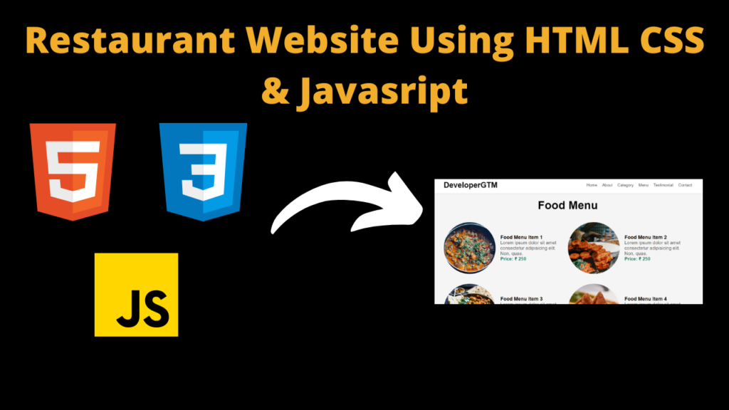
Responsive Restaurant Website Using HTML , CSS & JavaScript With Source Code
Introduction :
The Travel Planner App is a web application designed to help users organize and plan their travels. It provides features such as viewing different types of destinations, browsing through a food menu, reading testimonials from other users, and contacting the service for more information. The app is built using HTML for structure, CSS for styling, and JavaScript for interactivity.
Explanation :
HTML Structure
The HTML structure of the app is organized into various sections, each representing a different part of the web page:
- Navbar: Contains navigation links to different sections of the app.
- Showcase Area: A hero section that introduces the app and provides a call-to-action button.
- Food Section: Displays different categories of food with images and links to learn more about each category.
- Food Menu: Shows a list of food items available on the menu with images, descriptions, and prices.
- Testimonials: Features feedback from customers with star ratings.
- Contact Section: Provides a form for users to contact the service.
CSS Styling
The CSS file contains styles for various elements to enhance the visual appeal and layout of the app:
- Utility Classes: Includes general styles for elements like padding, margins, and font sizes.
- Navbar: Styles for the navigation bar, including positioning, colors, and hover effects.
- Showcase Area: Background image and text styles for the hero section.
- Food and Food Menu: Styles for displaying food categories and menu items, including image containers, hover effects, and text alignment.
- Testimonials: Styles for the testimonial section, including star ratings and customer details.
- Contact Section: Styles for the contact form and image.
JavaScript Logic
The JavaScript logic (although not provided in the initial code snippet) would typically involve:
- Navigation Toggle: Handling the display of the navigation menu on smaller screens using a hamburger icon.
- Form Submission: Capturing and handling the data entered in the contact form.
- Interactivity: Adding dynamic behaviors like hover effects, form validation, and smooth scrolling.
Structure :
The app is structured into distinct sections, each with a clear purpose:
- Header (Navbar): Provides quick access to different sections of the app.
- Main Content: Divided into the showcase area, food categories, food menu, testimonials, and contact form.
- Footer: Contains the footer information.
JavaScript Logic :
JavaScript adds interactivity and dynamic behavior to the travel planner app. The main functionalities covered by the JavaScript logic are:
- Navigation Menu Toggle: Making the navigation menu responsive by toggling its visibility on smaller screens.
- Form Submission Handling: Capturing and processing data from the contact form to provide feedback to the user.
- Smooth Scrolling: Enabling smooth scrolling behavior when users click on navigation links.
Navigation Menu Toggle :
Purpose:
- On smaller screens, the navigation menu should be hidden by default and displayed when a user clicks the hamburger icon.
Logic Explanation:
- Selecting Elements: Identify the hamburger icon and the navigation menu.
- Toggle Function: Define a function that toggles the visibility of the navigation menu.
- Event Listener: Attach a click event listener to the hamburger icon that triggers the toggle function.
Detailed Steps:
- Select the hamburger icon and the navigation menu.
- Define the toggle function: This function adds or removes a CSS class that controls the menu’s visibility.
- Attach the event listener: When the hamburger icon is clicked, the toggle function is executed.
Form Submission Handling :
Purpose:
- Validate the user’s input in the contact form and provide feedback.
Logic Explanation:
- Selecting Elements: Identify the form and input fields.
- Validation Function: Define a function to validate the input data.
- Submit Event Listener: Attach a submit event listener to the form that triggers the validation function.
Detailed Steps:
- Select the form and relevant input fields (e.g., textarea for messages).
- Define the validation function: This function checks if the input data meets the required criteria (e.g., non-empty message).
- Attach the submit event listener: When the form is submitted, the validation function is executed.
- Provide feedback: Based on the validation result, display appropriate messages to the user (e.g., alert messages).
Smooth Scrolling :
Purpose:
- Provide a smooth scrolling effect when users click on navigation links, enhancing user experience.
Logic Explanation:
- Selecting Elements: Identify the navigation links.
- Smooth Scroll Function: Define a function that performs smooth scrolling to the target section.
- Click Event Listener: Attach a click event listener to each navigation link that triggers the smooth scroll function.
Detailed Steps:
- Select all navigation links.
- Define the smooth scroll function: This function scrolls the page to the target section smoothly.
- Attach the click event listener: When a navigation link is clicked, the smooth scroll function is executed.
- Prevent default behavior: Ensure the default link behavior (instant jump) is prevented to allow smooth scrolling.
Conclusion :
JavaScript plays a crucial role in enhancing the travel planner app’s interactivity and user experience. The main functionalities include toggling the navigation menu for responsiveness, handling form submission with validation and feedback, and enabling smooth scrolling for better navigation. Each function and event listener is carefully designed to ensure a seamless and interactive user experience.
HTML (index.html)
Get Discount on Top Educational Courses
<title>Restraunt</title>
<nav class="navbar">
<div class="navbar-container container">
<div class="hamburger-lines">
<span class="line line1"></span>
<span class="line line2"></span>
<span class="line line3"></span>
</div>
<ul class="menu-items">
<li><a href="#home">Home</a></li>
<li><a href="#about">About</a></li>
<li><a href="#food">Category</a></li>
<li><a href="#food-menu">Menu</a></li>
<li><a href="#testimonials">Testimonial</a></li>
<li><a href="#contact">Contact</a></li>
</ul>
<h1 class="logo">DeveloperGTM</h1>
</div>
</nav>
<section class="showcase-area" id="showcase">
<div class="showcase-container">
<h1 class="main-title" id="home">Eat Right Food</h1>
<p>Eat Healty, it is good for our health.</p>
<a href="#food-menu" class="btn btn-primary">Menu</a>
</div>
</section>
<section id="food">
<h2>Types of food</h2>
<div class="food-container container">
<div class="food-type fruite">
<div class="img-container">
<img data-lazyloaded="1" src="data:image/svg+xml;base64,PHN2ZyB4bWxucz0iaHR0cDovL3d3dy53My5vcmcvMjAwMC9zdmciIHdpZHRoPSIxMDY3IiBoZWlnaHQ9IjgwMCIgdmlld0JveD0iMCAwIDEwNjcgODAwIj48cmVjdCB3aWR0aD0iMTAwJSIgaGVpZ2h0PSIxMDAlIiBzdHlsZT0iZmlsbDojY2ZkNGRiO2ZpbGwtb3BhY2l0eTogMC4xOyIvPjwvc3ZnPg==" decoding="async" data-src="https://i.postimg.cc/yxThVPXk/food1.jpg" alt="error" width="1067" height="800" />
<div class="img-content">
<h3>fruite</h3>
<a href="https://en.wikipedia.org/wiki/Fruit" class="btn btn-primary" target="blank" rel="nofollow noopener">learn more</a>
</div>
</div>
</div>
<div class="food-type vegetable">
<div class="img-container">
<img data-lazyloaded="1" src="data:image/svg+xml;base64,PHN2ZyB4bWxucz0iaHR0cDovL3d3dy53My5vcmcvMjAwMC9zdmciIHdpZHRoPSIxMDY3IiBoZWlnaHQ9IjgwMCIgdmlld0JveD0iMCAwIDEwNjcgODAwIj48cmVjdCB3aWR0aD0iMTAwJSIgaGVpZ2h0PSIxMDAlIiBzdHlsZT0iZmlsbDojY2ZkNGRiO2ZpbGwtb3BhY2l0eTogMC4xOyIvPjwvc3ZnPg==" decoding="async" data-src="https://i.postimg.cc/Nffm6Rkk/food2.jpg" alt="error" width="1067" height="800" />
<div class="img-content">
<h3>vegetable</h3>
<a href="https://en.wikipedia.org/wiki/Vegetable" class="btn btn-primary" target="blank" rel="nofollow noopener">learn more</a>
</div>
</div>
</div>
<div class="food-type grin">
<div class="img-container">
<img data-lazyloaded="1" src="data:image/svg+xml;base64,PHN2ZyB4bWxucz0iaHR0cDovL3d3dy53My5vcmcvMjAwMC9zdmciIHdpZHRoPSIxMDY2IiBoZWlnaHQ9IjgwMCIgdmlld0JveD0iMCAwIDEwNjYgODAwIj48cmVjdCB3aWR0aD0iMTAwJSIgaGVpZ2h0PSIxMDAlIiBzdHlsZT0iZmlsbDojY2ZkNGRiO2ZpbGwtb3BhY2l0eTogMC4xOyIvPjwvc3ZnPg==" decoding="async" data-src="https://i.postimg.cc/76ZwsPsd/food3.jpg" alt="error" width="1066" height="800" />
<div class="img-content">
<h3>grin</h3>
<a href="https://en.wikipedia.org/wiki/Grain" class="btn btn-primary" target="blank" rel="nofollow noopener">learn more</a>
</div>
</div>
</div>
</div>
</section>
<section id="food-menu">
<h2 class="food-menu-heading">Food Menu</h2>
<div class="food-menu-container container">
<div class="food-menu-item">
<div class="food-img">
<img data-lazyloaded="1" src="data:image/svg+xml;base64,PHN2ZyB4bWxucz0iaHR0cDovL3d3dy53My5vcmcvMjAwMC9zdmciIHdpZHRoPSI1MDAiIGhlaWdodD0iNjY3IiB2aWV3Qm94PSIwIDAgNTAwIDY2NyI+PHJlY3Qgd2lkdGg9IjEwMCUiIGhlaWdodD0iMTAwJSIgc3R5bGU9ImZpbGw6I2NmZDRkYjtmaWxsLW9wYWNpdHk6IDAuMTsiLz48L3N2Zz4=" decoding="async" data-src="https://images.unsplash.com/photo-1596797038530-2c107229654b?w=500&auto=format&fit=crop&q=60&ixlib=rb-4.0.3&ixid=M3wxMjA3fDB8MHxzZWFyY2h8Nnx8aW5kaWFuJTIwZm9vZHxlbnwwfHwwfHx8MA%3D%3D" alt="" width="500" height="667" />
</div>
<div class="food-description">
<h2 class="food-titile">Food Menu Item 1</h2>
<p>
Lorem ipsum dolor sit amet consectetur adipisicing elit. Non,
quae.
</p>
<p class="food-price">Price: ₹ 250</p>
</div>
</div>
<div class="food-menu-item">
<div class="food-img">
<img data-lazyloaded="1" src="data:image/svg+xml;base64,PHN2ZyB4bWxucz0iaHR0cDovL3d3dy53My5vcmcvMjAwMC9zdmciIHdpZHRoPSI1MDAiIGhlaWdodD0iNzUwIiB2aWV3Qm94PSIwIDAgNTAwIDc1MCI+PHJlY3Qgd2lkdGg9IjEwMCUiIGhlaWdodD0iMTAwJSIgc3R5bGU9ImZpbGw6I2NmZDRkYjtmaWxsLW9wYWNpdHk6IDAuMTsiLz48L3N2Zz4=" decoding="async" data-src="https://plus.unsplash.com/premium_photo-1691030658788-41d188eabb64?w=500&auto=format&fit=crop&q=60&ixlib=rb-4.0.3&ixid=M3wxMjA3fDB8MHxzZWFyY2h8NXx8aW5kaWFuJTIwZm9vZHxlbnwwfHwwfHx8MA%3D%3D" alt="error" width="500" height="750" />
</div>
<div class="food-description">
<h2 class="food-titile">Food Menu Item 2</h2>
<p>
Lorem ipsum dolor sit amet consectetur adipisicing elit. Non,
quae.
</p>
<p class="food-price">Price: ₹ 250</p>
</div>
</div>
<div class="food-menu-item">
<div class="food-img">
<img data-lazyloaded="1" src="data:image/svg+xml;base64,PHN2ZyB4bWxucz0iaHR0cDovL3d3dy53My5vcmcvMjAwMC9zdmciIHdpZHRoPSI1MDAiIGhlaWdodD0iNzI2IiB2aWV3Qm94PSIwIDAgNTAwIDcyNiI+PHJlY3Qgd2lkdGg9IjEwMCUiIGhlaWdodD0iMTAwJSIgc3R5bGU9ImZpbGw6I2NmZDRkYjtmaWxsLW9wYWNpdHk6IDAuMTsiLz48L3N2Zz4=" decoding="async" data-src="https://images.unsplash.com/photo-1505253758473-96b7015fcd40?w=500&auto=format&fit=crop&q=60&ixlib=rb-4.0.3&ixid=M3wxMjA3fDB8MHxzZWFyY2h8NHx8aW5kaWFuJTIwZm9vZHxlbnwwfHwwfHx8MA%3D%3D" alt="" width="500" height="726" />
</div>
<div class="food-description">
<h2 class="food-titile">Food Menu Item 3</h2>
<p>
Lorem ipsum dolor sit amet consectetur adipisicing elit. Non,
quae.
</p>
<p class="food-price">Price: ₹ 250</p>
</div>
</div>
<div class="food-menu-item">
<div class="food-img">
<img data-lazyloaded="1" src="data:image/svg+xml;base64,PHN2ZyB4bWxucz0iaHR0cDovL3d3dy53My5vcmcvMjAwMC9zdmciIHdpZHRoPSI1MDAiIGhlaWdodD0iMzMzIiB2aWV3Qm94PSIwIDAgNTAwIDMzMyI+PHJlY3Qgd2lkdGg9IjEwMCUiIGhlaWdodD0iMTAwJSIgc3R5bGU9ImZpbGw6I2NmZDRkYjtmaWxsLW9wYWNpdHk6IDAuMTsiLz48L3N2Zz4=" decoding="async" data-src="https://images.unsplash.com/photo-1601050690597-df0568f70950?w=500&auto=format&fit=crop&q=60&ixlib=rb-4.0.3&ixid=M3wxMjA3fDB8MHxzZWFyY2h8MTF8fGluZGlhbiUyMGZvb2R8ZW58MHx8MHx8fDA%3D" alt="" width="500" height="333" />
</div>
<div class="food-description">
<h2 class="food-titile">Food Menu Item 4</h2>
<p>
Lorem ipsum dolor sit amet consectetur adipisicing elit. Non,
quae.
</p>
<p class="food-price">Price: ₹ 250</p>
</div>
</div>
<div class="food-menu-item">
<div class="food-img">
<img data-lazyloaded="1" src="data:image/svg+xml;base64,PHN2ZyB4bWxucz0iaHR0cDovL3d3dy53My5vcmcvMjAwMC9zdmciIHdpZHRoPSI1MDAiIGhlaWdodD0iNDAyIiB2aWV3Qm94PSIwIDAgNTAwIDQwMiI+PHJlY3Qgd2lkdGg9IjEwMCUiIGhlaWdodD0iMTAwJSIgc3R5bGU9ImZpbGw6I2NmZDRkYjtmaWxsLW9wYWNpdHk6IDAuMTsiLz48L3N2Zz4=" decoding="async" data-src="https://images.unsplash.com/photo-1606491956689-2ea866880c84?w=500&auto=format&fit=crop&q=60&ixlib=rb-4.0.3&ixid=M3wxMjA3fDB8MHxzZWFyY2h8MTV8fGluZGlhbiUyMGZvb2R8ZW58MHx8MHx8fDA%3D" alt="" width="500" height="402" />
</div>
<div class="food-description">
<h2 class="food-titile">Food Menu Item 5</h2>
<p>
Lorem ipsum dolor sit amet consectetur adipisicing elit. Non,
quae.
</p>
<p class="food-price">Price: ₹ 250</p>
</div>
</div>
<div class="food-menu-item">
<div class="food-img">
<img data-lazyloaded="1" src="data:image/svg+xml;base64,PHN2ZyB4bWxucz0iaHR0cDovL3d3dy53My5vcmcvMjAwMC9zdmciIHdpZHRoPSI1MDAiIGhlaWdodD0iNzUwIiB2aWV3Qm94PSIwIDAgNTAwIDc1MCI+PHJlY3Qgd2lkdGg9IjEwMCUiIGhlaWdodD0iMTAwJSIgc3R5bGU9ImZpbGw6I2NmZDRkYjtmaWxsLW9wYWNpdHk6IDAuMTsiLz48L3N2Zz4=" decoding="async" data-src="https://plus.unsplash.com/premium_photo-1691030658159-e8e29b2b12b9?w=500&auto=format&fit=crop&q=60&ixlib=rb-4.0.3&ixid=M3wxMjA3fDB8MHxzZWFyY2h8MTd8fGluZGlhbiUyMGZvb2R8ZW58MHx8MHx8fDA%3D" alt="" width="500" height="750" />
</div>
<div class="food-description">
<h2 class="food-titile">Food Menu Item 6</h2>
<p>
Lorem ipsum dolor sit amet consectetur adipisicing elit. Non,
quae.
</p>
<p class="food-price">Price: ₹ 250</p>
</div>
</div>
</div>
</section>
<section id="testimonials">
<h2 class="testimonial-title">What Our Customers Say</h2>
<div class="testimonial-container container">
<div class="testimonial-box">
<div class="customer-detail">
<div class="customer-photo">
<img data-lazyloaded="1" src="data:image/svg+xml;base64,PHN2ZyB4bWxucz0iaHR0cDovL3d3dy53My5vcmcvMjAwMC9zdmciIHdpZHRoPSI1MzQiIGhlaWdodD0iODAwIiB2aWV3Qm94PSIwIDAgNTM0IDgwMCI+PHJlY3Qgd2lkdGg9IjEwMCUiIGhlaWdodD0iMTAwJSIgc3R5bGU9ImZpbGw6I2NmZDRkYjtmaWxsLW9wYWNpdHk6IDAuMTsiLz48L3N2Zz4=" decoding="async" data-src="https://i.postimg.cc/5Nrw360Y/male-photo1.jpg" alt="" width="534" height="800" />
<p class="customer-name">Ross Lee</p>
</div>
</div>
<div class="star-rating">
<span class="fa fa-star checked"></span>
<span class="fa fa-star checked"></span>
<span class="fa fa-star checked"></span>
<span class="fa fa-star checked"></span>
<span class="fa fa-star checked"></span>
</div>
<p class="testimonial-text">
Lorem ipsum dolor sit amet consectetur, adipisicing elit. Impedit
voluptas cupiditate aspernatur odit doloribus non.
</p>
</div>
<div class="testimonial-box">
<div class="customer-detail">
<div class="customer-photo">
<img data-lazyloaded="1" src="data:image/svg+xml;base64,PHN2ZyB4bWxucz0iaHR0cDovL3d3dy53My5vcmcvMjAwMC9zdmciIHdpZHRoPSIxMjAwIiBoZWlnaHQ9IjgwMCIgdmlld0JveD0iMCAwIDEyMDAgODAwIj48cmVjdCB3aWR0aD0iMTAwJSIgaGVpZ2h0PSIxMDAlIiBzdHlsZT0iZmlsbDojY2ZkNGRiO2ZpbGwtb3BhY2l0eTogMC4xOyIvPjwvc3ZnPg==" decoding="async" data-src="https://i.postimg.cc/sxd2xCD2/female-photo1.jpg" alt="" width="1200" height="800" />
<p class="customer-name">Amelia Watson</p>
</div>
</div>
<div class="star-rating">
<span class="fa fa-star checked"></span>
<span class="fa fa-star checked"></span>
<span class="fa fa-star checked"></span>
<span class="fa fa-star checked"></span>
<span class="fa fa-star checked"></span>
</div>
<p class="testimonial-text">
Lorem ipsum dolor sit amet consectetur, adipisicing elit. Impedit
voluptas cupiditate aspernatur odit doloribus non.
</p>
</div>
<div class="testimonial-box">
<div class="customer-detail">
<div class="customer-photo">
<img data-lazyloaded="1" src="data:image/svg+xml;base64,PHN2ZyB4bWxucz0iaHR0cDovL3d3dy53My5vcmcvMjAwMC9zdmciIHdpZHRoPSI2NDAiIGhlaWdodD0iNjQwIiB2aWV3Qm94PSIwIDAgNjQwIDY0MCI+PHJlY3Qgd2lkdGg9IjEwMCUiIGhlaWdodD0iMTAwJSIgc3R5bGU9ImZpbGw6I2NmZDRkYjtmaWxsLW9wYWNpdHk6IDAuMTsiLz48L3N2Zz4=" decoding="async" data-src="https://i.postimg.cc/fy90qvkV/male-photo3.jpg" alt="" width="640" height="640" />
<p class="customer-name">Ben Roy</p>
</div>
</div>
<div class="star-rating">
<span class="fa fa-star checked"></span>
<span class="fa fa-star checked"></span>
<span class="fa fa-star checked"></span>
<span class="fa fa-star checked"></span>
<span class="fa fa-star checked"></span>
</div>
<p class="testimonial-text">
Lorem ipsum dolor sit amet consectetur, adipisicing elit. Impedit
voluptas cupiditate aspernatur odit doloribus non.
</p>
</div>
</div>
</section>
<section id="contact">
<div class="contact-container container">
<div class="contact-img">
<img data-lazyloaded="1" src="data:image/svg+xml;base64,PHN2ZyB4bWxucz0iaHR0cDovL3d3dy53My5vcmcvMjAwMC9zdmciIHdpZHRoPSI1MDAiIGhlaWdodD0iMzM0IiB2aWV3Qm94PSIwIDAgNTAwIDMzNCI+PHJlY3Qgd2lkdGg9IjEwMCUiIGhlaWdodD0iMTAwJSIgc3R5bGU9ImZpbGw6I2NmZDRkYjtmaWxsLW9wYWNpdHk6IDAuMTsiLz48L3N2Zz4=" decoding="async" data-src="https://plus.unsplash.com/premium_photo-1661772253149-48ec033cf4b7?w=500&auto=format&fit=crop&q=60&ixlib=rb-4.0.3&ixid=M3wxMjA3fDB8MHxzZWFyY2h8MTd8fGluZGlhbiUyMGZvb2QlMjBnaXJsc3xlbnwwfHwwfHx8MA%3D%3D" alt="" width="500" height="334" />
</div>
<div class="form-container">
<h2>Contact Us</h2>
<textarea cols="30" rows="6"></textarea>
<a href="#" class="btn btn-primary">Submit</a>
</div>
</div>
</section>
<footer id="footer">
<h2>Restraunt © all rights reserved</h2>
</footer>
CSS (Style.css)
					*,
*::after,
*::before {
    box-sizing: border-box;
    padding: 0;
    margin: 0;
}

.html {
    font-size: 62.5%;
}

body {
    font-family: Arial, Helvetica, sans-serif;
}

/* ///////////..utility classes../////////// */

.container {
    max-width: 1200px;
    width: 90%;
    margin: auto;
}

#showcase{
    height: 500px;
}

.btn {
    display: inline-block;
    padding: 0.5em 1.5em;
    text-decoration: none;
    border-radius: 50px;
    cursor: pointer;
    outline: none;
    margin-top: 1em;
    text-transform: uppercase;
    font-weight: small;
}

.btn-primary {
    color: #fff;
    background: black;
}

.btn-primary:hover {
    background: #117964;
    transition: background 0.3s ease-in-out;
}

/* ............/navbar/............ *

/* desktop mode............/// */

.navbar input[type="checkbox"],
.navbar .hamburger-lines {
    display: none;
}

.navbar {
    box-shadow: 37px -42px 10px 37px #aaa;
    ;
    position: fixed;
    width: 100%;
    background: #fff;
    color: #000;
    height: 70px;
    display: flex;
    align-items: center;
    z-index: 12;
}

.navbar-container {
    display: flex;
    justify-content: space-between;
    height: 64px;
    align-items: center;
}

.menu-items {
    order: 2;
    display: flex;
}

.menu-items li {
    list-style: none;
    margin-left: 1.5rem;
    margin-bottom: 0.5rem;
    font-size: 1.2rem;
}

.menu-items a {
    text-decoration: none;
    color: #444;
    font-weight: 500;
    transition: color 0.3s ease-in-out;
}

.menu-items a:hover {
    color: #117964;
    transition: color 0.3s ease-in-out;
}

.logo {
    order: 1;
    font-size: 2.3rem;
    margin-bottom: 0.5rem;
}

/* ............//// Showcase styling ////......... */

.showcase-area {
    height: 50vh;
    background: linear-gradient(rgba(240, 240, 240, 0.144),
            rgba(255, 255, 255, 0.336)),
        url("https://images.unsplash.com/photo-1499028344343-cd173ffc68a9?w=500&auto=format&fit=crop&q=60&ixlib=rb-4.0.3&ixid=M3wxMjA3fDB8MHxleHBsb3JlLWZlZWR8MTV8fHxlbnwwfHx8fHw%3D");
        background-position: center;
    background-size: cover;
    background-position: center;
    background-repeat: no-repeat;
}

.showcase-container {
    display: flex;
    flex-direction: column;
    align-items: center;
    justify-content: center;
    height: 100%;
    font-size: 1.6rem;
    row-gap: 20px;
}

.main-title {
    text-transform: uppercase;
    margin-top: 1.5em;
    font-size: 4rem;
    color: chocolate;
}

.showcase-container p{
    color: white;
}

/* ......//about us//...... */

#about {
    padding: 50px 0;
    background: #f5f5f7;
}

.about-wrapper {
    display: flex;
    flex-wrap: wrap;
}

#about h2 {
    font-size: 2.3rem;
}

#about p {
    font-size: 1.2rem;
    color: #555;
}

#about .small {
    font-size: 1.2rem;
    color: #666;
    font-weight: 600;
}

.about-img {
    flex: 1 1 400px;
    padding: 30px;
    transform: translateX(150%);
    animation: about-img-animation 1s ease-in-out forwards;
}

@keyframes about-img-animation {
    100% {
        transform: translate(0);
    }
}

.about-text {
    flex: 1 1 400px;
    padding: 30px;
    margin: auto;
    transform: translate(-150%);
    animation: about-text-animation 1s ease-in-out forwards;
    display: flex;
    flex-direction: column;
    row-gap: 20px;
    text-align: justify;
}

@keyframes about-text-animation {
    100% {
        transform: translate(0);
    }
}

.about-img img {
    display: block;
    height: 400px;
    margin: auto;
    object-fit: cover;
    object-position: right;
    width: 400px;
    border-radius: 50%;
}

/* ..........////Food category///........... */

#food-menu{
    background-color: whitesmoke;
    padding-top: 30px;
}

#food {
    padding: 5rem 0 10rem 0;
}

#food h2 {
    text-align: center;
    font-size: 2.5rem;
    font-weight: 400;
    margin-bottom: 40px;
    text-transform: uppercase;
    color: black;
    font-weight: 700;
}

.food-container {
    display: flex;
    justify-content: space-between;
}

.food-container img {
    display: block;
    width: 100%;
    margin: auto;
    max-height: 300px;
    object-fit: cover;
    border-radius: 10px;
    object-position: center;
}

.img-container {
    margin: 0 1rem;
    position: relative;
}

.img-content {
    position: absolute;
    top: 70%;
    left: 50%;
    transform: translate(-50%, -50%);
    opacity: 0;
    z-index: 2;
    text-align: center;
    transition: all 0.3s ease-in-out 0.1s;
}

.img-content h3 {
    color: #fff;
    font-size: 2.2rem;
}

.img-content a {
    font-size: 1.2rem;
}

.img-container::after {
    content: "";
    display: block;
    position: absolute;
    top: 0;
    left: 0;
    width: 100%;
    height: 100%;
    background: rgba(0, 0, 0, 0.871);
    opacity: 0;
    z-index: 1;

    transform: scaleY(0);
    transform-origin: 100% 100%;
    transition: all 0.3s ease-in-out;
}

.img-container:hover::after {
    opacity: 1;
    transform: scaleY(1);
}

.img-container:hover .img-content {
    opacity: 1;
    top: 40%;
}

/* .........../Food Menu/............ */

.food-menu-heading {
    text-align: center;
    font-size: 3.4rem;
    color: black;
    font-weight: 700;
}

.food-menu-container {
    display: flex;
    flex-wrap: wrap;
    padding: 50px 0px 30px 0px;
}

.food-menu-container img {
    display: block;
    width: 250px;
    height: 250px;
    border-radius: 50%;
    object-fit: cover;
    object-position: center;
}

.food-menu-item {
    display: flex;
    flex: 1 1 600px;
    justify-content: space-evenly;
    margin-bottom: 3rem;
}

.food-description {
    margin: auto 1.5rem;
}

.font-title {
    font-size: 1.8rem;
    font-weight: 400;
    color: #444;
}

.food-description p {
    font-size: 1.4rem;
    color: #555;
    font-weight: 500;
}

.food-description .food-price {
    color: #117964;
    font-weight: 700;
}

/* ........./ Testimonial /.......... */

#testimonials {
    padding: 5rem 0;
    background-color: white;
}

.testimonial-title {
    text-align: center;
    font-size: 2.8rem;
    color: black;
    font-weight: 700;
}

.testimonial-container {
    display: flex;
    justify-content: space-between;
    margin-top: 30px;
    column-gap: 20px;
}

.testimonial-box .checked {
    color: #ff9529;
}

.testimonial-box .testimonial-text {
    margin: 1rem 0;
    color: #444;
}

.testimonial-box {
    text-align: center;
    padding: 20px;
    background-color: white;
    border-radius: 10px;
    display: flex;
    flex-direction: column;
    row-gap: 10px;
    box-shadow: rgba(149, 157, 165, 0.2) 0px 8px 24px;
}

.customer-photo img {
    display: block;
    width: 150px;
    height: 150px;
    object-fit: cover;
    object-position: center;
    border-radius: 50%;
    margin: auto;
}

.customer-photo p {
    padding-top: 20px;
}

/* ........ Contact Us........... */

#contact {
    padding: 5rem 0;
    background: rgb(226, 226, 226);
}

.contact-container {
    display: flex;
    background: #fff;
    border-radius: 10px;
    padding: 20px;
}

.contact-img {
    width: 50%;
}

.contact-img img {
    display: block;
    height: 420px;
    border-top-left-radius: 10px;
    border-bottom-left-radius: 10px;
    width: 100%;
    object-position: center;
    object-fit: cover;
}

.form-container {
    padding: 1rem;
    width: 50%;
    margin: auto;
}

.form-container input {
    display: block;
    width: 100%;
    padding: 1rem 0;
    box-shadow: none;
    outline: none;
    margin-bottom: 1rem;
    color: #444;
    font-weight: 500;
    background: whitesmoke;
    padding-left: 20px;
    border: 1px solid;
    border-radius: 10px;
}

.form-container textarea {
    display: block;
    width: 100%;
    border: none;
    display: block;
    width: 100%;
    padding: 1rem 0;
    box-shadow: none;
    outline: none;
    margin-bottom: 1rem;
    color: #444;
    font-weight: 500;
    background: whitesmoke;
    padding-left: 20px;
    border: 1px solid;
    border-radius: 10px;
    color: #444;
    outline: none;
    resize: none;
}

.form-container h2 {
    font-size: 2.7rem;
    color: black;
    font-weight: 700;
    margin-bottom: 1rem;
    margin-top: -1.2rem;
}

.form-container a {
    font-size: 1.3rem;
}

#footer h2 {
    text-align: center;
    font-size: 1.8rem;
    padding: 0.6rem;
    font-weight: 500;
    color: black;
    background: white;
}

/* ......../ media query /.......... */

@media (max-width: 768px) {
    .navbar {
        opacity: 0.95;
    }

    .navbar-container input[type="checkbox"],
    .navbar-container .hamburger-lines {
        display: block;
    }

    .navbar-container {
        display: block;
        position: relative;
        height: 64px;
    }

    .navbar-container input[type="checkbox"] {
        position: absolute;
        display: block;
        height: 32px;
        width: 30px;
        top: 20px;
        left: 20px;
        z-index: 5;
        opacity: 0;
    }

    .navbar-container .hamburger-lines {
        display: block;
        height: 23px;
        width: 35px;
        position: absolute;
        top: 17px;
        left: 20px;
        z-index: 2;
        display: flex;
        flex-direction: column;
        justify-content: space-between;
    }

    .navbar-container .hamburger-lines .line {
        display: block;
        height: 4px;
        width: 100%;
        border-radius: 10px;
        background: #333;
    }

    .navbar-container .hamburger-lines .line1 {
        transform-origin: 0% 0%;
        transition: transform 0.4s ease-in-out;
    }

    .navbar-container .hamburger-lines .line2 {
        transition: transform 0.2s ease-in-out;
    }

    .navbar-container .hamburger-lines .line3 {
        transform-origin: 0% 100%;
        transition: transform 0.4s ease-in-out;
    }

    .navbar .menu-items {
        padding-top: 100px;
        background: #fff;
        height: 100vh;
        max-width: 300px;
        transform: translate(-150%);
        display: flex;
        flex-direction: column;
        margin-left: -40px;
        padding-left: 50px;
        transition: transform 0.5s ease-in-out;
        box-shadow: 5px 0px 10px 0px #aaa;
    }

    .navbar .menu-items li {
        margin-bottom: 1.5rem;
        font-size: 1.3rem;
        font-weight: 500;
    }

    .logo {
        position: absolute;
        top: 5px;
        right: 15px;
        font-size: 2rem;
    }

    .navbar-container input[type="checkbox"]:checked~.menu-items {
        transform: translateX(0);
    }

    .navbar-container input[type="checkbox"]:checked~.hamburger-lines .line1 {
        transform: rotate(35deg);
    }

    .navbar-container input[type="checkbox"]:checked~.hamburger-lines .line2 {
        transform: scaleY(0);
    }

    .navbar-container input[type="checkbox"]:checked~.hamburger-lines .line3 {
        transform: rotate(-35deg);
    }

    /* ......./ food /......... */

    .food-container {
        flex-direction: column;
        align-items: stretch;
    }

    .food-type:not(:last-child) {
        margin-bottom: 3rem;
    }

    .food-type {
        box-shadow: 5px 5px 10px 0 #aaa;
    }

    .img-container {
        margin: 0;
    }
}

@media (max-width: 500px) {
    html {
        font-size: 65%;
    }

    .navbar .menu-items li {
        font-size: 1.6rem;
    }

    .testimonial-container {
        flex-direction: column;
        text-align: center;
    }

    .food-menu-container img {
        margin: auto;
    }

    .food-menu-item {
        flex-direction: column;
        text-align: center;
    }

    .form-container {
        width: 90%;
    }

    .contact-container {
        display: flex;
        flex-direction: column;
    }

    .contact-img {
        width: 90%;
        margin: 3rem auto;
    }

    .logo {
        position: absolute;
        top: 06px;
        right: 15px;
        font-size: 3rem;
    }

    .navbar .menu-items li {
        margin-bottom: 2.5rem;
        font-size: 1.8rem;
        font-weight: 500;
    }
}

@media (min-width: 769px) and (max-width: 1200px) {
    .img-container h3 {
        font-size: 1.5rem;
    }

    .img-container .btn {
        font-size: 0.7rem;
    }
}

@media (orientation: landscape) and (max-height: 500px) {
    .showcase-area {
        height: 50vmax;
    }
}
Javascript (Script.js)
					$(document).ready(function () {
    $(window).scroll(function () {
      if ($(this).scrollTop() > 50) {
        $("header").addClass("sticky");
      } else {
        $("header").removeClass("sticky");
      }
    });

    function newDate() {
      return new Date().getFullYear();
    }
    document.onload = document.getElementById("autodate").innerHTML = +newDate();
  });
Top 5 Data Science Courses to Build a Strong Career in 2026 Data science is no longer limited to tech companies. Banks …
Free Things You Get With Your College ID 🎓 Free / Discounted Platforms with College ID Platform What You Get (Student Benefits) …
25 Best Free Great Learning Courses for CSE Students (With Certificates) – Start Learning Today! If you’re a CSE student, engineering fresher, …

Why Target Test Prep Is the Best GMAT/GRE Prep Platform in 2025? Preparing for the GMAT or GRE has changed drastically in …
Get Huge Discounts

More Python Projects