
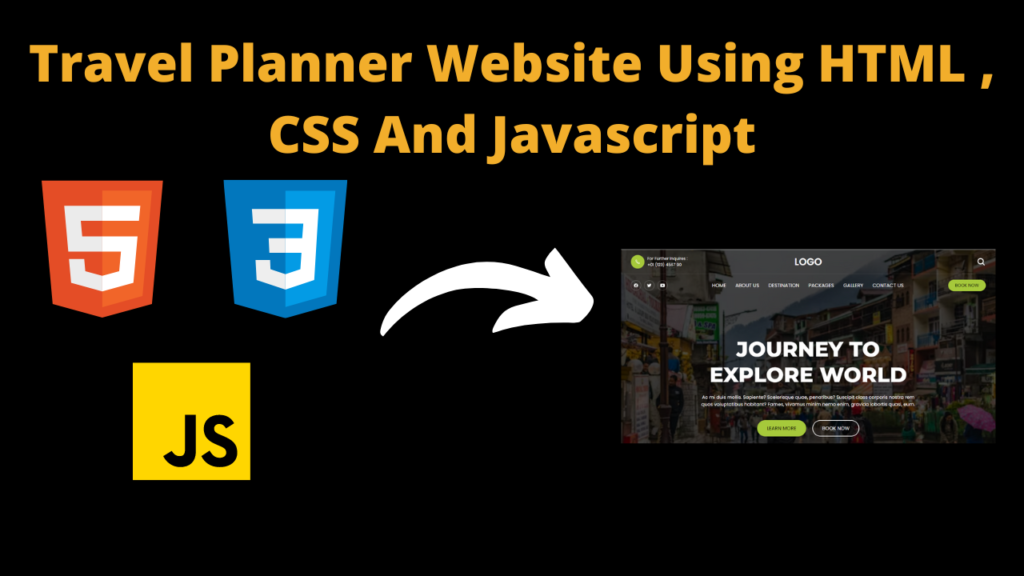
Travel Planner Website Using HTML , CSS And JavaScript With Source Code
Introduction
Hello friends, welcome to all of you developer friends, in this new blog post today we have created a very wonderful project for you which is very good and this project is related to travel. Let me tell you that this project is a travel planner website which If any user wants to travel then he can book the travel as per his time.
The special feature of this travel planner website is that it is completely responsive. This website can be used on all devices. Friends, we have designed this website very well which is very good in appearance and working. In this website, we have We have added many things so that the user can get all the features like we have created a section in this website to book a vehicle for traveling and along with that we have selected the place where the user wants to visit. You can also book, and the important thing is that we have also added a contact section in it, so that if the user has any problem, then the user can directly contact us so that the user can solve any problem. and the user feels comfortable using our website.
Friends, we have added a photo section of some good places to visit in this website, in which we have also added the option of rating so that the user can see which place is the best to visit. Friends, we have created this website. We have prepared the structure of this website with HTML, then we have used css to make the design look good i.e. color or font should appear properly and at the same time we have also used JavaScript so that there is no problem in creating a responsive website. If you want to use this website then you will have to keep some things in mind which you will find step by step below.
Steps to Create Traval Planner Website:-
Friends, if we want to use the code of this website, then we will have to first understand what happens with which code and which file, so let us know.
Friends, first of all, to create this website, we have to prepare its structure, but to tear the structure, we will need HTML file. HTML file is needed because to create the structure of any website, we have used HTML. If you have to write code in a code, then to prepare the structure, you have to first create a folder, then open that folder in your code editor, which you can name as per your choice, then you have to go to that folder. A file has to be created by the name of index.html. If you have created the file then you will find the code highlighted below by the name of index.html, the code which you have to upload in your file. As soon as you upload the code in the file, you will get the website structure ready.
Friends, now if you have created the structure of the website, then now you will need CSS to make the structure of this website beautiful, without this you cannot make your website look good, so first of all you need to save the CSS file. You will have to create a file which you will name as style.css but if you do not know what is done by css file then let me tell you that with this you can make your website look good then design it well. You can do things like what should be the color, what should be the size of the font so that the user likes it, in this way you can do all the work with the help of CSS, then to use the code, you have to add the code named style.css below. You will get that code, you have to upload it in this file, then as soon as you view your website, your website will now look much better than before.
Now it comes to the most important code of this website, this code is of JavaScript, in which if you make any mistake then your code will not work. We have used some codes in the JavaScript code like if a user accesses the website on mobile. When you open it, you will see a hamburger, on clicking which you will be able to use whatever button we have added inside the header. You cannot use it without JavaScript, so to use it you have to Below you will find the code of script.js, you will have to upload it in your file, for which you have to create a file named script.js in your folder in which you have to put the code of the script, then you After moving the buttons will start working
HTML (index.html)
Get Discount on Top Educational Courses
<title>travel planner</title>
<header class="header" data-header>
<div class="overlay" data-overlay></div>
<div class="header-top">
<div class="container">
<a href="tel:+01123456790" class="helpline-box">
<div class="icon-box">
</div>
<div class="wrapper">
<p class="helpline-title">For Further Inquires :</p>
<p class="helpline-number">+01 (123) 4567 90</p>
</div>
</a>
<a href="#" class="logo">
Logo
</a>
<div class="header-btn-group">
<button class="search-btn" aria-label="Search">
</button>
<button class="nav-open-btn" aria-label="Open Menu" data-nav-open-btn>
</button>
</div>
</div>
</div>
<div class="header-bottom">
<div class="container">
<ul class="social-list">
<li>
<a href="#" class="social-link">
</a>
</li>
<li>
<a href="#" class="social-link">
</a>
</li>
<li>
<a href="#" class="social-link">
</a>
</li>
</ul>
<nav class="navbar" data-navbar>
<div class="navbar-top">
<a href="#" class="logo">
<img data-lazyloaded="1" src="data:image/gif;base64,R0lGODdhAQABAPAAAMPDwwAAACwAAAAAAQABAAACAkQBADs=" decoding="async" data-src="./assets/images/logo-blue.svg" alt="Tourly logo">
</a>
<button class="nav-close-btn" aria-label="Close Menu" data-nav-close-btn>
</button>
</div>
<ul class="navbar-list">
<li>
<a href="#home" class="navbar-link" data-nav-link>home</a>
</li>
<li>
<a href="#" class="navbar-link" data-nav-link>about us</a>
</li>
<li>
<a href="#destination" class="navbar-link" data-nav-link>destination</a>
</li>
<li>
<a href="#package" class="navbar-link" data-nav-link>packages</a>
</li>
<li>
<a href="#gallery" class="navbar-link" data-nav-link>gallery</a>
</li>
<li>
<a href="#contact" class="navbar-link" data-nav-link>contact us</a>
</li>
</ul>
</nav>
<button class="btn btn-primary">Book Now</button>
</div>
</div>
</header>
<main>
<article>
<section class="hero" id="home">
<div class="container">
<h2 class="h1 hero-title">Journey to explore world</h2>
<p class="hero-text">
Ac mi duis mollis. Sapiente? Scelerisque quae, penatibus? Suscipit class corporis nostra rem quos
voluptatibus habitant?
Fames, vivamus minim nemo enim, gravida lobortis quasi, eum.
</p>
<div class="btn-group">
<button class="btn btn-primary">Learn more</button>
<button class="btn btn-secondary">Book now</button>
</div>
</div>
</section>
<section class="tour-search">
<div class="container">
<div class="input-wrapper">
<label for="destination" class="input-label">Search Destination*</label>
</div>
<div class="input-wrapper">
<label for="people" class="input-label">Pax Number*</label>
</div>
<div class="input-wrapper">
<label for="checkin" class="input-label">Checkin Date**</label>
</div>
<div class="input-wrapper">
<label for="checkout" class="input-label">Checkout Date*</label>
</div>
<button type="submit" class="btn btn-secondary">Inquire now</button>
</div>
</section>
<section class="popular" id="destination">
<div class="container">
<p class="section-subtitle">Uncover place</p>
<h2 class="h2 section-title">Popular destination</h2>
<p class="section-text">
Fusce hic augue velit wisi quibusdam pariatur, iusto primis, nec nemo, rutrum. Vestibulum cumque laudantium.
Sit ornare
mollitia tenetur, aptent.
</p>
<ul class="popular-list">
<li>
<div class="popular-card">
<figure class="card-img">
<img data-lazyloaded="1" src="data:image/gif;base64,R0lGODdhAQABAPAAAMPDwwAAACwAAAAAAQABAAACAkQBADs=" decoding="async" data-src="./assets/images/popular-1.jpg" alt="San miguel, italy" loading="lazy">
</figure>
<div class="card-content">
<div class="card-rating">
</div>
<p class="card-subtitle">
<a href="#">Italy</a>
</p>
<h3 class="h3 card-title">
<a href="#">San miguel</a>
</h3>
<p class="card-text">
Fusce hic augue velit wisi ips quibusdam pariatur, iusto.
</p>
</div>
</div>
</li>
<li>
<div class="popular-card">
<figure class="card-img">
<img data-lazyloaded="1" src="data:image/gif;base64,R0lGODdhAQABAPAAAMPDwwAAACwAAAAAAQABAAACAkQBADs=" decoding="async" data-src="./assets/images/popular-2.jpg" alt="Burj khalifa, dubai" loading="lazy">
</figure>
<div class="card-content">
<div class="card-rating">
</div>
<p class="card-subtitle">
<a href="#">Dubai</a>
</p>
<h3 class="h3 card-title">
<a href="#">Burj khalifa</a>
</h3>
<p class="card-text">
Fusce hic augue velit wisi ips quibusdam pariatur, iusto.
</p>
</div>
</div>
</li>
<li>
<div class="popular-card">
<figure class="card-img">
<img data-lazyloaded="1" src="data:image/gif;base64,R0lGODdhAQABAPAAAMPDwwAAACwAAAAAAQABAAACAkQBADs=" decoding="async" data-src="./assets/images/popular-3.jpg" alt="Kyoto temple, japan" loading="lazy">
</figure>
<div class="card-content">
<div class="card-rating">
</div>
<p class="card-subtitle">
<a href="#">Japan</a>
</p>
<h3 class="h3 card-title">
<a href="#">Kyoto temple</a>
</h3>
<p class="card-text">
Fusce hic augue velit wisi ips quibusdam pariatur, iusto.
</p>
</div>
</div>
</li>
</ul>
<button class="btn btn-primary">More destintion</button>
</div>
</section>
<section class="package" id="package">
<div class="container">
<p class="section-subtitle">Popular Packeges</p>
<h2 class="h2 section-title">Checkout Our Packeges</h2>
<p class="section-text">
Fusce hic augue velit wisi quibusdam pariatur, iusto primis, nec nemo, rutrum. Vestibulum cumque laudantium.
Sit ornare
mollitia tenetur, aptent.
</p>
<ul class="package-list">
<li>
<div class="package-card">
<figure class="card-banner">
<img data-lazyloaded="1" src="data:image/gif;base64,R0lGODdhAQABAPAAAMPDwwAAACwAAAAAAQABAAACAkQBADs=" decoding="async" data-src="./assets/images/packege-1.jpg" alt="Experience The Great Holiday On Beach" loading="lazy">
</figure>
<div class="card-content">
<h3 class="h3 card-title">Experience The Great Holiday On Beach</h3>
<p class="card-text">
Laoreet, voluptatum nihil dolor esse quaerat mattis explicabo maiores, est aliquet porttitor! Eaque,
cras, aspernatur.
</p>
<ul class="card-meta-list">
<li class="card-meta-item">
<div class="meta-box">
<p class="text">7D/6N</p>
</div>
</li>
<li class="card-meta-item">
<div class="meta-box">
<p class="text">pax: 10</p>
</div>
</li>
<li class="card-meta-item">
<div class="meta-box">
<p class="text">Malaysia</p>
</div>
</li>
</ul>
</div>
<div class="card-price">
<div class="wrapper">
<p class="reviews">(25 reviews)</p>
<div class="card-rating">
</div>
</div>
<p class="price">
$750
<span>/ per person</span>
</p>
<button class="btn btn-secondary">Book Now</button>
</div>
</div>
</li>
<li>
<div class="package-card">
<figure class="card-banner">
<img data-lazyloaded="1" src="data:image/gif;base64,R0lGODdhAQABAPAAAMPDwwAAACwAAAAAAQABAAACAkQBADs=" decoding="async" data-src="./assets/images/packege-2.jpg" alt="Summer Holiday To The Oxolotan River" loading="lazy">
</figure>
<div class="card-content">
<h3 class="h3 card-title">Summer Holiday To The Oxolotan River</h3>
<p class="card-text">
Laoreet, voluptatum nihil dolor esse quaerat mattis explicabo maiores, est aliquet porttitor! Eaque,
cras, aspernatur.
</p>
<ul class="card-meta-list">
<li class="card-meta-item">
<div class="meta-box">
<p class="text">7D/6N</p>
</div>
</li>
<li class="card-meta-item">
<div class="meta-box">
<p class="text">pax: 10</p>
</div>
</li>
<li class="card-meta-item">
<div class="meta-box">
<p class="text">Malaysia</p>
</div>
</li>
</ul>
</div>
<div class="card-price">
<div class="wrapper">
<p class="reviews">(20 reviews)</p>
<div class="card-rating">
</div>
</div>
<p class="price">
$520
<span>/ per person</span>
</p>
<button class="btn btn-secondary">Book Now</button>
</div>
</div>
</li>
<li>
<div class="package-card">
<figure class="card-banner">
<img data-lazyloaded="1" src="data:image/gif;base64,R0lGODdhAQABAPAAAMPDwwAAACwAAAAAAQABAAACAkQBADs=" decoding="async" data-src="./assets/images/packege-3.jpg" alt="Santorini Island's Weekend Vacation" loading="lazy">
</figure>
<div class="card-content">
<h3 class="h3 card-title">Santorini Island's Weekend Vacation</h3>
<p class="card-text">
Laoreet, voluptatum nihil dolor esse quaerat mattis explicabo maiores, est aliquet porttitor! Eaque,
cras, aspernatur.
</p>
<ul class="card-meta-list">
<li class="card-meta-item">
<div class="meta-box">
<p class="text">7D/6N</p>
</div>
</li>
<li class="card-meta-item">
<div class="meta-box">
<p class="text">pax: 10</p>
</div>
</li>
<li class="card-meta-item">
<div class="meta-box">
<p class="text">Malaysia</p>
</div>
</li>
</ul>
</div>
<div class="card-price">
<div class="wrapper">
<p class="reviews">(40 reviews)</p>
<div class="card-rating">
</div>
</div>
<p class="price">
$660
<span>/ per person</span>
</p>
<button class="btn btn-secondary">Book Now</button>
</div>
</div>
</li>
</ul>
<button class="btn btn-primary">View All Packages</button>
</div>
</section>
<section class="gallery" id="gallery">
<div class="container">
<p class="section-subtitle">Photo Gallery</p>
<h2 class="h2 section-title">Photo's From Travellers</h2>
<p class="section-text">
Fusce hic augue velit wisi quibusdam pariatur, iusto primis, nec nemo, rutrum. Vestibulum cumque laudantium.
Sit ornare
mollitia tenetur, aptent.
</p>
<ul class="gallery-list">
<li class="gallery-item">
<figure class="gallery-image">
<img data-lazyloaded="1" src="data:image/gif;base64,R0lGODdhAQABAPAAAMPDwwAAACwAAAAAAQABAAACAkQBADs=" decoding="async" data-src="./assets/images/gallery-1.jpg" alt="Gallery image">
</figure>
</li>
<li class="gallery-item">
<figure class="gallery-image">
<img data-lazyloaded="1" src="data:image/gif;base64,R0lGODdhAQABAPAAAMPDwwAAACwAAAAAAQABAAACAkQBADs=" decoding="async" data-src="./assets/images/gallery-2.jpg" alt="Gallery image">
</figure>
</li>
<li class="gallery-item">
<figure class="gallery-image">
<img data-lazyloaded="1" src="data:image/gif;base64,R0lGODdhAQABAPAAAMPDwwAAACwAAAAAAQABAAACAkQBADs=" decoding="async" data-src="./assets/images/gallery-3.jpg" alt="Gallery image">
</figure>
</li>
<li class="gallery-item">
<figure class="gallery-image">
<img data-lazyloaded="1" src="data:image/gif;base64,R0lGODdhAQABAPAAAMPDwwAAACwAAAAAAQABAAACAkQBADs=" decoding="async" data-src="./assets/images/gallery-4.jpg" alt="Gallery image">
</figure>
</li>
<li class="gallery-item">
<figure class="gallery-image">
<img data-lazyloaded="1" src="data:image/gif;base64,R0lGODdhAQABAPAAAMPDwwAAACwAAAAAAQABAAACAkQBADs=" decoding="async" data-src="./assets/images/gallery-5.jpg" alt="Gallery image">
</figure>
</li>
</ul>
</div>
</section>
<section class="cta" id="contact">
<div class="container">
<div class="cta-content">
<p class="section-subtitle">Call To Action</p>
<h2 class="h2 section-title">Ready For Unforgatable Travel. Remember Us!</h2>
<p class="section-text">
Fusce hic augue velit wisi quibusdam pariatur, iusto primis, nec nemo, rutrum. Vestibulum cumque
laudantium. Sit ornare
mollitia tenetur, aptent.
</p>
</div>
<button class="btn btn-secondary">Contact Us !</button>
</div>
</section>
</article>
</main>
<footer class="footer">
<div class="footer-top">
<div class="container">
<div class="footer-brand">
<p class="footer-text">
Urna ratione ante harum provident, eleifend, vulputate molestiae proin fringilla, praesentium magna conubia
at
perferendis, pretium, aenean aut ultrices.
</p>
</div>
<div class="footer-contact">
<h4 class="contact-title">Contact Us</h4>
<p class="contact-text">
Feel free to contact and reach us !!
</p>
<ul>
<li class="contact-item">
<a href="tel:+01123456790" class="contact-link">+01 (123) 4567 90</a>
</li>
<li class="contact-item">
<a href="mailto:info.tourly.com" class="contact-link">info.tourly.com</a>
</li>
<li class="contact-item">
<address>3146 Koontz, California</address>
</li>
</ul>
</div>
<div class="footer-form">
<p class="form-text">
Subscribe our newsletter for more update & news !!
</p>
<button type="submit" class="btn btn-secondary">Subscribe</button>
</div>
</div>
</div>
<div class="footer-bottom">
<div class="container">
<p class="copyright">
© 2024 <a href="">Developergtm</a>. All rights reserved
</p>
<ul class="footer-bottom-list">
<li>
<a href="#" class="footer-bottom-link">Privacy Policy</a>
</li>
<li>
<a href="#" class="footer-bottom-link">Term & Condition</a>
</li>
<li>
<a href="#" class="footer-bottom-link">FAQ</a>
</li>
</ul>
</div>
</div>
</footer>
<a href="#top" class="go-top" data-go-top>
</a>
CSS (Style.css)
					:root {

  /**
   * colors
   */

  --united-nations-blue: hsl(214, 56%, 58%);
  --bright-navy-blue: hsl(214, 57%, 51%);
  --spanish-gray: hsl(0, 0%, 60%);
  --black-coral: hsl(225, 8%, 42%);
  --oxford-blue: hsl(208, 97%, 12%);
  --yale-blue: hsl(214, 72%, 33%);
  --blue-ncs: hsl(197, 100%, 36%);
  --gunmetal: hsl(206, 34%, 20%);
  --gainsboro: hsl(0, 0%, 88%);
  --cultured: hsl(0, 0%, 98%);
  --white: hsl(0, 0%, 100%);
  --black: hsl(0, 0%, 0%);
  --onyx: hsl(0, 0%, 25%);
  --jet: hsl(0, 0%, 20%);

  /**
   * typography
   */

  --ff-poppins: "Poppins", sans-serif;
  --ff-montserrat: "Montserrat", sans-serif;

  --fs-1: calc(20px + 3.5vw);
  --fs-2: calc(18px + 1.6vw);
  --fs-3: calc(16px + 0.45vw);
  --fs-4: 15px;
  --fs-5: 14px;
  --fs-6: 13px;
  --fs-7: 12px;
  --fs-8: 11px;

  --fw-500: 500;
  --fw-600: 600;
  --fw-700: 700;
  --fw-800: 800;

  /**
   * transition
   */

  --transition: 0.25s ease-in-out;

  /**
   * spacing
   */

  --section-padding: 60px;

  /**
   * border-radius
   */

  --radius-15: 15px;
  --radius-25: 25px;

}


/*-----------------------------------*\
 * #RESET
\*-----------------------------------*/

*,
*::before,
*::after {
  margin: 0;
  padding: 0;
  box-sizing: border-box;
}

li {
  list-style: none;
}

a {
  text-decoration: none;
}

a,
img,
span,
input,
label,
button,
ion-icon {
  display: block;
}

input,
button {
  background: none;
  border: none;
  font: inherit;
}

button {
  cursor: pointer;
}

input {
  width: 100%;
}

ion-icon {
  pointer-events: none;
}

html {
  font-family: var(--ff-poppins);
  scroll-behavior: smooth;
}

body {
  background: var(--white);
}


/*-----------------------------------*\
 * #REUSED STYLE
\*-----------------------------------*/

.container {
  padding-inline: 15px;
}

.btn {
  color: var(--white);
  text-transform: uppercase;
  font-size: var(--fs-5);
  border-radius: 100px;
  padding: var(--padding, 8px 18px);
  border: var(--border-width, 2px) solid transparent;
  transition: var(--transition);
}

.btn-primary {
  background: hsl(74.77deg 57% 51%);
  color: black;
}

.btn-primary:is(:hover, :focus) {
  background: hsl(75, 48%, 49%);
}

.btn-secondary {
  border-color: var(--white);
}

.btn-secondary:is(:hover, :focus) {
  background: hsla(0, 0%, 100%, 0.1);
}

.h1,
.h2,
.h3 {
  font-weight: var(--fw-800);
  font-family: var(--ff-montserrat);
  text-transform: uppercase;
}

.h1 {
  color: var(--white);
  font-size: var(--fs-1);
}

.h2,
.h3 {
  color: var(--gunmetal);
}

.h2 {
  font-size: var(--fs-2);
}

.h3 {
  font-size: var(--fs-3);
  font-weight: var(--fw-700);
}

.section-subtitle {
  color: var(--bright-navy-blue);
  font-size: var(--fs-5);
  text-transform: uppercase;
  font-family: var(--ff-montserrat);
  margin-bottom: 8px;
}

.section-title {
  margin-bottom: 15px;
}

.section-text {
  color: var(--black-coral);
  margin-bottom: 30px;
}

.card-text {
  color: var(--black-coral);
  font-size: var(--fs-5);
}


/*-----------------------------------*\
 * #HEADER
\*-----------------------------------*/

.header {
  position: absolute;
  top: 0;
  left: 0;
  width: 100%;
  padding-top: 61px;
  z-index: 4;
}

.header-top {
  position: absolute;
  top: 0;
  left: 0;
  width: 100%;
  transition: var(--transition);
  border-bottom: 1px solid hsla(0, 0%, 100%, 0.1);
  padding-block: 15px;
  z-index: 1;
}

.header.active .header-top {
  position: fixed;
  background: var(--gunmetal);
}

.header-top .container {
  display: grid;
  grid-template-columns: repeat(3, 1fr);
  justify-items: flex-start;
  align-items: center;
}

.helpline-box .wrapper {
  display: none;
}

.helpline-box .icon-box {
  background: hsl(74.77deg 57% 51%);
  padding: 6px;
  border-radius: 50%;
  color: var(--white);
}

.helpline-box .icon-box ion-icon {
  --ionicon-stroke-width: 40px;
}

.header-top .logo {
  margin-inline: auto;
  margin-inline: auto;
  font-size: 2rem;
  color: white;
  font-weight: 600;
  text-transform: uppercase;
}

.header-top .logo img {
  max-width: 100px;
}

.header-btn-group {
  justify-self: flex-end;
  display: flex;
  align-items: center;
  gap: 10px;
  color: var(--white);
}

.search-btn,
.nav-open-btn {
  font-size: 30px;
  color: inherit;
}

.search-btn {
  font-size: 20px;
}

.header-bottom {
  border-bottom: 1px solid hsla(0, 0%, 100%, 0.1);
}

.header-bottom .container {
  display: flex;
  justify-content: space-between;
  align-items: center;
  padding-block: 15px;
}

.social-list {
  display: flex;
  align-items: center;
  gap: 5px;
}

.social-link {
  color: var(--white);
  padding: 8px;
  border: 1px solid hsla(0, 0%, 100%, 0.3);
  border-radius: 50%;
  font-size: 15px;
  transition: var(--transition);
}

.social-link:is(:hover, :focus) {
  background: hsla(0, 0%, 100%, 0.2);
}

.header .btn {
  --padding: 4px 20px;
}

.header .navbar {
  position: fixed;
  top: 0;
  right: -300px;
  width: 100%;
  max-width: 300px;
  height: 100%;
  background: var(--white);
  visibility: hidden;
  pointer-events: none;
  transition: 0.15s ease-in;
  z-index: 3;
}

.navbar.active {
  right: 0;
  visibility: visible;
  pointer-events: all;
  transition: 0.25s ease-out;
}

.navbar-top {
  display: flex;
  justify-content: space-between;
  align-items: center;
  padding: 40px 15px;
}

.navbar-top .logo img {
  width: 150px;
}

.nav-close-btn {
  font-size: 20px;
  color: var(--bright-navy-blue);
}

.nav-close-btn ion-icon {
  --ionicon-stroke-width: 80px;
}

.navbar-list {
  border-top: 1px solid hsla(0, 0%, 0%, 0.1);
}

.navbar-list li {
  border-bottom: 1px solid hsla(0, 0%, 0%, 0.1);
}

.navbar-link {
  padding: 15px 20px;
  color: var(--jet);
  font-weight: var(--fw-500);
  font-size: var(--fs-4);
  transition: var(--transition);
  text-transform: capitalize;
}

.navbar-link:is(:hover, :focus) {
  color: var(--bright-navy-blue);
}

.overlay {
  position: fixed;
  inset: 0;
  background: var(--black);
  opacity: 0;
  pointer-events: none;
  z-index: 2;
  transition: var(--transition);
}

.overlay.active {
  opacity: 0.7;
  pointer-events: all;
}


/*-----------------------------------*\
 * #HERO
\*-----------------------------------*/

.hero {
  background-image: url("https://images.unsplash.com/photo-1516406742981-2b7d67ec4ae8?w=500&auto=format&fit=crop&q=60&ixlib=rb-4.0.3&ixid=M3wxMjA3fDB8MHxzZWFyY2h8MTB8fG1hbmFsaXxlbnwwfHwwfHx8MA%3D%3D");
  background-repeat: no-repeat;
  background-size: cover;
  background-position: center;
  background-color: hsla(0, 0%, 0%, 0.7);
  background-blend-mode: overlay;
  display: grid;
  place-items: center;
  min-height: 600px;
  text-align: center;
  padding-top: 125px;
}

.hero-title {
  margin-bottom: 20px;
}

.hero-text {
  color: var(--white);
  font-size: var(--fs-5);
  margin-bottom: 40px;
}

.btn-group {
  display: flex;
  flex-wrap: wrap;
  justify-content: center;
  align-items: center;
  gap: 10px;
}


/*-----------------------------------*\
 * #TOUR SEARCH
\*-----------------------------------*/

.tour-search {
  background: hsl(74.77deg 57% 51%);

  padding-block: var(--section-padding);
}

.tour-search-form .input-label {
  color: var(--black);
  font-size: var(--fs-4);
  margin-left: 20px;
  margin-bottom: 10px;
}

.tour-search-form .input-field {
  background: var(--white);
  padding: 10px 15px;
  font-size: var(--fs-5);
  border-radius: 50px;
}

.tour-search-form .input-field::placeholder {
  color: var(--spanish-gray);
}

.tour-search-form .input-field::-webkit-datetime-edit {
  color: var(--spanish-gray);
  text-transform: uppercase;
}

.tour-search-form .input-wrapper {
  margin-bottom: 15px;
}

.tour-search .btn {
  width: 100%;
  --border-width: 1px;
  font-weight: var(--fw-600);
  margin-top: 35px;
}


/*-----------------------------------*\
 * #POPULAR
\*-----------------------------------*/

.popular {
  padding-block: var(--section-padding);
}

.popular-list,
.popular-list>li:not(:last-child) {
  margin-bottom: 30px;
}

.popular-card {
  position: relative;
  overflow: hidden;
  border-radius: var(--radius-25);
  height: 430px;
}

.popular-card .card-img {
  height: 100%;
}

.popular-card .card-img img {
  width: 100%;
  height: 100%;
  object-fit: cover;
}

.popular-card .card-content {
  position: absolute;
  bottom: 20px;
  left: 20px;
  right: 20px;
  background: var(--white);
  border-radius: var(--radius-25);
  padding: 20px;
}


.popular-card .card-rating {
  background: hsl(74.77deg 57% 51%);

  color: var(--white);
  position: absolute;
  top: 0;
  right: 25px;
  display: flex;
  align-items: center;
  gap: 1px;
  transform: translateY(-50%);
  padding: 6px 10px;
  border-radius: 20px;
  font-size: 14px;
}

.popular-card .card-subtitle {
  color: var(--blue-ncs);
  font-size: var(--fs-6);
  text-transform: uppercase;
  margin-bottom: 8px;
}

.popular-card .card-title {
  margin-bottom: 5px;
}

.popular-card :is(.card-subtitle, .card-title)>a {
  color: inherit;
}

.popular .btn {
  margin-inline: auto;
}


/*-----------------------------------*\
 * #PACKAGE
\*-----------------------------------*/

.package {
  padding-block: var(--section-padding);
}

.package-list {
  margin-bottom: 40px;
}

.package-list>li:not(:last-child) {
  margin-bottom: 30px;
}

.package-card {
  background: var(--cultured);
  overflow: hidden;
  border-radius: 15px;
}

.package-card .card-banner {
  height: 250px;
}

.package-card .card-banner img {
  width: 100%;
  height: 100%;
  object-fit: cover;
}

.package-card .card-content {
  padding: 30px 20px;
}

.package-card .card-title {
  margin-bottom: 15px;
}

.package-card .card-text {
  line-height: 1.6;
  margin-bottom: 20px;
}

.card-meta-list {
  background: var(--white);
  max-width: max-content;
  display: flex;
  flex-wrap: wrap;
  justify-content: center;
  align-items: center;
  padding: 8px;
  box-shadow: 0 0 5px hsla(0, 0%, 0%, 0.15);
  border-radius: 50px;
}

.card-meta-item {
  position: relative;
}

.card-meta-item:not(:last-child)::after {
  content: "";
  position: absolute;
  top: 4px;
  right: -1px;
  bottom: 4px;
  width: 1px;
  background: hsla(0, 0%, 0%, 0.3);
}

.meta-box {
  display: flex;
  justify-content: center;
  align-items: center;
  gap: 5px;
  padding-inline: 9px;
  color: var(--black-coral);
  font-size: var(--fs-8);
}

.meta-box>ion-icon {
  color: var(--bright-navy-blue);
  font-size: 13px;
}

.package-card .card-price {
  background: var(--united-nations-blue);
  color: var(--white);
  padding: 25px 20px;
  text-align: center;
}

.package-card .card-price .wrapper {
  display: flex;
  flex-wrap: wrap;
  justify-content: center;
  align-items: center;
  gap: 5px 15px;
  margin-bottom: 10px;
}

.package-card .card-price .reviews {
  font-size: var(--fs-5);
}

.package-card .card-rating {
  display: flex;
  justify-content: center;
  align-items: center;
  gap: 1px;
  font-size: 14px;
}

.package-card .card-rating ion-icon:last-child {
  color: hsl(0, 0%, 80%);
}

.package-card .price {
  font-size: var(--fs-2);
  font-family: var(--ff-montserrat);
  font-weight: var(--fw-800);
  margin-bottom: 20px;
}

.package-card .price span {
  font-size: var(--fs-7);
  font-weight: initial;
}

.package .btn {
  margin-inline: auto;
}


/*-----------------------------------*\
 * #GALLERY
\*-----------------------------------*/

.gallery {
  padding-block: var(--section-padding);
}

.gallery-list {
  display: grid;
  grid-template-columns: 1fr 1fr;
  gap: 10px;
}

.gallery-image {
  width: 100%;
  height: 100%;
  border-radius: var(--radius-15);
  overflow: hidden;
}

.gallery-item:nth-child(3) {
  grid-area: 1 / 2 / 3 / 3;
}

.gallery-image img {
  width: 100%;
  height: 100%;
  object-fit: cover;
}


/*-----------------------------------*\
 * #CTA
\*-----------------------------------*/

.cta {
  background: hsl(74.77deg 57% 51%);

  padding-block: var(--section-padding);
}

.cta :is(.section-subtitle, .section-title, .section-text) {
  color: var(--white);
}

.cta .section-text {
  font-size: var(--fs-5);
}


/*-----------------------------------*\
 * #FOOTER
\*-----------------------------------*/

.footer-top {
  background: var(--gunmetal);
  padding-block: var(--section-padding);
  color: var(--gainsboro);
}

.footer-brand {
  margin-bottom: 30px;
}

.footer-brand img {
  width: 180px;
}

.footer-brand .logo {
  margin-bottom: 20px;
}

.footer-text {
  font-size: var(--fs-5);
  line-height: 1.7;
}

.footer-contact {
  margin-bottom: 30px;
}

.contact-title {
  position: relative;
  font-family: var(--ff-montserrat);
  font-weight: var(--fw-500);
  margin-bottom: 30px;
}

.contact-title::after {
  content: "";
  position: absolute;
  bottom: -10px;
  left: 0;
  width: 50px;
  height: 2px;
  background: hsl(74.77deg 57% 51%);

}

.contact-text {
  font-size: var(--fs-5);
  margin-bottom: 15px;
  max-width: 200px;
}

.contact-item {
  display: flex;
  justify-content: flex-start;
  align-items: center;
  gap: 10px;
  margin-bottom: 10px;
}

.contact-item ion-icon {
  --ionicon-stroke-width: 40px;
}

.contact-link,
address {
  font-style: normal;
  color: var(--gainsboro);
  font-size: var(--fs-5);
}

.contact-link:is(:hover, :focus) {
  color: var(--white);
}

.form-text {
  font-size: var(--fs-5);
  margin-bottom: 20px;
}

.footer-form .input-field {
  background: var(--white);
  font-size: var(--fs-5);
  padding: 15px 20px;
  border-radius: 100px;
  margin-bottom: 10px;
}

.footer-form .btn {
  width: 100%;
}

.footer-bottom {
  --gunmetal: hsl(205, 36%, 17%);
  background: var(--gunmetal);
  padding-block: 20px;
  text-align: center;
}

.copyright {
  color: var(--gainsboro);
  font-size: var(--fs-5);
  margin-bottom: 10px;
}

.copyright a {
  color: inherit;
  display: inline-block;
}

.copyright a:is(:hover, :focus) {
  color: var(--white);
}

.footer-bottom-list {
  display: flex;
  align-items: center;
  justify-content: center;
  gap: 21px;
}

.footer-bottom-list>li {
  position: relative;
}

.footer-bottom-list>li:not(:last-child)::after {
  content: "";
  position: absolute;
  top: 3px;
  right: -10px;
  bottom: 3px;
  width: 1px;
  background: hsla(0, 0%, 100%, 0.2);
}

.footer-bottom-link {
  color: var(--gainsboro);
  font-size: var(--fs-7);
  transition: var(--transition);
}

.footer-bottom-link:is(:hover, :focus) {
  color: var(--white);
}


/*-----------------------------------*\
 * #GO TO TOP
\*-----------------------------------*/

.go-top {
  position: fixed;
  bottom: 15px;
  right: 15px;
  width: 35px;
  height: 35px;
  background: hsl(74.77deg 57% 51%);

  color: var(--white);
  display: grid;
  place-items: center;
  font-size: 18px;
  border-radius: 6px;
  box-shadow: 0 1px 3px hsla(0, 0%, 0%, 0.5);
  opacity: 0;
  transform: translateY(10px);
  visibility: hidden;
  transition: var(--transition);
}

.go-top.active {
  opacity: 0.8;
  transform: translateY(0);
  visibility: visible;
}

.go-top:is(:hover, :focus) {
  opacity: 1;
}


/*-----------------------------------*\
 * #MEDIA QUERIES
\*-----------------------------------*/

/**
 * responsive for larger than 580px screen
 */

@media (min-width: 580px) {

  /**
   * REUSED STYLE
   */

  .container {
    max-width: 580px;
    margin-inline: auto;
  }

  .btn {
    --fs-5: 16px;
    --padding: 12px 30px;
  }

  section:not(.cta) :is(.section-subtitle, .section-title, .section-text) {
    text-align: center;
  }

  .section-text {
    margin-bottom: 40px;
  }

  .card-text {
    --fs-5: 15px;
  }


  /**
   * HEADER
   */

  .header {
    padding-top: 83px;
  }

  .helpline-box .icon-box {
    padding: 14px;
  }

  .header-top .logo img {
    max-width: unset;
  }

  .search-btn {
    font-size: 30px;
  }

  .nav-open-btn {
    font-size: 40px;
  }

  .header .btn {
    --fs-5: 14px;
    --padding: 6px 20px;
  }


  /**
   * HERO
   */

  .hero {
    min-height: 800px;
    padding-top: 85px;
  }

  .hero-text {
    --fs-5: 15px;
  }

  .btn-group {
    gap: 20px;
  }


  /**
   * TOUR SEARCH
   */

  .tour-search-form {
    display: grid;
    grid-template-columns: 1fr 1fr;
    align-items: flex-end;
    gap: 15px;
  }

  .tour-search-form .input-wrapper {
    margin-bottom: 0;
  }

  .tour-search-form .input-field {
    padding: 16px 20px;
  }

  .tour-search .btn {
    grid-column: span 2;
    margin-top: 20px;
  }


  /**
   * POPULAR
   */

  .popular-card .card-content {
    right: auto;
  }


  /**
   * FOOTER
   */

  .footer .container {
    display: grid;
    grid-template-columns: 1fr 1fr;
    gap: 30px;
  }

  .footer-form {
    grid-column: span 2;
  }

  .footer-bottom {
    text-align: left;
  }

  .copyright {
    margin-bottom: 0;
  }

  .footer-bottom-list {
    justify-content: flex-end;
  }

}


/**
 * responsive for larger than 768px screen
 */

@media (min-width: 768px) {

  /**
   * CUSTOM PROPERTY
   */

  :root {

    /**
     * typography
     */

    --fs-5: 15px;

  }


  /**
   * REUSED STYLE
   */

  .container {
    max-width: 800px;
  }

  .section-text {
    max-width: 60ch;
    margin-inline: auto;
  }


  /**
   * HEADER
   */

  .helpline-box {
    display: flex;
    justify-content: flex-start;
    align-items: center;
    gap: 10px;
  }

  .helpline-box .wrapper {
    display: block;
    color: var(--white);
    font-size: var(--fs-6);
  }

  .social-list {
    gap: 10px;
  }


  /**
   * POPULAR
   */

  .popular-list {
    display: grid;
    grid-template-columns: 1fr 1fr;
    gap: 30px;
    margin-bottom: 50px;
  }

  .popular-list>li:not(:last-child) {
    margin-bottom: 0;
  }

  .popular-card .card-content {
    right: 20px;
  }


  /**
   * PACKAGE
   */

  .package-list {
    margin-bottom: 50px;
  }

  .package-list>li:not(:last-child) {
    margin-bottom: 40px;
  }

  .package-card {
    display: grid;
    grid-template-columns: 1.3fr 1.5fr 1fr;
  }

  .package-card .card-banner {
    height: 100%;
  }

  .package-card .card-content {
    padding: 40px;
  }

  .package-card .card-price {
    display: grid;
    place-content: center;
  }

  .package-card .card-price .wrapper {
    margin-bottom: 15px;
  }


  /**
   * GALLERY
   */

  .gallery {
    padding-bottom: calc(var(--section-padding * 2));
  }

  .gallery-list {
    grid-template-columns: repeat(3, 1fr);
    gap: 20px;
  }

  .gallery-image {
    border-radius: var(--radius-25);
  }


  /**
   * CTA
   */

  .cta .container {
    display: flex;
    justify-content: space-between;
    align-items: center;
  }

  .cta-content {
    width: calc(100% - 225px);
  }

  .cta .section-text {
    margin-inline: 0;
  }


  /**
   * FOOTER
   */

  .form-wrapper {
    display: flex;
    justify-content: flex-start;
    align-items: center;
    gap: 20px;
  }

  .footer-form .input-field {
    margin-bottom: 0;
  }

  .footer-form .btn {
    width: max-content;
  }

}


/**
 * responsive for larger than 992px screen
 */

@media (min-width: 992px) {

  /**
   * REUSED STYLE
   */

  .container {
    max-width: 1050px;
  }


  /**
   * HEADER
   */

  .header.active .header-top {
    position: unset;
    background: unset;
  }

  .nav-open-btn,
  .navbar-top {
    display: none;
  }

  .header-bottom {
    border-bottom: none;
  }

  .header.active .header-bottom {
    position: fixed;
    top: 0;
    left: 0;
    width: 100%;
    background: var(--white);
    color: var(--onyx);
    box-shadow: 0 2px 5px hsla(0, 0%, 0%, 0.08);
    transition: var(--transition);
  }

  .header-bottom .container {
    padding-block: 0;
  }

  .header .navbar {
    all: unset;
  }

  .navbar-list {
    border-top: none;
    display: flex;
    justify-content: center;
    align-items: center;
  }

  .navbar-list li {
    border-bottom: none;
  }

  .navbar-link:hover {
    color: black;
    background: hsl(74.77deg 57% 51%);
    box-shadow: rgba(100, 100, 111, 0.2) 0px 7px 29px 0px;
  }

  .navbar-link {
    color: var(--white);
    --fs-4: 16px;
    font-weight: unset;
    text-transform: uppercase;
    padding: 20px 15px;
  }

  .header.active .navbar-link {
    color: var(--onyx);
  }

  .header.active .navbar-link:is(:hover, :focus) {
    color: var(--bright-navy-blue);
  }

  .header.active .social-link {
    color: var(--onyx);
    border-color: hsla(0, 0%, 0%, 0.15);
  }

  .overlay {
    display: none;
  }


  /**
   * HERO
   */

  .hero .container {
    max-width: 740px;
  }


  /**
   * TOUR SEARCH
   */

  .tour-search-form {
    grid-template-columns: repeat(5, 1fr);
  }

  .tour-search .btn {
    --padding: 15px;
    grid-column: unset;
    margin-top: 0;
  }


  /**
   * POPULAR
   */

  .popular-list {
    grid-template-columns: repeat(3, 1fr);
  }


  /**
   * PACKAGE
   */

  .meta-box {
    --fs-8: 13px;
  }

  .meta-box>ion-icon {
    font-size: 15px;
  }


  /**
   * CTA
   */

  .cta .section-title {
    max-width: 25ch;
  }


  /**
   * FOOTER
   */

  .footer-top .container {
    grid-template-columns: repeat(3, 1fr);
    gap: 50px;
  }

  .footer-form {
    grid-column: unset;
  }

  .form-wrapper {
    flex-direction: column;
  }

  .footer-form .btn {
    width: 100%;
  }

}


/**
 * responsive for larger than 1200px screen
 */

@media (min-width: 1200px) {

  /**
   * CUSTOM PROPERTY
   */

  :root {

    /**
     * spacing
     */

    --section-padding: 100px;

  }


  /**
   * REUSED STYLE
   */

  .container {
    max-width: 1180px;
  }

}
Javascript (Script.js)
					'use strict';

/**
 * navbar toggle
 */

const overlay = document.querySelector("[data-overlay]");
const navOpenBtn = document.querySelector("[data-nav-open-btn]");
const navbar = document.querySelector("[data-navbar]");
const navCloseBtn = document.querySelector("[data-nav-close-btn]");
const navLinks = document.querySelectorAll("[data-nav-link]");

const navElemArr = [navOpenBtn, navCloseBtn, overlay];

const navToggleEvent = function (elem) {
  for (let i = 0; i = 200) {
    header.classList.add("active");
    goTopBtn.classList.add("active");
  } else {
    header.classList.remove("active");
    goTopBtn.classList.remove("active");
  }

});
Output:-
Top 5 Data Science Courses to Build a Strong Career in 2026 Data science is no longer limited to tech companies. Banks …
Free Things You Get With Your College ID 🎓 Free / Discounted Platforms with College ID Platform What You Get (Student Benefits) …
25 Best Free Great Learning Courses for CSE Students (With Certificates) – Start Learning Today! If you’re a CSE student, engineering fresher, …

Why Target Test Prep Is the Best GMAT/GRE Prep Platform in 2025? Preparing for the GMAT or GRE has changed drastically in …
Get Huge Discounts

More Python Projects