
Amazon Clone using HTML and CSS With source Code
Introduction :
Creating a website clone is an ambitious project that involves replicating the user interface and functionality of a well-established platform. In this case, the chosen platform is Amazon, one of the largest and most popular online marketplaces globally. The objective of this project is to understand and implement the key features and design elements that contribute to Amazon’s success in the e-commerce domain. The scope of this project encompasses the development of a static website using HTML for structure, CSS for styling, The use of external libraries, such as Font Awesome for icons, enhances the visual appeal and functionality of the site. The website aims to mimic Amazon’s layout, including a navigation bar, search box, promotional hero section, product cards, and footer. The project utilizes HTML for creating the structure of the web pages, defining the layout, and organizing content. CSS is employed to style the elements, providing a visually cohesive and aesthetically pleasing appearance. External resources like the Font Awesome library and Google Fonts enhance the overall design and user experience.
Explanation :
Structure
The project is structured into several sections, each representing different parts of the Amazon website. Here’s a breakdown of the main components:
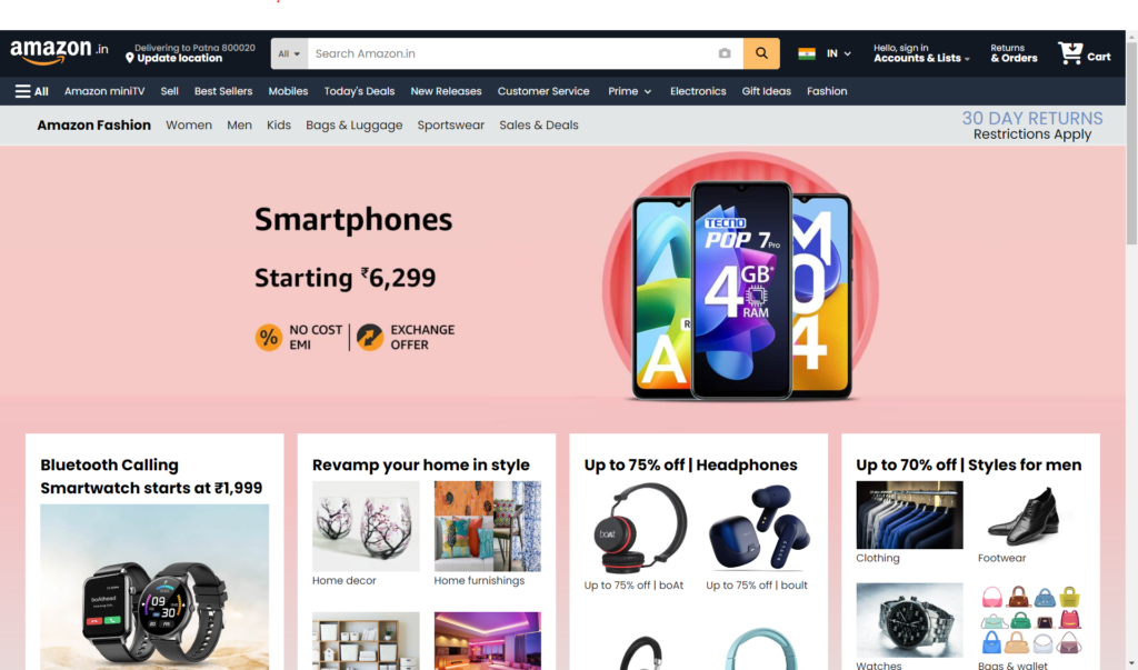
- Header/NavBar: This includes the logo, location settings, search bar, country selection, account information, returns and orders, and the shopping cart.
- Menu Bar: This section contains quick links to various Amazon services and product categories, such as Amazon miniTV, Best Sellers, Mobiles, Today’s Deals, and more.
- Hero Section: This area is typically used for promotional content or banners.
- Product Cards: These are individual sections displaying products or categories of products with images, descriptions, and links to shop or explore further.
- Footer: The footer contains additional links to various Amazon services, social media handles, and other helpful links.
HTML Explanation
Header/NavBar
- Logo: Contains the Amazon logo and a “.in” suffix to represent the Indian site.
- Set Location: Displays the current delivery location with an option to update it.
- Search Box: Includes a dropdown for selecting categories, a camera icon for image search, and a magnifying glass icon for initiating the search.
- Choose Country: Allows users to select their country and language preferences.
- Account Information: Provides options for signing in and accessing account and list information.
- Orders: Links to returns and orders page.
- Cart: Shows the shopping cart icon and a link to the cart page.
Menu Bar
- Contains quick links to various sections of the site, such as Amazon miniTV, Best Sellers, Mobiles, etc.
- Location Selector: Allows users to select a location to see product availability.
Hero Section
- This section is typically used to showcase promotional banners or featured products.
Product Cards
- Each card represents a product category or a set of related products.
- Card Heading: Displays the main title or promotion.
- Product Images: Show images of the products within the category.
- Links: Provide options to shop or explore more products within the category.
Footer
- Divided into multiple parts with links to Amazon services, social media handles, and additional customer support information.
- Global Locations: Lists various countries where Amazon operates.
- Footer Links: Provides links to various Amazon services like AbeBooks, Amazon Web Services, Audible, etc.
CSS Explanation
The CSS is used to style the HTML structure and make it visually appealing and responsive. Here are the key aspects:
Variables
Defines custom properties (CSS variables) for main background color, navbar background, and search box color.
Universal Styles
- Reset Styles: Ensures consistent styling across different browsers by resetting margins, paddings, and box-sizing.
- Font: Sets the global font to “Poppins” from Google Fonts.
- Scroll Behavior: Smoothens scrolling.
Container
- Container: Sets the width and height of the main container to 100%.
Reusable Classes
- first-line and second-line: Define text styles for different lines of text.
- ln-height: Sets line height for elements.
- border: Adds padding, border, and hover effects.
Navbar
- nav: Styles the navbar with padding, background color, and flexbox properties for alignment.
- Logo: Sets the logo’s size and position.
- Set Location: Styles the location text.
- Search Box: Positions and styles the search input and icons.
- Country Selection: Aligns the country flag and text.
- Account Info, Orders, and Cart: Styles these sections with padding and text alignment.
Menu Bar
- menuBar: Styles the quick links with padding, flexbox for alignment, and hover effects.
Hero Section
- heroPage: Typically styled to showcase a background image or promotional content.
Product Cards
- cards and card: Defines the grid layout for displaying product cards.
- cardHeading: Styles the heading of each card.
- cardContainer: Aligns products within each card.
Footer
- socialHandle: Styles the footer with flexbox for alignment and padding.
- sh-part-1, sh-part-2, and sh-part-m: Divide the footer into different sections for various links and logos.
JavaScript Logic
In a more advanced version of this project, JavaScript would be used to add interactivity. While this HTML/CSS-only version doesn’t include JavaScript, here’s what could be implemented:
- Search Functionality: JavaScript can capture input from the search box and filter products or redirect to a search results page.
- Location Update: A script could update the delivery location based on user input.
- Sign In/Account Management: JavaScript can handle user authentication, displaying personalized information once a user logs in.
- Cart Management: Scripts can manage adding/removing items from the cart, updating the cart count, and showing the cart summary.
- Dynamic Content Loading: JavaScript can be used to dynamically load product data from a server or API, making the site more dynamic and responsive to user interactions.
Purpose of Functions
- Search Functionality: Enhance user experience by allowing quick product searches.
- Location Update: Provide localized product availability and delivery options.
- User Authentication: Secure access to user-specific information and features.
- Cart Management: Simplify the shopping process by managing cart items and providing a seamless checkout experience.
- Dynamic Content Loading: Improve performance and user experience by loading content on-demand rather than all at once.
Get Discount on Top Educational Courses
Source Code :
HTML (index.html)
<title>Online Shopping site in India: Shop Online for Mobiles, Books, Watches, Shoes and More - Amazon.in'</title>
<div class="container">
<nav>
<div class="logo">
<img data-lazyloaded="1" src="data:image/gif;base64,R0lGODdhAQABAPAAAMPDwwAAACwAAAAAAQABAAACAkQBADs=" decoding="async" data-src="main-assets/logo.png" alt="main-logo">
<span>.in</span>
</div>
<div class="set_location ln-height border">
<p class="first-line">Delivering to Patna 800020</p>
<p class="second-line">
<i class="fa-solid fa-location-dot"></i>
Update location
</p>
</div>
<div class="search_box">
<div>All <i class="fa-solid fa-caret-down"></i></div>
<div class="camera_search">
<i class="fa-solid fa-camera"></i>
</div>
<div class="search">
<i class="fa-solid fa-magnifying-glass"></i>
</div>
</div>
<div class="choose_country border">
<div class="flag">
<img data-lazyloaded="1" src="data:image/gif;base64,R0lGODdhAQABAPAAAMPDwwAAACwAAAAAAQABAAACAkQBADs=" decoding="async" data-src="main-assets/indian flag.png" alt="country flag" height="25px" />
</div>
IN
EN
US
</div>
<div class="ac_info ln-height border">
<p class="first-line">Hello, sign in</p>
<p class="second-line">Accounts & Lists <i class="fa-solid fa-caret-down"></i></p>
</div>
<div class="orders ln-height border">
<p class="first-line">Returns</p>
<p class="second-line">& Orders</p>
</div>
<div class="cart border">
<i class="fa-solid fa-cart-arrow-down"></i>
<p class="second-line">Cart</p>
</div>
</nav>
<div class="menuBar">
<ul>
<a href="" class="border">
<i class="fa-solid fa-bars"></i>
<span>All</span>
</a>
<a class="border">Amazon miniTV</a>
<a class="border">Sell</a>
<a class="border">Best Sellers</a>
<a class="border">Mobiles</a>
<a class="border">Today's Deals</a>
<a class="border">New Releases</a>
<a class="border">Customer Service</a>
<a class="border">
Prime
Free
Premium
</a>
<a class="border">Electronics</a>
<a class="border">Gift Ideas</a>
<a class="border">Fashion</a>
</ul>
<div class="location">
<i class="fa-solid fa-location-dot"></i>
<p>Select a location to see product availabilty</p>
<i class="fa-solid fa-angle-down"></i>
</div>
</div>
<div class="quickLink">
<h2>Amazon Fashion</h2>
<ul>
<a>Women</a>
<a>Men</a>
<a>Kids</a>
<a>Bags & Luggage</a>
<a>Sportswear</a>
<a>Sales & Deals</a>
</ul>
<div>
<p>30 DAY RETURNS</p>
<p>Restrictions Apply</p>
</div>
</div>
<div class="heroPage">
<div class="linearShade"></div>
</div>
<div class="cards">
<div class="card">
<div class="cardHeading">
Bluetooth Calling Smartwatch starts at ₹1,999
</div>
<img data-lazyloaded="1" src="data:image/gif;base64,R0lGODdhAQABAPAAAMPDwwAAACwAAAAAAQABAAACAkQBADs=" decoding="async" data-src="assets/Watch.jpg" alt="" />
<a href="">Shop Now</a>
</div>
<div class="card">
<div class="cardHeading">Revamp your home in style</div>
<div class="cardContainer">
<div class="product">
<img data-lazyloaded="1" src="data:image/gif;base64,R0lGODdhAQABAPAAAMPDwwAAACwAAAAAAQABAAACAkQBADs=" decoding="async" data-src="assets/A1.jpg" alt="" />
<p>Home decor</p>
</div>
<div class="product">
<img data-lazyloaded="1" src="data:image/gif;base64,R0lGODdhAQABAPAAAMPDwwAAACwAAAAAAQABAAACAkQBADs=" decoding="async" data-src="assets/A2.jpg" alt="" />
<p>Home furnishings</p>
</div>
<div class="product">
<img data-lazyloaded="1" src="data:image/gif;base64,R0lGODdhAQABAPAAAMPDwwAAACwAAAAAAQABAAACAkQBADs=" decoding="async" data-src="assets/A3.jpg" alt="" />
<p>Home storage</p>
</div>
<div class="product">
<img data-lazyloaded="1" src="data:image/gif;base64,R0lGODdhAQABAPAAAMPDwwAAACwAAAAAAQABAAACAkQBADs=" decoding="async" data-src="assets/A4.jpg" alt="" />
<p>Lighting solutions</p>
</div>
</div>
<a href="">Explore all</a>
</div>
<div class="card">
<div class="cardHeading">Up to 75% off | Headphones</div>
<div class="cardContainer">
<div class="product">
<img data-lazyloaded="1" src="data:image/gif;base64,R0lGODdhAQABAPAAAMPDwwAAACwAAAAAAQABAAACAkQBADs=" decoding="async" data-src="assets/B1.jpg" alt="" />
<p>Up to 75% off | boAt</p>
</div>
<div class="product">
<img data-lazyloaded="1" src="data:image/gif;base64,R0lGODdhAQABAPAAAMPDwwAAACwAAAAAAQABAAACAkQBADs=" decoding="async" data-src="assets/B2.jpg" alt="" />
<p>Up to 75% off | boult</p>
</div>
<div class="product">
<img data-lazyloaded="1" src="data:image/gif;base64,R0lGODdhAQABAPAAAMPDwwAAACwAAAAAAQABAAACAkQBADs=" decoding="async" data-src="assets/B3.jpg" alt="" />
<p>Up to 75% off | Noise</p>
</div>
<div class="product">
<img data-lazyloaded="1" src="data:image/gif;base64,R0lGODdhAQABAPAAAMPDwwAAACwAAAAAAQABAAACAkQBADs=" decoding="async" data-src="assets/B4.jpg" alt="" />
<p>Up to 75% off | Zebronics</p>
</div>
</div>
<a href="">See all offers</a>
</div>
<div class="card">
<div class="cardHeading">Up to 70% off | Styles for men</div>
<div class="cardContainer">
<div class="product">
<img data-lazyloaded="1" src="data:image/gif;base64,R0lGODdhAQABAPAAAMPDwwAAACwAAAAAAQABAAACAkQBADs=" decoding="async" data-src="assets/C1.jpg" alt="" />
<p>Clothing</p>
</div>
<div class="product">
<img data-lazyloaded="1" src="data:image/gif;base64,R0lGODdhAQABAPAAAMPDwwAAACwAAAAAAQABAAACAkQBADs=" decoding="async" data-src="assets/C2.jpg" alt="" />
<p>Footwear</p>
</div>
<div class="product">
<img data-lazyloaded="1" src="data:image/gif;base64,R0lGODdhAQABAPAAAMPDwwAAACwAAAAAAQABAAACAkQBADs=" decoding="async" data-src="assets/C3.jpg" alt="" />
<p>Watches</p>
</div>
<div class="product">
<img data-lazyloaded="1" src="data:image/gif;base64,R0lGODdhAQABAPAAAMPDwwAAACwAAAAAAQABAAACAkQBADs=" decoding="async" data-src="assets/C4.jpg" alt="" />
<p>Bags & wallet</p>
</div>
</div>
<a href="">Mega Fashion Days</a>
</div>
<div class="card">
<div class="cardHeading">
Starting ₹99 | All your home improvement needs
</div>
<div class="cardContainer">
<div class="product">
<img data-lazyloaded="1" src="data:image/gif;base64,R0lGODdhAQABAPAAAMPDwwAAACwAAAAAAQABAAACAkQBADs=" decoding="async" data-src="assets/D1.jpg" alt="" />
<p>Spin mops, wipes & more</p>
</div>
<div class="product">
<img data-lazyloaded="1" src="data:image/gif;base64,R0lGODdhAQABAPAAAMPDwwAAACwAAAAAAQABAAACAkQBADs=" decoding="async" data-src="assets/D2.jpg" alt="" />
<p>Bathromm hardware & accessories</p>
</div>
<div class="product">
<img data-lazyloaded="1" src="data:image/gif;base64,R0lGODdhAQABAPAAAMPDwwAAACwAAAAAAQABAAACAkQBADs=" decoding="async" data-src="assets/D3.jpg" alt="" />
<p>Hammers, screwdrivers & more</p>
</div>
<div class="product">
<img data-lazyloaded="1" src="data:image/gif;base64,R0lGODdhAQABAPAAAMPDwwAAACwAAAAAAQABAAACAkQBADs=" decoding="async" data-src="assets/D4.jpg" alt="" />
<p>Extension boards, plugs & more</p>
</div>
</div>
<a href="">Explore all</a>
</div>
<div class="card">
<div class="cardHeading">
Starting ₹99 | All your home improvement needs
</div>
<div class="cardContainer">
<div class="product">
<img data-lazyloaded="1" src="data:image/gif;base64,R0lGODdhAQABAPAAAMPDwwAAACwAAAAAAQABAAACAkQBADs=" decoding="async" data-src="assets/E1.jpg" alt="" />
<p>Gaming Accessories</p>
</div>
<div class="product">
<img data-lazyloaded="1" src="data:image/gif;base64,R0lGODdhAQABAPAAAMPDwwAAACwAAAAAAQABAAACAkQBADs=" decoding="async" data-src="assets/E2.jpg" alt="" />
<p>Keyboard and Mice</p>
</div>
<div class="product">
<img data-lazyloaded="1" src="data:image/gif;base64,R0lGODdhAQABAPAAAMPDwwAAACwAAAAAAQABAAACAkQBADs=" decoding="async" data-src="assets/E3.jpg" alt="" />
<p>Stands, Cables & more</p>
</div>
<div class="product">
<img data-lazyloaded="1" src="data:image/gif;base64,R0lGODdhAQABAPAAAMPDwwAAACwAAAAAAQABAAACAkQBADs=" decoding="async" data-src="assets/E4.jpg" alt="" />
<p>Backpacks</p>
</div>
</div>
<a href="">See all offers</a>
</div>
<div class="card">
<div class="cardHeading">Up to 70% off | Styles for women</div>
<div class="cardContainer">
<div class="product">
<img data-lazyloaded="1" src="data:image/gif;base64,R0lGODdhAQABAPAAAMPDwwAAACwAAAAAAQABAAACAkQBADs=" decoding="async" data-src="assets/F1.jpg" alt="" />
<p>Women's Clothing</p>
</div>
<div class="product">
<img data-lazyloaded="1" src="data:image/gif;base64,R0lGODdhAQABAPAAAMPDwwAAACwAAAAAAQABAAACAkQBADs=" decoding="async" data-src="assets/F2.jpg" alt="" />
<p>Footwear+Handbags</p>
</div>
<div class="product">
<img data-lazyloaded="1" src="data:image/gif;base64,R0lGODdhAQABAPAAAMPDwwAAACwAAAAAAQABAAACAkQBADs=" decoding="async" data-src="assets/F3.jpg" alt="" />
<p>Watches</p>
</div>
<div class="product">
<img data-lazyloaded="1" src="data:image/gif;base64,R0lGODdhAQABAPAAAMPDwwAAACwAAAAAAQABAAACAkQBADs=" decoding="async" data-src="assets/F4.jpg" alt="" />
<p>Fashion jewellery</p>
</div>
</div>
<a href="">Mega Fashion Days</a>
</div>
<div class="card">
<div class="cardHeading">
Appliances for your home | Up to 55% off
</div>
<div class="cardContainer">
<div class="product">
<img data-lazyloaded="1" src="data:image/gif;base64,R0lGODdhAQABAPAAAMPDwwAAACwAAAAAAQABAAACAkQBADs=" decoding="async" data-src="assets/G1.jpg" alt="" />
<p>Air conditioners</p>
</div>
<div class="product">
<img data-lazyloaded="1" src="data:image/gif;base64,R0lGODdhAQABAPAAAMPDwwAAACwAAAAAAQABAAACAkQBADs=" decoding="async" data-src="assets/G2.jpg" alt="" />
<p>Refrigerators</p>
</div>
<div class="product">
<img data-lazyloaded="1" src="data:image/gif;base64,R0lGODdhAQABAPAAAMPDwwAAACwAAAAAAQABAAACAkQBADs=" decoding="async" data-src="assets/G3.jpg" alt="" />
<p>Microwaves</p>
</div>
<div class="product">
<img data-lazyloaded="1" src="data:image/gif;base64,R0lGODdhAQABAPAAAMPDwwAAACwAAAAAAQABAAACAkQBADs=" decoding="async" data-src="assets/G4.jpg" alt="" />
<p>Washing machines</p>
</div>
</div>
<a href="">See more</a>
</div>
<div class="card">
<div class="cardHeading">Starting ₹99 | Toys for your kids</div>
<div class="cardContainer">
<div class="product">
<img data-lazyloaded="1" src="data:image/gif;base64,R0lGODdhAQABAPAAAMPDwwAAACwAAAAAAQABAAACAkQBADs=" decoding="async" data-src="assets/H1.jpg" alt="" />
<p>Starting ₹299 | Bikes, trikes & ride-ons</p>
</div>
<div class="product">
<img data-lazyloaded="1" src="data:image/gif;base64,R0lGODdhAQABAPAAAMPDwwAAACwAAAAAAQABAAACAkQBADs=" decoding="async" data-src="assets/H2.jpg" alt="" />
<p>Starting ₹149 | Sport & outdoor</p>
</div>
<div class="product">
<img data-lazyloaded="1" src="data:image/gif;base64,R0lGODdhAQABAPAAAMPDwwAAACwAAAAAAQABAAACAkQBADs=" decoding="async" data-src="assets/H3.jpg" alt="" />
<p>Starting ₹99 | Soft toys</p>
</div>
<div class="product">
<img data-lazyloaded="1" src="data:image/gif;base64,R0lGODdhAQABAPAAAMPDwwAAACwAAAAAAQABAAACAkQBADs=" decoding="async" data-src="assets/h4.jpg" alt="" />
<p>Starting ₹199 | Indoor games</p>
</div>
</div>
<a href="">See more</a>
</div>
</div>
<div class="newUser">
<div class="newcustomer">
<div>See personalized recommendations</div>
<button>Sign in</button>
<p>New customer? <a href="">Start here.</a></p>
</div>
</div>
<div class="backTop">
<i class="fa-solid fa-caret-up"></i>
<a href="#">Back to top</a>
<a href="">TOP OF PAGE</a>
</div>
<div class="socialHandle">
<div class="sh-part-1">
<ul>
<li>Get to Know Us</li>
<li>About Us</li>
<li>Careers</li>
<li>Press Releases</li>
<li>Amazon Science</li>
</ul>
<ul>
<li>Connect with US</li>
<li>Facbook</li>
<li>Twitter</li>
<li>Instagram</li>
</ul>
<ul>
<li>Make Money with Us</li>
<li>Sell on Amazon</li>
<li>Sell under Amazon Accelerator</li>
<li>Protect and Build Your Brand</li>
<li>Amazon Global Selling</li>
<li>Become an Affilate</li>
<li>Fulfilment by Amazon</li>
<li>Advertise Your Products</li>
<li>Amazon Pay on Merchants</li>
</ul>
<ul>
<li>Let Us Help You</li>
<li>COVID-19 and Amazon</li>
<li>Your Account</li>
<li>Returns centre</li>
<li>100% Purchase Protection</li>
<li>Amazon App Download</li>
<li>Help</li>
</ul>
</div>
<div class="sh-part-2">
<div class="foot-logo">
<img data-lazyloaded="1" src="data:image/gif;base64,R0lGODdhAQABAPAAAMPDwwAAACwAAAAAAQABAAACAkQBADs=" decoding="async" data-src="main-assets/logo.png" alt="" />
<button>
<i class="fa-solid fa-globe"></i>
English
<i class="fa-solid fa-sort"></i>
</button>
</div>
<div class="locations">
<span>Australia</span>
<span>Brazil</span>
<span>Canada</span>
<span>China</span>
<span>France</span>
<span>Germany</span>
<span>Itlay</span>
<span>Japan</span>
<span>Mexico</span>
<span>Netherlands</span>
<span>Poland</span>
<span>Singapore</span>
<span>Spain</span>
<span>Turkey</span>
<span>United Arab Emirates</span>
<span>United Kingdom</span>
<span>United States </span>
</div>
</div>
<div class="sh-part-m">
<ul>
<li>Your Amazon.in</li>
<li>Amazon Pay</li>
<li>Wish List</li>
<li>Your Account</li>
<li>Returns</li>
<li>Customer Service</li>
<li>Your Orders</li>
<li>Amazon App Download</li>
<li>Find a Wish List</li>
<li>Your Recently Viewed Items</li>
<li>Sell</li>
</ul>
</div>
</div>
<footer>
<div class="footer-part-1">
<ul>
<li>AbeBooks</li>
<li>Books, art</li>
<li>& collectibles</li>
</ul>
<ul>
<li>Amazon Web Services</li>
<li>Scalable Cloud</li>
<li>Computing Services</li>
</ul>
<ul>
<li>Audible</li>
<li>Download</li>
<li>Audio Books</li>
</ul>
<ul>
<li>DPReview</li>
<li>Digital</li>
<li>Photography</li>
</ul>
<ul>
<li>IMDb</li>
<li>Movies, TV</li>
<li>& Celebrities</li>
</ul>
<ul>
<li>Amazon Bussiness</li>
<li>Everything For</li>
<li>Your Bussiness</li>
</ul>
<ul>
<li>Prime Now</li>
<li>2-Hours Delivery</li>
<li>on Everyday Items</li>
</ul>
<ul>
<li>Amazon Prime Music</li>
<li>100 million songs, ad-free</li>
<li>Over 15 million podcast episodes</li>
</ul>
</div>
<div class="footer-part-sm">
<div class="lang">
<i class="fa-solid fa-globe"></i>
English
</div>
<h3><a href="">Already a customer? Sign in</a></h3>
</div>
<div class="footer-part-2">
<p>
<a href="">Conditions of Use & Sale</a>
<a href="">Privacy Notice</a> <a href="">Interest-Based Ads</a>
</p>
<p>© 1996-2023, Amazon.com, Inc. or its affilates</p>
</div>
</footer>
</div>
CSS (style.css)
					@import url("https://fonts.googleapis.com/css2?family=Poppins:wght@200;300;400;500;600;700;800;900&display=swap");

* {
  margin: 0;
  padding: 0;
  box-sizing: border-box;
  font-family: "Poppins", sans-serif;
  scroll-behavior: smooth;
}

:root {
  --main-background: #e3e6e6;
  --nav-background: #121821;
  --searchbox-color: #febd69;
}

body,
html {
  height: 100%;
  width: 100%;
  background-color: var(--main-background);
}

.container {
  height: 100%;
  width: 100%;
}

/* ============= Reusable Classes =========== */
.first-line {
  font-size: 12px;
  color: #bbb;
  font-weight: 500;
}

.second-line {
  font-size: 14px;
  color: #fff;
  font-weight: 700;
}

.ln-height {
  line-height: 1.1;
}

.border {
  padding: 2px 5px;
  border: 1px solid transparent;
  border-radius: 2px;
}

.border:hover {
  border: 1px solid #ddd;
  cursor: pointer;
}

/* NOT TO SHOW */
.category,
.wishlist,
.deals,
.sell,
.location,
.sh-part-m,
.footer-part-sm {
  display: none;
}

/* ============== NAVBAR =============== */
nav {
  padding: 5px 10px;
  width: 100%;
  background-color: var(--nav-background);
  display: flex;
  align-items: center;
  justify-content: space-between;
}

nav * {
  margin: 0px 2px;
}

@media screen and (max-width: 1100px) {
  nav {
    padding: 15px 20px;
    flex-direction: column;
    align-items: start;
  }
}

nav .logo {
  display: flex;
  align-items: center;
  gap: 1px;
  color: white;
  font-size: 16px;
  position: relative;
  bottom: 6px;
}

nav .logo img {
  position: relative;
  width: 110px;
  top: 9px;
}

.set_location {
  padding: 10px 5px;
}

@media screen and (max-width: 1100px) {
  .set_location {
    order: 1;
  }
}

.set_location p:nth-child(1) {
  text-indent: 14px;
}

.search_box {
  position: relative;
  display: flex;
  height: 43px;
  width: 45vw;
}

@media screen and (min-width: 1700px) {
  .search_box {
    width: 70vw;
  }
}

@media screen and (min-width: 1650px) {
  .search_box {
    width: 60vw;
  }
}

@media screen and (min-width: 1600px) {
  .search_box {
    width: 50vw;
  }
}

@media screen and (max-width: 1420px) {
  .search_box {
    width: 350px;
  }
}

@media screen and (max-width: 1100px) {
  .search_box {
    margin: 10px 0px;
    height: 60px;
    width: 100%;
  }
}

.search_box div:nth-child(1) {
  position: absolute;
  height: 100%;
  width: 50px;
  font-size: 12px;
  color: #444;
  font-weight: 500;
  background-color: #ddd;
  display: flex;
  gap: 5px;
  align-items: center;
  justify-content: center;
  border-top-left-radius: 5px;
  border-bottom-left-radius: 5px;
}

.search_box input {
  padding-left: 60px;
  height: 100%;
  width: 100%;
  border: none;
  border-radius: 5px;
  outline: none;
  color: #111111;
  font-size: 15px;
}

.search_box input:focus {
  outline: 3px solid #ff822f;
}

.search_box .camera_search {
  position: absolute;
  right: 50px;
  height: 100%;
  width: 50px;
  opacity: 0.3;
  display: flex;
  align-items: center;
  justify-content: center;
}

.search_box .search {
  position: absolute;
  right: 0;
  height: 100%;
  width: 50px;
  background-color: var(--searchbox-color);
  display: flex;
  align-items: center;
  justify-content: center;
  border-top-right-radius: 5px;
  border-bottom-right-radius: 5px;
}

.search:hover {
  background-color: #ffa52f;
  cursor: pointer;
}

.choose_country {
  padding: 10px 5px;
  display: flex;
  gap: 5px;
  align-items: center;
}

@media screen and (max-width: 1100px) {
  .choose_country {
    display: none;
  }
}

.choose_country .flag {
  position: relative;
  top: 3.6px;
}

.choose_country select {
  height: 20px;
  background-color: transparent;
  border: none;
  font-weight: 600;
  font-size: 14px;
  color: #fff;
  outline: none;
}

.choose_country option {
  background-color: #fff;
  color: #000;
}

.ac_info {
  padding: 10px 5px;
}

@media screen and (max-width: 1100px) {
  .ac_info {
    display: none;
  }
}

.ac_info .first-line {
  color: #fff;
  font-weight: 400;
}

.ac_info i {
  opacity: 0.6;
  font-size: 10px;
}

.orders {
  padding: 10px 5px;
}

@media screen and (max-width: 1100px) {
  .orders {
    display: none;
  }
}

.orders .first-line {
  color: #fff;
  font-weight: 400;
}

.cart {
  padding: 10px 5px;
  display: flex;
  align-items: end;
  gap: 2px;
}

@media screen and (max-width: 1100px) {
  .cart {
    order: 2;
  }
}

.cart i {
  font-size: 30px;
  color: #fff;
}

/* ============== MENU BAR ============= */
.menuBar {
  padding: 5px 15px;
  background-color: #232f3e;
  display: flex;
  align-items: center;
}

@media screen and (max-width: 1160px) {
  .menuBar {
    padding: 10px 15px;
  }
}

@media screen and (max-width: 700px) {
  .menuBar {
    display: none;
  }
}

.menuBar ul {
  display: flex;
  align-items: center;
  gap: 10px;
}

@media screen and (max-width: 1160px) {
  .menuBar ul {
    gap: 6px;
  }
}

.menuBar i {
  font-size: 2.7vh;
  color: #fff;
  margin-right: 5px;
}

.menuBar a {
  font-size: 14px;
  text-decoration: none;
  color: #fff;
  display: flex;
  align-items: center;
}

@media screen and (max-width: 1160px) {
  .menuBar a {
    font-size: 13px;
  }
}

@media screen and (max-width: 1100px) {

  .menuBar a:nth-child(12),
  .menuBar a:nth-child(11),
  .menuBar a:nth-child(10),
  .menuBar a:nth-child(7),
  .menuBar a:nth-child(3) {
    display: none;
  }
}

.menuBar a:nth-child(1) {
  font-size: 15px;
  font-weight: 600;
}

.menuBar a:nth-child(9) select {
  font-size: 14px;
  width: 66px;
  border: none;
  background: transparent;
  color: #fff;
}

/* QUICK LINK */
.quickLink {
  padding: 5px 30px;
  border-bottom: 0.3vh solid #eee;
  display: flex;
  align-items: center;
}

@media screen and (max-width: 1100px) {
  .quickLink {
    display: none;
  }
}

.quickLink ul {
  margin-right: auto;
  display: flex;
  align-items: center;
  justify-content: space-between;
  gap: 20px;
}

.quickLink h2 {
  font-size: 18px;
  margin: 0px 20px;
}

.quickLink a {
  text-decoration: none;
  color: #111;
  font-size: 16px;
}

.quickLink a:hover {
  text-decoration: 2px rgb(255, 89, 0) underline;
  cursor: pointer;
}

.quickLink div {
  text-align: center;
  line-height: 1;
}

.quickLink div p:nth-child(1) {
  color: #6f91c4;
  font-size: 24px;
}

.quickLink div p:nth-child(2) {
  color: #000;
  font-size: 18px;
}

/* HERO PAGE */
.heroPage {
  height: 100vh;
  background: url("main-assets/Hero-Image.jpg");
  background-size: cover;
  background-position: top;
  display: flex;
  align-items: end;
}

@media screen and (max-width: 800px) {
  .heroPage {
    height: 80vh;
  }
}

.linearShade {
  height: 47vh;
  width: 100%;
  background: linear-gradient(transparent, #e3e6e6);
}

/* CARDS AND PRODUCTS */
.cards {
  padding: 0vh 4vh;
  position: relative;
  bottom: 55vh;
  gap: 18px;
  height: 560px;
  display: grid;
  grid-template-columns: 1fr 1fr 1fr 1fr;
}

@media screen and (min-width: 1750px) {
  .cards {
    margin: auto;
    max-width: 1700px;
  }
}

@media screen and (min-width: 1500px) {
  .cards :nth-child(9) {
    display: none;
  }
}

@media screen and (max-width: 1500px) {
  .cards {
    height: 1105px;
    grid-template-columns: 1fr 1fr 1fr;
  }
}

@media screen and (min-width: 1350px) and (max-width: 1500px) {
  .cards {
    max-width: 1350px;
    margin: auto;
  }
}

@media screen and (max-width: 1150px) {
  .cards {
    height: 1545px;
    grid-template-columns: 1fr 1fr;
  }

  .cards :nth-child(9) {
    display: none;
  }
}

@media screen and (min-width: 900px) and (max-width: 1150px) {
  .cards {
    max-width: 900px;
    margin: auto;
  }
}

@media screen and (max-width: 650px) {
  .cards {
    grid-template-columns: 1fr;
    height: 4104px;
  }
}

@media screen and (max-width: 530px) {
  .cards {
    height: 3345px;
  }
}

.card {
  padding: 20px;
  height: 460px;
  background-color: #fff;
  position: relative;
  display: flex;
  flex-direction: column;
}

@media screen and (max-width: 650px) {
  .card {
    padding: 10px 30px;
    height: 70vh;
  }
}

@media screen and (max-width: 530px) {
  .card {
    padding: 10px 30px;
    height: 60vh;
  }
}

.card a {
  position: absolute;
  bottom: 20px;
  text-decoration: none;
  font-size: 14px;
  font-weight: 500;
  color: #017184;
}

.card a:hover {
  --red: #c7511f;
  color: var(--red);
  text-decoration: 1px solid var(--red) underline;
}

.cardHeading {
  padding: 6px 0px;
  line-height: 1.5;
  font-size: 21px;
  font-weight: 700;
}

.cardContainer {
  display: grid;
  grid-template-columns: 1fr 1fr;
  gap: 20px;
}

.product {
  line-height: 1.2;
}

.product img {
  height: 78%;
  width: 100%;
}

.product p {
  text-decoration: none;
  font-size: 14px;
  color: #222;
}

.card:nth-child(1) img {
  width: 100%;
}

/* NEW USER */
.newUser {
  padding: 40px 0px 23px 0px;
  width: 100%;
  background: #fff;
}

.newcustomer {
  padding: 30px 0px 16px 0px;
  width: 100%;
  border-radius: 1vh;
  border: 0.1vh solid #ddd;
  display: flex;
  flex-direction: column;
  align-items: center;
  justify-content: center;
}

.newcustomer div {
  line-height: 5vh;
  font-size: 15px;
}

.newcustomer button {
  font-weight: 600;
  font-size: 12px;
  padding: 6px 126px;
  border: 0.3vh solid #b99401;
  border-radius: 1vh;
  background: linear-gradient(#ffe39f 20%, #fec52e);
}

.newcustomer button:hover {
  cursor: pointer;
}

.newcustomer p {
  padding: 5px 0px;
  font-size: 12px;
}

.newcustomer a {
  text-decoration: none;
  color: #017184;
}

/* BACK TO TOP */
.backTop {
  height: 52px;
  background-color: #37475a;
  display: flex;
  align-items: center;
  justify-content: center;
}

.backTop:hover {
  background: #495768;
}

.backTop i,
.backTop a:nth-child(3) {
  display: none;
}

.backTop a {
  color: #eee;
  font-size: 13px;
  font-weight: 500;
  text-decoration: none;
}

/* FOOTER */
.socialHandle {
  width: 100%;
  background: #232f3e;
}

.sh-part-1 {
  padding: 36px 0px;
  max-width: 80vw;
  margin: auto;
  display: grid;
  grid-template-columns: 1fr 1fr 1fr 1fr;
  gap: 8px;
}

@media screen and (min-width: 1500px) {
  .sh-part-1 {
    max-width: 1300px;
  }
}

@media screen and (max-width: 1150px) {
  .sh-part-1 {
    max-width: 65vw;
    grid-template-columns: 2fr 1fr;
  }
}

@media screen and (max-width: 960px) {
  .sh-part-1 {
    max-width: 70vw;
  }
}

@media screen and (max-width: 770px) {
  .sh-part-1 {
    grid-template-columns: 3fr 2fr;
    max-width: 75vw;
  }
}

.sh-part-1 ul li {
  font-size: 14px;
  line-height: 2;
  list-style-type: none;
  color: #dddddd;
  cursor: pointer;
}

.sh-part-1 ul li:hover {
  text-decoration: 1px underline;
}

.sh-part-1 ul li:nth-child(1) {
  font-weight: 700;
  font-size: 16px;
  color: #ffffff;
}

.sh-part-1 ul li:nth-child(1) {
  text-decoration: none;
}

.sh-part-2 {
  padding: 10px 0px 30px 0px;
  width: 100%;
  border-top: 0.1vh solid #666;
}

.foot-logo {
  padding: 30px 0px;
  max-width: 70vw;
  margin: auto;
  display: flex;
  align-items: center;
  justify-content: center;
  gap: 92px;
}

.foot-logo img {
  position: relative;
  top: 1.5vh;
  height: 36px;
}

.foot-logo button {
  padding: 7px 10px;
  color: #ddd;
  font-size: 13px;
  background: transparent;
  border: 0.1vh solid #ddd;
  border-radius: 3px;
  display: flex;
  align-items: center;
  gap: 10px;
}

.foot-logo button i {
  opacity: 0.6;
}

.locations {
  display: flex;
  flex-wrap: wrap;
  align-content: center;
  justify-content: center;
  gap: 1.9vh;
  font-size: 12px;
  color: #eee;
  line-height: 0.5;
  padding: 2vh 19vh;
  max-width: 80vw;
  margin: auto;
}

@media screen and (min-width: 1500px) {
  .locations {
    max-width: 1300px;
  }
}

@media screen and (max-width: 1400px) {
  .locations {
    padding: 2vh 8vh;
    max-width: 90vw;
  }
}

.locations span:hover {
  text-decoration: 1px underline;
  cursor: pointer;
}

footer {
  background: #131a22;
}

.footer-part-1 {
  max-width: 66vw;
  margin: auto;
  padding: 24px 0px;
  display: grid;
  grid-template-columns: 1fr 1fr 1fr 1fr;
  gap: 14px;
}

@media screen and (min-width: 1500px) {
  .footer-part-1 {
    max-width: 1300px;
  }
}

@media screen and (max-width: 1080px) {
  .footer-part-1 {
    grid-template-columns: 1fr 1fr;
    max-width: 47vw;
  }
}

@media screen and (max-width: 890px) {
  .footer-part-1 {
    max-width: 52vw;
  }
}

@media screen and (max-width: 800px) {
  .footer-part-1 {
    max-width: 56vw;
    grid-template-columns: 2fr 3fr;
  }
}

@media screen and (max-width: 730px) {
  .footer-part-1 {
    max-width: 60vw;
  }
}

@media screen and (max-width: 690px) {
  .footer-part-1 {
    max-width: 65vw;
  }
}

@media screen and (max-width: 550px) {
  .footer-part-1 {
    max-width: 70vw;
  }
}

@media screen and (max-width: 500px) {
  .footer-part-1 {
    max-width: 80vw;
  }
}

@media screen and (max-width: 450px) {
  .footer-part-1 {
    max-width: 100vw;
    padding: 24px 30px;
  }
}

.footer-part-1 ul li:hover {
  text-decoration: 0.2vh #fff underline;
  text-underline-offset: 3px;
  cursor: pointer;
}

.footer-part-1 ul li {
  line-height: 1.4;
  font-size: 12px;
  list-style-type: none;
  color: #777;
  font-weight: 600;
}

.footer-part-1 ul :nth-child(1) {
  font-weight: 500;
  color: #fff;
}

.footer-part-1 ul li:nth-child(2):hover,
.footer-part-1 ul li:nth-child(3):hover {
  text-decoration: 0.2vh #777 underline;
}

.footer-part-2 {
  padding: 10px 0px 40px 0px;
  color: #fff;
  font-size: 12px;
  height: 40%;
  width: 100%;
  display: flex;
  flex-direction: column;
  justify-content: center;
  align-items: center;
}

.footer-part-2 p:nth-child(1) {
  display: flex;
  gap: 5vh;
}

.footer-part-2 a {
  color: #fff;
  text-decoration: none;
}

.footer-part-2 a:hover {
  text-decoration: underline;
}
Output :
Conclusion :
This Amazon clone project, built using HTML and CSS, demonstrates the fundamental structure and styling needed to replicate a large e-commerce platform. While it lacks interactivity and dynamic content, it provides a solid foundation for understanding how such a site is constructed and styled. Adding JavaScript would significantly enhance its functionality, making it a more realistic and usable application.
More HTML CSS JS Projects

Get Huge Discounts

Get Discount on Top EdTech Compnies
Find More Projects

URL Shortener Using Python Django Introduction: Long URLs can be shortened into short, shareable links with the help of the URL Shortener …

User Authentication System Using Python Django Introduction: The implementation of safe and adaptable user authentication in Django is the main goal of …

The E-Learning System using Java with a Graphical User Interface (GUI) Introduction The E-Learning System is developed using Java (with a Graphical …

Weather App Using Python Django Introduction: When a user enters the name of a city, the Weather App retrieves current weather information. …

Quiz App Using Python Django Introduction: Users can take quizzes in a variety of subjects, see their results, and monitor their progress …
resume screener in python using python introduction The hiring process often begins with reviewing numerous resumes to filter out the most suitable …