
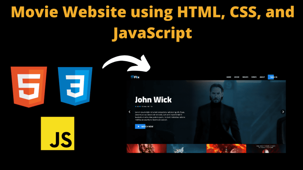
movie Website using HTML, CSS, and JavaScript
Introduction
Hello friends my name is Gautam and you all are welcome to today’s beautiful blog post. Today we have created a nice website for you which is very beautiful as well as completely responsive which works on any device and this is a movie website in which user can watch movie.
We have created this movie website with the help of html CSS and JavaScript. Friends if you want to become a successful web developer then you must create such a website from which you get information about the design and errors of the website. Hence this movie website is going to be absolutely beginners friendly which every user can download. Anyone can use it. In this website we have used some animated sliders which we have created with the help of JavaScript which are quite amazing and give a good look to our movie website. So, let’s understand the code of our movie website step by step so that we do not face any problem in using the code.
HTML (index.html)
Get Discount on Top Educational Courses
Friends, this is the html code of our movie website, with the help of which we are going to create the structure of our movie website, so first of all let’s understand the important code of html.
- First of all we have added the icon of our website <link rel=”shortcut icon” type=”x-icon” href=”./images/movie logo.png”>
- After this we have used link attribute to link css with html file <link rel=”stylesheet” href=”app.css”> In this you can also change the name of your file
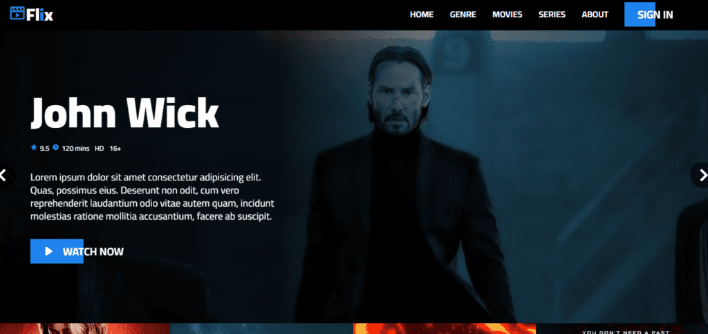
- First of all, any website has its header section. To create this, we have created a container of <nav> <div class=”nav-wrapper”>
- In this we have again created a separate <div> for the website logo <a character=”#” class=”logo”> and added the logo in it
- To add the menu to the header, we have used the <ul> tag <ul class=”nav-menu” id=”nav-menu”> in which the menu has been added
- Then we have created a hero section for which a separate <div> has been created <div class=”hero-section”>
- In the hero section we have created the slider <div class=”hero-slide”>
- <img> tag is used to add images in the hero section slider <img src=”./images/black-banner.png” alt=””>
- We have added some text using the <span> element of HTML <span>9.5</span> In this, we have added movie review, movie time etc.
- Then we have created a movie slider in which different movies slide automatically which looks very nice <div class=”hero-slide-item”>
- Then we have created a pricing section in which we have added some plans which the user can buy <div class=”pricing”></div> In this we have added three plans
- Then comes our footer section <footer class=”section”> which we have created using the <footer> element
Friends, we have used a lot of HTML code but we have explained to you only the code which is necessary and you can check the HTML code. We have used a lot of sliders in which most of the code is the same and there are slight changes in the image.
<title>
Flix
</title>
<div class="nav-wrapper">
<div class="container">
<div class="nav">
<a href="#" class="logo">
<i class='bx bx-movie-play bx-tada main-color'></i>Fl<span class="main-color">i</span>x
</a>
<ul class="nav-menu" id="nav-menu">
<li><a href="#">Home</a></li>
<li><a href="#">Genre</a></li>
<li><a href="#">Movies</a></li>
<li><a href="#">Series</a></li>
<li><a href="#">About</a></li>
<li>
<a href="#" class="btn btn-hover">
<span>Sign in</span>
</a>
</li>
</ul>
<div class="hamburger-menu" id="hamburger-menu">
<div class="hamburger"></div>
</div>
</div>
</div>
</div>
<div class="hero-section">
<div class="hero-slide">
<div class="owl-carousel carousel-nav-center" id="hero-carousel">
<div class="hero-slide-item">
<img data-lazyloaded="1" src="data:image/gif;base64,R0lGODdhAQABAPAAAMPDwwAAACwAAAAAAQABAAACAkQBADs=" decoding="async" data-src="./images/black-banner.png" alt="">
<div class="overlay"></div>
<div class="hero-slide-item-content">
<div class="item-content-wraper">
<div class="item-content-title top-down">
Black Panther
</div>
<div class="movie-infos top-down delay-2">
<div class="movie-info">
<i class="bx bxs-star"></i>
<span>9.5</span>
</div>
<div class="movie-info">
<i class="bx bxs-time"></i>
<span>120 mins</span>
</div>
<div class="movie-info">
<span>HD</span>
</div>
<div class="movie-info">
<span>16+</span>
</div>
</div>
<div class="item-content-description top-down delay-4">
Lorem ipsum dolor sit amet consectetur adipisicing elit. Quas, possimus eius. Deserunt non odit, cum vero reprehenderit laudantium odio vitae autem quam, incidunt molestias ratione mollitia accusantium, facere ab suscipit.
</div>
<div class="item-action top-down delay-6">
<a href="#" class="btn btn-hover">
<i class="bx bxs-right-arrow"></i>
<span>Watch now</span>
</a>
</div>
</div>
</div>
</div>
<div class="hero-slide-item">
<img data-lazyloaded="1" src="data:image/gif;base64,R0lGODdhAQABAPAAAMPDwwAAACwAAAAAAQABAAACAkQBADs=" decoding="async" data-src="./images/John wick.jpg" alt="">
<div class="overlay"></div>
<div class="hero-slide-item-content">
<div class="item-content-wraper">
<div class="item-content-title top-down">
John Wick
</div>
<div class="movie-infos top-down delay-2">
<div class="movie-info">
<i class="bx bxs-star"></i>
<span>9.5</span>
</div>
<div class="movie-info">
<i class="bx bxs-time"></i>
<span>120 mins</span>
</div>
<div class="movie-info">
<span>HD</span>
</div>
<div class="movie-info">
<span>16+</span>
</div>
</div>
<div class="item-content-description top-down delay-4">
Lorem ipsum dolor sit amet consectetur adipisicing elit. Quas, possimus eius. Deserunt non odit, cum vero reprehenderit laudantium odio vitae autem quam, incidunt molestias ratione mollitia accusantium, facere ab suscipit.
</div>
<div class="item-action top-down delay-6">
<a href="#" class="btn btn-hover">
<i class="bx bxs-right-arrow"></i>
<span>Watch now</span>
</a>
</div>
</div>
</div>
</div>
<div class="hero-slide-item">
<img data-lazyloaded="1" src="data:image/gif;base64,R0lGODdhAQABAPAAAMPDwwAAACwAAAAAAQABAAACAkQBADs=" decoding="async" data-src="./images/GATG vol3.jpeg" alt="">
<div class="overlay"></div>
<div class="hero-slide-item-content">
<div class="item-content-wraper">
<div class="item-content-title top-down">
GOTG Vol 3
</div>
<div class="movie-infos top-down delay-2">
<div class="movie-info">
<i class="bx bxs-star"></i>
<span>9.5</span>
</div>
<div class="movie-info">
<i class="bx bxs-time"></i>
<span>120 mins</span>
</div>
<div class="movie-info">
<span>HD</span>
</div>
<div class="movie-info">
<span>16+</span>
</div>
</div>
<div class="item-content-description top-down delay-4">
Lorem ipsum dolor sit amet consectetur adipisicing elit. Quas, possimus eius. Deserunt non odit, cum vero reprehenderit laudantium odio vitae autem quam, incidunt molestias ratione mollitia accusantium, facere ab suscipit.
</div>
<div class="item-action top-down delay-6">
<a href="#" class="btn btn-hover">
<i class="bx bxs-right-arrow"></i>
<span>Watch now</span>
</a>
</div>
</div>
</div>
</div>
</div>
</div>
<div class="top-movies-slide">
<div class="owl-carousel" id="top-movies-slide">
<div class="movie-item">
<img data-lazyloaded="1" src="data:image/gif;base64,R0lGODdhAQABAPAAAMPDwwAAACwAAAAAAQABAAACAkQBADs=" decoding="async" data-src="./images/series/supergirl.jpg" alt="">
<div class="movie-item-content">
<div class="movie-item-title">
Supergirl
</div>
<div class="movie-infos">
<div class="movie-info">
<i class="bx bxs-star"></i>
<span>9.5</span>
</div>
<div class="movie-info">
<i class="bx bxs-time"></i>
<span>120 mins</span>
</div>
<div class="movie-info">
<span>HD</span>
</div>
<div class="movie-info">
<span>16+</span>
</div>
</div>
</div>
</div>
<div class="movie-item">
<img data-lazyloaded="1" src="data:image/gif;base64,R0lGODdhAQABAPAAAMPDwwAAACwAAAAAAQABAAACAkQBADs=" decoding="async" data-src="./images/movies/captain-marvel.png" alt="">
<div class="movie-item-content">
<div class="movie-item-title">
Captain Marvel
</div>
<div class="movie-infos">
<div class="movie-info">
<i class="bx bxs-star"></i>
<span>9.5</span>
</div>
<div class="movie-info">
<i class="bx bxs-time"></i>
<span>120 mins</span>
</div>
<div class="movie-info">
<span>HD</span>
</div>
<div class="movie-info">
<span>16+</span>
</div>
</div>
</div>
</div>
<div class="movie-item">
<img data-lazyloaded="1" src="data:image/gif;base64,R0lGODdhAQABAPAAAMPDwwAAACwAAAAAAQABAAACAkQBADs=" decoding="async" data-src="./images/cartoons/demon-slayer.jpg" alt="">
<div class="movie-item-content">
<div class="movie-item-title">
Infinity Train
</div>
<div class="movie-infos">
<div class="movie-info">
<i class="bx bxs-star"></i>
<span>9.5</span>
</div>
<div class="movie-info">
<i class="bx bxs-time"></i>
<span>120 mins</span>
</div>
<div class="movie-info">
<span>HD</span>
</div>
<div class="movie-info">
<span>16+</span>
</div>
</div>
</div>
</div>
<div class="movie-item">
<img data-lazyloaded="1" src="data:image/gif;base64,R0lGODdhAQABAPAAAMPDwwAAACwAAAAAAQABAAACAkQBADs=" decoding="async" data-src="./images/movies/blood-shot.jpg" alt="">
<div class="movie-item-content">
<div class="movie-item-title">
Bloodshot
</div>
<div class="movie-infos">
<div class="movie-info">
<i class="bx bxs-star"></i>
<span>9.5</span>
</div>
<div class="movie-info">
<i class="bx bxs-time"></i>
<span>120 mins</span>
</div>
<div class="movie-info">
<span>HD</span>
</div>
<div class="movie-info">
<span>16+</span>
</div>
</div>
</div>
</div>
<div class="movie-item">
<img data-lazyloaded="1" src="data:image/gif;base64,R0lGODdhAQABAPAAAMPDwwAAACwAAAAAAQABAAACAkQBADs=" decoding="async" data-src="./images/series/wanda.png" alt="">
<div class="movie-item-content">
<div class="movie-item-title">
Wanda Vision
</div>
<div class="movie-infos">
<div class="movie-info">
<i class="bx bxs-star"></i>
<span>9.5</span>
</div>
<div class="movie-info">
<i class="bx bxs-time"></i>
<span>120 mins</span>
</div>
<div class="movie-info">
<span>HD</span>
</div>
<div class="movie-info">
<span>16+</span>
</div>
</div>
</div>
</div>
<div class="movie-item">
<img data-lazyloaded="1" src="data:image/gif;base64,R0lGODdhAQABAPAAAMPDwwAAACwAAAAAAQABAAACAkQBADs=" decoding="async" data-src="./images/movies/bat-man.jpg" alt="">
<div class="movie-item-content">
<div class="movie-item-title">
The Dark Knight
</div>
<div class="movie-infos">
<div class="movie-info">
<i class="bx bxs-star"></i>
<span>9.5</span>
</div>
<div class="movie-info">
<i class="bx bxs-time"></i>
<span>120 mins</span>
</div>
<div class="movie-info">
<span>HD</span>
</div>
<div class="movie-info">
<span>16+</span>
</div>
</div>
</div>
</div>
</div>
</div>
</div>
<div class="section">
<div class="container">
<div class="section-header">
latest movies
</div>
<div class="movies-slide carousel-nav-center owl-carousel">
<a href="#" class="movie-item">
<img data-lazyloaded="1" src="data:image/gif;base64,R0lGODdhAQABAPAAAMPDwwAAACwAAAAAAQABAAACAkQBADs=" decoding="async" data-src="./images/movies/theatre-dead.jpg" alt="">
<div class="movie-item-content">
<div class="movie-item-title">
Theatre of the dead
</div>
<div class="movie-infos">
<div class="movie-info">
<i class="bx bxs-star"></i>
<span>9.5</span>
</div>
<div class="movie-info">
<i class="bx bxs-time"></i>
<span>120 mins</span>
</div>
<div class="movie-info">
<span>HD</span>
</div>
<div class="movie-info">
<span>16+</span>
</div>
</div>
</div>
</a>
<a href="#" class="movie-item">
<img data-lazyloaded="1" src="data:image/gif;base64,R0lGODdhAQABAPAAAMPDwwAAACwAAAAAAQABAAACAkQBADs=" decoding="async" data-src="./images/movies/transformer.jpg" alt="">
<div class="movie-item-content">
<div class="movie-item-title">
Transformer
</div>
<div class="movie-infos">
<div class="movie-info">
<i class="bx bxs-star"></i>
<span>9.5</span>
</div>
<div class="movie-info">
<i class="bx bxs-time"></i>
<span>120 mins</span>
</div>
<div class="movie-info">
<span>HD</span>
</div>
<div class="movie-info">
<span>16+</span>
</div>
</div>
</div>
</a>
<a href="#" class="movie-item">
<img data-lazyloaded="1" src="data:image/gif;base64,R0lGODdhAQABAPAAAMPDwwAAACwAAAAAAQABAAACAkQBADs=" decoding="async" data-src="./images/movies/resident-evil.jpg" alt="">
<div class="movie-item-content">
<div class="movie-item-title">
Resident Evil
</div>
<div class="movie-infos">
<div class="movie-info">
<i class="bx bxs-star"></i>
<span>9.5</span>
</div>
<div class="movie-info">
<i class="bx bxs-time"></i>
<span>120 mins</span>
</div>
<div class="movie-info">
<span>HD</span>
</div>
<div class="movie-info">
<span>16+</span>
</div>
</div>
</div>
</a>
<a href="#" class="movie-item">
<img data-lazyloaded="1" src="data:image/gif;base64,R0lGODdhAQABAPAAAMPDwwAAACwAAAAAAQABAAACAkQBADs=" decoding="async" data-src="./images/movies/captain-marvel.png" alt="">
<div class="movie-item-content">
<div class="movie-item-title">
Captain Marvel
</div>
<div class="movie-infos">
<div class="movie-info">
<i class="bx bxs-star"></i>
<span>9.5</span>
</div>
<div class="movie-info">
<i class="bx bxs-time"></i>
<span>120 mins</span>
</div>
<div class="movie-info">
<span>HD</span>
</div>
<div class="movie-info">
<span>16+</span>
</div>
</div>
</div>
</a>
<a href="#" class="movie-item">
<img data-lazyloaded="1" src="data:image/gif;base64,R0lGODdhAQABAPAAAMPDwwAAACwAAAAAAQABAAACAkQBADs=" decoding="async" data-src="./images/movies/hunter-killer.jpg" alt="">
<div class="movie-item-content">
<div class="movie-item-title">
Hunter Killer
</div>
<div class="movie-infos">
<div class="movie-info">
<i class="bx bxs-star"></i>
<span>9.5</span>
</div>
<div class="movie-info">
<i class="bx bxs-time"></i>
<span>120 mins</span>
</div>
<div class="movie-info">
<span>HD</span>
</div>
<div class="movie-info">
<span>16+</span>
</div>
</div>
</div>
</a>
<a href="#" class="movie-item">
<img data-lazyloaded="1" src="data:image/gif;base64,R0lGODdhAQABAPAAAMPDwwAAACwAAAAAAQABAAACAkQBADs=" decoding="async" data-src="./images/movies/blood-shot.jpg" alt="">
<div class="movie-item-content">
<div class="movie-item-title">
Bloodshot
</div>
<div class="movie-infos">
<div class="movie-info">
<i class="bx bxs-star"></i>
<span>9.5</span>
</div>
<div class="movie-info">
<i class="bx bxs-time"></i>
<span>120 mins</span>
</div>
<div class="movie-info">
<span>HD</span>
</div>
<div class="movie-info">
<span>16+</span>
</div>
</div>
</div>
</a>
<a href="#" class="movie-item">
<img data-lazyloaded="1" src="data:image/gif;base64,R0lGODdhAQABAPAAAMPDwwAAACwAAAAAAQABAAACAkQBADs=" decoding="async" data-src="./images/movies/call.jpg" alt="">
<div class="movie-item-content">
<div class="movie-item-title">
Call
</div>
<div class="movie-infos">
<div class="movie-info">
<i class="bx bxs-star"></i>
<span>9.5</span>
</div>
<div class="movie-info">
<i class="bx bxs-time"></i>
<span>120 mins</span>
</div>
<div class="movie-info">
<span>HD</span>
</div>
<div class="movie-info">
<span>16+</span>
</div>
</div>
</div>
</a>
</div>
</div>
</div>
<div class="section">
<div class="container">
<div class="section-header">
latest series
</div>
<div class="movies-slide carousel-nav-center owl-carousel">
<a href="#" class="movie-item">
<img data-lazyloaded="1" src="data:image/gif;base64,R0lGODdhAQABAPAAAMPDwwAAACwAAAAAAQABAAACAkQBADs=" decoding="async" data-src="./images/series/supergirl.jpg" alt="">
<div class="movie-item-content">
<div class="movie-item-title">
Supergirl
</div>
<div class="movie-infos">
<div class="movie-info">
<i class="bx bxs-star"></i>
<span>9.5</span>
</div>
<div class="movie-info">
<i class="bx bxs-time"></i>
<span>120 mins</span>
</div>
<div class="movie-info">
<span>HD</span>
</div>
<div class="movie-info">
<span>16+</span>
</div>
</div>
</div>
</a>
<a href="#" class="movie-item">
<img data-lazyloaded="1" src="data:image/gif;base64,R0lGODdhAQABAPAAAMPDwwAAACwAAAAAAQABAAACAkQBADs=" decoding="async" data-src="./images/series/stranger-thing.jpg" alt="">
<div class="movie-item-content">
<div class="movie-item-title">
Stranger Things
</div>
<div class="movie-infos">
<div class="movie-info">
<i class="bx bxs-star"></i>
<span>9.5</span>
</div>
<div class="movie-info">
<i class="bx bxs-time"></i>
<span>120 mins</span>
</div>
<div class="movie-info">
<span>HD</span>
</div>
<div class="movie-info">
<span>16+</span>
</div>
</div>
</div>
</a>
<a href="#" class="movie-item">
<img data-lazyloaded="1" src="data:image/gif;base64,R0lGODdhAQABAPAAAMPDwwAAACwAAAAAAQABAAACAkQBADs=" decoding="async" data-src="./images/series/star-trek.jpg" alt="">
<div class="movie-item-content">
<div class="movie-item-title">
Star Trek
</div>
<div class="movie-infos">
<div class="movie-info">
<i class="bx bxs-star"></i>
<span>9.5</span>
</div>
<div class="movie-info">
<i class="bx bxs-time"></i>
<span>120 mins</span>
</div>
<div class="movie-info">
<span>HD</span>
</div>
<div class="movie-info">
<span>16+</span>
</div>
</div>
</div>
</a>
<a href="#" class="movie-item">
<img data-lazyloaded="1" src="data:image/gif;base64,R0lGODdhAQABAPAAAMPDwwAAACwAAAAAAQABAAACAkQBADs=" decoding="async" data-src="./images/series/penthouses.jpg" alt="">
<div class="movie-item-content">
<div class="movie-item-title">
Penthouses
</div>
<div class="movie-infos">
<div class="movie-info">
<i class="bx bxs-star"></i>
<span>9.5</span>
</div>
<div class="movie-info">
<i class="bx bxs-time"></i>
<span>120 mins</span>
</div>
<div class="movie-info">
<span>HD</span>
</div>
<div class="movie-info">
<span>16+</span>
</div>
</div>
</div>
</a>
<a href="#" class="movie-item">
<img data-lazyloaded="1" src="data:image/gif;base64,R0lGODdhAQABAPAAAMPDwwAAACwAAAAAAQABAAACAkQBADs=" decoding="async" data-src="./images/series/mandalorian.jpg" alt="">
<div class="movie-item-content">
<div class="movie-item-title">
Mandalorian
</div>
<div class="movie-infos">
<div class="movie-info">
<i class="bx bxs-star"></i>
<span>9.5</span>
</div>
<div class="movie-info">
<i class="bx bxs-time"></i>
<span>120 mins</span>
</div>
<div class="movie-info">
<span>HD</span>
</div>
<div class="movie-info">
<span>16+</span>
</div>
</div>
</div>
</a>
<a href="#" class="movie-item">
<img data-lazyloaded="1" src="data:image/gif;base64,R0lGODdhAQABAPAAAMPDwwAAACwAAAAAAQABAAACAkQBADs=" decoding="async" data-src="./images/series/the-falcon.webp" alt="">
<div class="movie-item-content">
<div class="movie-item-title">
The Falcon And The Winter Soldier
</div>
<div class="movie-infos">
<div class="movie-info">
<i class="bx bxs-star"></i>
<span>9.5</span>
</div>
<div class="movie-info">
<i class="bx bxs-time"></i>
<span>120 mins</span>
</div>
<div class="movie-info">
<span>HD</span>
</div>
<div class="movie-info">
<span>16+</span>
</div>
</div>
</div>
</a>
<a href="#" class="movie-item">
<img data-lazyloaded="1" src="data:image/gif;base64,R0lGODdhAQABAPAAAMPDwwAAACwAAAAAAQABAAACAkQBADs=" decoding="async" data-src="./images/series/wanda.png" alt="">
<div class="movie-item-content">
<div class="movie-item-title">
Wanda Vision
</div>
<div class="movie-infos">
<div class="movie-info">
<i class="bx bxs-star"></i>
<span>9.5</span>
</div>
<div class="movie-info">
<i class="bx bxs-time"></i>
<span>120 mins</span>
</div>
<div class="movie-info">
<span>HD</span>
</div>
<div class="movie-info">
<span>16+</span>
</div>
</div>
</div>
</a>
</div>
</div>
</div>
<div class="section">
<div class="container">
<div class="section-header">
latest cartoons
</div>
<div class="movies-slide carousel-nav-center owl-carousel">
<a href="#" class="movie-item">
<img data-lazyloaded="1" src="data:image/gif;base64,R0lGODdhAQABAPAAAMPDwwAAACwAAAAAAQABAAACAkQBADs=" decoding="async" data-src="./images/cartoons/demon-slayer.jpg" alt="">
<div class="movie-item-content">
<div class="movie-item-title">
Demon Slayer
</div>
<div class="movie-infos">
<div class="movie-info">
<i class="bx bxs-star"></i>
<span>9.5</span>
</div>
<div class="movie-info">
<i class="bx bxs-time"></i>
<span>120 mins</span>
</div>
<div class="movie-info">
<span>HD</span>
</div>
<div class="movie-info">
<span>16+</span>
</div>
</div>
</div>
</a>
<a href="#" class="movie-item">
<img data-lazyloaded="1" src="data:image/gif;base64,R0lGODdhAQABAPAAAMPDwwAAACwAAAAAAQABAAACAkQBADs=" decoding="async" data-src="./images/cartoons/croods.jpg" alt="">
<div class="movie-item-content">
<div class="movie-item-title">
Croods
</div>
<div class="movie-infos">
<div class="movie-info">
<i class="bx bxs-star"></i>
<span>9.5</span>
</div>
<div class="movie-info">
<i class="bx bxs-time"></i>
<span>120 mins</span>
</div>
<div class="movie-info">
<span>HD</span>
</div>
<div class="movie-info">
<span>16+</span>
</div>
</div>
</div>
</a>
<a href="#" class="movie-item">
<img data-lazyloaded="1" src="data:image/gif;base64,R0lGODdhAQABAPAAAMPDwwAAACwAAAAAAQABAAACAkQBADs=" decoding="async" data-src="./images/cartoons/dragon.jpg" alt="">
<div class="movie-item-content">
<div class="movie-item-title">
Dragonball
</div>
<div class="movie-infos">
<div class="movie-info">
<i class="bx bxs-star"></i>
<span>9.5</span>
</div>
<div class="movie-info">
<i class="bx bxs-time"></i>
<span>120 mins</span>
</div>
<div class="movie-info">
<span>HD</span>
</div>
<div class="movie-info">
<span>16+</span>
</div>
</div>
</div>
</a>
<a href="#" class="movie-item">
<img data-lazyloaded="1" src="data:image/gif;base64,R0lGODdhAQABAPAAAMPDwwAAACwAAAAAAQABAAACAkQBADs=" decoding="async" data-src="./images/cartoons/over-the-moon.jpg" alt="">
<div class="movie-item-content">
<div class="movie-item-title">
Over The Moon
</div>
<div class="movie-infos">
<div class="movie-info">
<i class="bx bxs-star"></i>
<span>9.5</span>
</div>
<div class="movie-info">
<i class="bx bxs-time"></i>
<span>120 mins</span>
</div>
<div class="movie-info">
<span>HD</span>
</div>
<div class="movie-info">
<span>16+</span>
</div>
</div>
</div>
</a>
<a href="#" class="movie-item">
<img data-lazyloaded="1" src="data:image/gif;base64,R0lGODdhAQABAPAAAMPDwwAAACwAAAAAAQABAAACAkQBADs=" decoding="async" data-src="./images/cartoons/weathering.jpg" alt="">
<div class="movie-item-content">
<div class="movie-item-title">
Weathering With You
</div>
<div class="movie-infos">
<div class="movie-info">
<i class="bx bxs-star"></i>
<span>9.5</span>
</div>
<div class="movie-info">
<i class="bx bxs-time"></i>
<span>120 mins</span>
</div>
<div class="movie-info">
<span>HD</span>
</div>
<div class="movie-info">
<span>16+</span>
</div>
</div>
</div>
</a>
<a href="#" class="movie-item">
<img data-lazyloaded="1" src="data:image/gif;base64,R0lGODdhAQABAPAAAMPDwwAAACwAAAAAAQABAAACAkQBADs=" decoding="async" data-src="./images/cartoons/your-name.jpg" alt="">
<div class="movie-item-content">
<div class="movie-item-title">
Your Name
</div>
<div class="movie-infos">
<div class="movie-info">
<i class="bx bxs-star"></i>
<span>9.5</span>
</div>
<div class="movie-info">
<i class="bx bxs-time"></i>
<span>120 mins</span>
</div>
<div class="movie-info">
<span>HD</span>
</div>
<div class="movie-info">
<span>16+</span>
</div>
</div>
</div>
</a>
<a href="#" class="movie-item">
<img data-lazyloaded="1" src="data:image/gif;base64,R0lGODdhAQABAPAAAMPDwwAAACwAAAAAAQABAAACAkQBADs=" decoding="async" data-src="./images/cartoons/coco.jpg" alt="">
<div class="movie-item-content">
<div class="movie-item-title">
Coco
</div>
<div class="movie-infos">
<div class="movie-info">
<i class="bx bxs-star"></i>
<span>9.5</span>
</div>
<div class="movie-info">
<i class="bx bxs-time"></i>
<span>120 mins</span>
</div>
<div class="movie-info">
<span>HD</span>
</div>
<div class="movie-info">
<span>16+</span>
</div>
</div>
</div>
</a>
</div>
</div>
</div>
<div class="section">
<div class="hero-slide-item">
<img data-lazyloaded="1" src="data:image/gif;base64,R0lGODdhAQABAPAAAMPDwwAAACwAAAAAAQABAAACAkQBADs=" decoding="async" data-src="./images/transformer-banner.jpg" alt="">
<div class="overlay"></div>
<div class="hero-slide-item-content">
<div class="item-content-wraper">
<div class="item-content-title">
Transformers
</div>
<div class="movie-infos">
<div class="movie-info">
<i class="bx bxs-star"></i>
<span>9.5</span>
</div>
<div class="movie-info">
<i class="bx bxs-time"></i>
<span>120 mins</span>
</div>
<div class="movie-info">
<span>HD</span>
</div>
<div class="movie-info">
<span>16+</span>
</div>
</div>
<div class="item-content-description">
Lorem ipsum dolor sit amet consectetur adipisicing elit. Quas, possimus eius. Deserunt non odit, cum vero reprehenderit laudantium odio vitae autem quam, incidunt molestias ratione mollitia accusantium, facere ab suscipit.
</div>
<div class="item-action">
<a href="#" class="btn btn-hover">
<i class="bx bxs-right-arrow"></i>
<span>Watch now</span>
</a>
</div>
</div>
</div>
</div>
</div>
<div class="section">
<div class="container">
<div class="pricing">
<div class="pricing-header">
Fl<span class="main-color">i</span>x pricing
</div>
<div class="pricing-list">
<div class="row">
<div class="col-4 col-md-12 col-sm-12">
<div class="pricing-box">
<div class="pricing-box-header">
<div class="pricing-name">
Basic
</div>
<div class="pricing-price">
Free
</div>
</div>
<div class="pricing-box-content">
<p>Originals</p>
<p>Swich plans anytime</p>
<p><del>65+ top Live</del></p>
<p><del>TV Channels</del></p>
<p><del>4K Video Quality</del></p>
</div>
<div class="pricing-box-action">
<a href="#" class="btn btn-hover">
<span>Register now</span>
</a>
</div>
</div>
</div>
<div class="col-4 col-md-12 col-sm-12">
<div class="pricing-box hightlight">
<div class="pricing-box-header">
<div class="pricing-name">
Premium
</div>
<div class="pricing-price">
$15.99 <span>/month</span>
</div>
</div>
<div class="pricing-box-content">
<p>Originals</p>
<p>Swich plans anytime</p>
<p>Full HD Video Quality</p>
<p>65+ top Live</p>
<p><del>TV Channels</del></p>
</div>
<div class="pricing-box-action">
<a href="#" class="btn btn-hover">
<span>Register now</span>
</a>
</div>
</div>
</div>
<div class="col-4 col-md-12 col-sm-12">
<div class="pricing-box">
<div class="pricing-box-header">
<div class="pricing-name">
VIP
</div>
<div class="pricing-price">
$35.99 <span>/month</span>
</div>
</div>
<div class="pricing-box-content">
<p>Originals</p>
<p>Swich plans anytime</p>
<p>65+ top Live</p>
<p>TV Channels</p>
<p>4K Video Quality</p>
</div>
<div class="pricing-box-action">
<a href="#" class="btn btn-hover">
<span>Register now</span>
</a>
</div>
</div>
</div>
</div>
</div>
</div>
</div>
</div>
<footer class="section">
<div class="container">
<div class="row">
<div class="col-4 col-md-6 col-sm-12">
<div class="content">
<a href="#" class="logo">
<i class='bx bx-movie-play bx-tada main-color'></i>Fl<span class="main-color">i</span>x
</a>
<p>
Lorem ipsum dolor sit amet, consectetur adipisicing elit. Aut veniam ex quos hic id nobis beatae earum sapiente! Quod ipsa exercitationem officiis non error illum minima iusto et. Dolores, quibusdam?
</p>
<div class="social-list">
<a href="#" class="social-item">
<i class="bx bxl-facebook"></i>
</a>
<a href="#" class="social-item">
<i class="bx bxl-twitter"></i>
</a>
<a href="#" class="social-item">
<i class="bx bxl-instagram"></i>
</a>
</div>
</div>
</div>
<div class="col-8 col-md-6 col-sm-12">
<div class="row">
<div class="col-3 col-md-6 col-sm-6">
<div class="content">
<p><b>Flix</b></p>
<ul class="footer-menu">
<li><a href="#">About us</a></li>
<li><a href="#">My profile</a></li>
<li><a href="#">Pricing plans</a></li>
<li><a href="#">Contacts</a></li>
</ul>
</div>
</div>
<div class="col-3 col-md-6 col-sm-6">
<div class="content">
<p><b>Browse</b></p>
<ul class="footer-menu">
<li><a href="#">About us</a></li>
<li><a href="#">My profile</a></li>
<li><a href="#">Pricing plans</a></li>
<li><a href="#">Contacts</a></li>
</ul>
</div>
</div>
<div class="col-3 col-md-6 col-sm-6">
<div class="content">
<p><b>Help</b></p>
<ul class="footer-menu">
<li><a href="#">About us</a></li>
<li><a href="#">My profile</a></li>
<li><a href="#">Pricing plans</a></li>
<li><a href="#">Contacts</a></li>
</ul>
</div>
</div>
<div class="col-3 col-md-6 col-sm-6">
<div class="content">
<p><b>Download app</b></p>
<ul class="footer-menu">
<li>
<a href="#">
<img data-lazyloaded="1" src="data:image/gif;base64,R0lGODdhAQABAPAAAMPDwwAAACwAAAAAAQABAAACAkQBADs=" decoding="async" data-src="./images/google-play.png" alt="">
</a>
</li>
<li>
<a href="#">
<img data-lazyloaded="1" src="data:image/gif;base64,R0lGODdhAQABAPAAAMPDwwAAACwAAAAAAQABAAACAkQBADs=" decoding="async" data-src="./images/app-store.png" alt="">
</a>
</li>
</ul>
</div>
</div>
</div>
</div>
</div>
</div>
</footer>
<div class="copyright">
Copyright 2023
</div>
CSS (Style.css)
Now we are going to design our website in which we have to see what should be the color of the button, what should be the background color of the body, and all this happens only with the help of CSS, so now we should know about the CSS code.
- First of all we have used this font in the body font-family: “Cairo”, sans-serif; We added this font to the body because it will be added to all the text now
- We have used this color in body background background-color: var(–body-bg);
- We have used text-decoration: none; in the menu so that there is no line below the menu
- We set the image width to max-width: 100%;
- Friends, we have used blue color in the buttons and icons of the website color: var(–i-color);
- In <nav> we have added some buttons and menus for which we have used display: flex; and align-items: center; , justify-content: space-between; to flex them
- We have kept the menu color of the header section white. color: var(–text-color);
- The header section logo has font-size: 2rem; and font-weight: 900;
- For the navbar menu we have used list-style-type: none; so that bullet points are not shown display: flex; and to center the items we have used align-items: center; and also a little padding padding: 0 20px;
- In the movie-item we have used display: block; so that all the content gets set properly and position: relative; along with that we have used overflow: hidden; so that the content does not overflow. padding-top: 140%; has been given
- In movie-item img we have used position: absolute; width: 100%; and kept 0% from top and 0% from left and we have used transition because we have added hover effect in the image transition: transform 0.3s linear;
I would like to tell you that when we design any website or any other project, we have to use the same code for many elements, which is absolutely not wrong, so I have told you some important codes which you can check in the code above.
					:root {
    --main-color: #1f83ed;
    --body-bg: #181616;
    --box-bg: #221f1f;
    --text-color: #ffffff;

    --nav-height: 60px;
    --space-top: 30px;
}

* {
    padding: 0;
    margin: 0;
    box-sizing: border-box;
}

html {
    font-size: 16px;
}

body {
    font-family: "Cairo", sans-serif;
    background-color: var(--body-bg);
    color: var(--text-color);
    padding-top: var(--nav-height);
}

a {
    text-decoration: none;
    color: unset;
}

img {
    max-width: 100%;
}

.main-color {
    color: var(--main-color);
}

.container {
    max-width: 1920px;
    padding: 0 40px;
    margin: auto;
}

.overlay {
    position: absolute;
    top: 0;
    right: 0;
    bottom: 0;
    left: 0;
    background-color: rgba(0, 0, 0, 0.5);
}

.nav-wrapper {
    position: fixed;
    top: 0;
    left: 0;
    width: 100%;
    z-index: 99;
    background-color: #000000;
}

.nav {
    display: flex;
    align-items: center;
    justify-content: space-between;
    color: var(--text-color);
    height: var(--nav-height);
}

.nav a {
    color: var(--text-color);
}

.logo {
    font-size: 2rem;
    font-weight: 900;
}

.nav-menu {
    list-style-type: none;
    display: flex;
    align-items: center;
    padding: 0 20px;
}

.nav-menu li ~ li {
    margin-left: 30px;
}

.nav-menu a {
    text-transform: uppercase;
    font-weight: 700;
}

.nav-menu a:hover {
    color: var(--main-color);
}

.nav-menu a.btn:hover,
a.logo:hover,
a.movie-item:hover {
    color: unset;
}

.btn {
    color: #ffffff;
    padding: 0.25rem 1.5rem;
    text-transform: uppercase;
    font-size: 1.25rem;
    font-weight: 700;
    display: inline-flex;
    position: relative;
    align-items: center;
}

.btn-hover::before {
    z-index: 1;
    content: "";
    position: absolute;
    top: 0;
    left: 0;
    width: 50%;
    height: 100%;
    background-color: var(--main-color);
    transition: 0.3s ease-in-out;
}

.btn-hover:hover::before {
    width: 100%;
}

.btn i,
.btn span {
    z-index: 1;
}

.btn i {
    margin-right: 1rem;
}

.hamburger-menu {
    --size: 30px;
    height: var(--size);
    width: var(--size);
    cursor: pointer;
    z-index: 101;
    position: relative;
    display: none;
    align-items: center;
}

.hamburger {
    position: relative;
}

.hamburger,
.hamburger::before,
.hamburger::after {
    width: var(--size);
    height: 3px;
    border-radius: 0.5rem;
    background-color: var(--text-color);
    transition: 0.4s;
}

.hamburger::before,
.hamburger::after {
    content: "";
    position: absolute;
    left: 0;
}

.hamburger::before {
    top: -10px;
}

.hamburger::after {
    bottom: -10px;
}

.hamburger-menu.active .hamburger {
    background-color: transparent;
}

.hamburger-menu.active .hamburger::before {
    transform-origin: top left;
    transform: rotate(45deg);
    left: 6px;
}

.hamburger-menu.active .hamburger::after {
    transform-origin: bottom left;
    transform: rotate(-45deg);
    left: 6px;
}

.hero-slide-item {
    padding-top: 40%;
    position: relative;
    overflow: hidden;
}

.hero-slide-item img {
    width: 100%;
    position: absolute;
    top: 0;
    left: 0;
}

.hero-slide-item-content {
    position: absolute;
    top: 0;
    left: 0;
    width: 100%;
    height: 100%;
    color: var(--text-color);
    display: flex;
}

.item-content-wraper {
    padding-left: 5rem;
    width: 40%;
    background-color: rgba(0, 0, 0, 0.8);
    display: flex;
    flex-direction: column;
    justify-content: center;
    position: relative;
}

.item-content-wraper::before {
    content: "";
    position: absolute;
    top: 0;
    left: 100%;
    width: 50%;
    height: 100%;
    background: linear-gradient(to right, rgba(0, 0, 0, 0.8), rgba(0, 0, 0, 0));
}

.item-content-title {
    font-size: 5rem;
    line-height: 5rem;
    font-weight: 900;
}

.movie-infos {
    display: flex;
    align-items: center;
    flex-wrap: wrap;
    margin-top: calc(var(--space-top) / 2);
}

.movie-info {
    display: flex;
    align-items: center;
    font-size: 0.8rem;
    font-weight: 600;
}

.movie-info span {
    margin-left: 5px;
}

.movie-info i {
    color: var(--main-color);
}

.movie-info ~ .movie-info {
    margin-left: 5px;
}

.item-content-description {
    font-size: 1.15rem;
    margin-top: var(--space-top);
    line-height: 1.5rem;
}

.item-action {
    margin-top: var(--space-top);
}

.carousel-nav-center {
    position: relative;
}

.carousel-nav-center .owl-nav button i {
    font-size: 3rem;
}

.carousel-nav-center .owl-nav button {
    position: absolute;
    top: 50%;
    transform: translateY(-50%);
}

.carousel-nav-center .owl-nav .owl-prev {
    position: absolute;
    left: 5px;
}

.carousel-nav-center .owl-nav .owl-next {
    position: absolute;
    right: 5px;
}

.owl-nav button {
    border: none;
    outline: none;
}

.owl-nav button i {
    background-color: rgba(0, 0, 0, 0.6);
    border-radius: 50%;
}

.owl-nav button:hover i {
    color: var(--main-color);
}

.top-down {
    transform: translateY(-50px);
    visibility: hidden;
    opacity: 0;
    transition: 0.5s ease-in-out;
}

.delay-2 {
    transition-delay: 0.2s;
}

.delay-4 {
    transition-delay: 0.4s;
}

.delay-6 {
    transition-delay: 0.6s;
}

.delay-8 {
    transition-delay: 0.8s;
}

.owl-item.active .top-down {
    transform: translateY(0);
    visibility: visible;
    opacity: 1;
}

.movie-item {
    display: block;
    position: relative;
    overflow: hidden;
    padding-top: 140%;
    cursor: pointer;
}

.movie-item img {
    position: absolute;
    top: 0;
    left: 0;
    width: 100%;
    transition: transform 0.3s linear;
}

.movie-item:hover img {
    transform: scale(1.2);
}

.movie-item-content {
    position: absolute;
    bottom: 0;
    left: 0;
    width: 100%;
    padding: 5px;
    background-color: rgba(0, 0, 0, 0.8);
}

.movie-item-content::before {
    content: "";
    position: absolute;
    bottom: 100%;
    left: 0;
    width: 100%;
    height: 100px;
    background: linear-gradient(to top, rgba(0, 0, 0, 0.8), rgba(0, 0, 0, 0));
}

.movie-item-title {
    color: var(--text-color);
    font-size: 1.5rem;
    position: relative;
    font-weight: 700;
}

.section {
    padding-top: 80px;
}

.section-header {
    margin-bottom: 30px;
    padding-left: 20px;
    text-transform: uppercase;
    font-size: 1.5rem;
    font-weight: 700;
    border-left: 4px solid var(--main-color);
    display: flex;
    align-items: center;
}

.pricing-header {
    margin-bottom: 30px;
    text-align: center;
    font-size: 2rem;
    font-weight: 700;
    text-transform: uppercase;
}

.pricing-box {
    padding: 50px;
    margin: 15px 0;
    background-color: var(--box-bg);
    border-top: 5px solid transparent;
    transition: transform 0.3s ease-in-out;
}

.pricing-box:hover {
    transform: translateY(-20px);
}

.pricing-box.hightlight {
    border-top: 5px solid var(--main-color);
}

.pricing-box-header {
    display: flex;
    align-items: center;
    justify-content: space-between;
    font-size: 1.5rem;
}

.pricing-price {
    font-weight: 700;
}

.pricing-price span {
    font-size: 1rem;
}

.pricing-box-content {
    text-align: center;
    margin-top: 60px;
    font-size: 1.25rem;
}

.pricing-box-action {
    text-align: center;
    margin-top: 60px;
}

footer.section {
    margin-top: 80px;
    padding-bottom: 80px;
    position: relative;
    background-color: var(--box-bg);
}

footer a:hover {
    color: var(--main-color);
}

footer a.logo {
    margin-top: -2.5rem;
    display: block;
}

footer a.logo:hover {
    color: unset;
}

.social-list {
    display: flex;
    align-items: center;
    margin-top: 20px;
}

.social-item {
    --size: 30px;
    height: var(--size);
    width: var(--size);
    display: grid;
    place-items: center;
    border-radius: 50%;
    background-color: var(--text-color);
    color: var(--main-color);
}

.social-item:hover {
    background-color: var(--main-color);
    color: var(--text-color);
}

.social-item ~ .social-item {
    margin-left: 20px;
}

footer .content {
    margin-top: 20px;
}

.footer-menu {
    list-style-type: none;
}

.footer-menu a {
    display: inline-block;
    transition: transform 0.2s ease-in-out;
}

.footer-menu a:hover {
    transform: translateX(5px);
}

.copyright {
    padding: 10px;
    border-top: 1px solid var(--body-bg);
    background-color: var(--box-bg);
    text-align: center;
}

/* RESPONSIVE */

@media only screen and (max-width: 1280px) {
    html {
        font-size: 14px;
    }

    .hero-slide-item {
        padding-top: 50%;
    }

    .item-content-wraper {
        width: 50%;
    }
}

@media only screen and (max-width: 850px) {
    html {
        font-size: 12px;
    }

    .container {
        padding: 0 15px;
    }

    .hero-slide-item {
        height: max-content;
        padding-top: unset;
    }

    .item-content-wraper {
        width: 100%;
        height: 100%;
        padding-bottom: 20px;
        padding-right: 5rem;
        background-color: rgba(0, 0, 0, 0.2);
    }

    .hero-slide-item-content {
        position: relative;
    }

    .hero-slide-item img {
        height: 100%;
    }

    .item-content-title {
        font-size: 3rem;
    }

    .hamburger-menu {
        display: grid;
    }

    .nav-menu {
        /* display: none; */
        position: absolute;
        top: 100%;
        left: -100%;
        background-color: #000000;
        flex-direction: column;
        width: 80%;
        height: 100vh;
        padding: 20px;
        transition: 0.3s ease-in-out;
    }

    .nav-menu li {
        margin: 10px 30px;
    }

    .nav-menu.active {
        left: 0;
    }
}
Javascript (Script.js)
Friends, this is the code of javascript with the help of which we have done the work in the right way, meaning when the user comes to our website and slides the slider, it should slide and work properly, we have done all this work with the help of javascript and most importantly, when we make any website responsive, we have to keep the header section in the right way, so when our website is responsive, a hamburger is displayed in it, on which when the user clicks, he gets the item of the navigation, we have done all this work with the help of javascript which you can see in the code above
$(document).ready(() => {
$(‘#hamburger-menu’).click(() => {
$(‘#hamburger-menu’).toggleClass(‘active’)
$(‘#nav-menu’).toggleClass(‘active’)
					$(document).ready(() => {
    $('#hamburger-menu').click(() => {
        $('#hamburger-menu').toggleClass('active')
        $('#nav-menu').toggleClass('active')
    })

    // setting owl carousel

    let navText = ["<i class='bx bx-chevron-left'></i>", "<i class='bx bx-chevron-right'></i>"]

    $('#hero-carousel').owlCarousel({
        items: 1,
        dots: false,
        loop: true,
        nav:true,
        navText: navText,
        autoplay: true,
        autoplayHoverPause: true
    })

    $('#top-movies-slide').owlCarousel({
        items: 2,
        dots: false,
        loop: true,
        autoplay: true,
        autoplayHoverPause: true,
        responsive: {
            500: {
                items: 3
            },
            1280: {
                items: 4
            },
            1600: {
                items: 6
            }
        }
    })

    $('.movies-slide').owlCarousel({
        items: 2,
        dots: false,
        nav:true,
        navText: navText,
        margin: 15,
        responsive: {
            500: {
                items: 2
            },
            1280: {
                items: 4
            },
            1600: {
                items: 6
            }
        }
    })
})
Output:
Disclaimer: The code provided in this post is sourced from GitHub and is distributed under the MIT License. All credits for the original code go to the respective owner. We have shared this code for educational purposes only. Please refer to the original repository for detailed information and any additional usage rights or restrictions.
Top 5 Data Science Courses to Build a Strong Career in 2026Data science is no longer limited to tech companies. Banks use …
Free Things You Get With Your College ID 🎓 Free / Discounted Platforms with College ID Platform What You Get (Student Benefits) …
25 Best Free Great Learning Courses for CSE Students (With Certificates) – Start Learning Today! If you’re a CSE student, engineering fresher, …

Why Target Test Prep Is the Best GMAT/GRE Prep Platform in 2025? Preparing for the GMAT or GRE has changed drastically in …
Get Huge Discounts

More Python Projects