
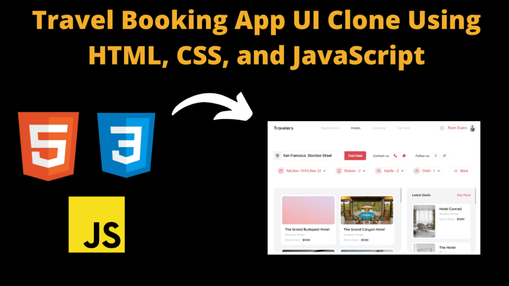
Travel Booking App UI Clone Using HTML, CSS, and JavaScript
Introduction
Hello friends, you all are welcome to this new blog post. Today we have created a beautiful project for you which is the UI of a Travel Booking App which is quite beautiful. Creating it is a very easy task. If you have even a little knowledge of coding or web technology, you can design such a UI which can be created very easily. We have used html, CSS and JavaScript to create this travel booking UI. We have made it beginners-friendly so that anyone can use it and understand its code very easily.
In this travel booking app, you can book a hotel as well as take a car on rent. You can also book camping in this way, in this way we have added some facilities to it, if you want then you can try different things in it, through which you will get knowledge of designing and coding as well. Friends, we have kept its UI very simple, in which we have created images of some hotels and a section of location to track the location, then we have created a section for content and hotel booking, so let’s understand the code now.
HTML (index.html)
Get Discount on Top Educational Courses
Friends, this is our HTML code, with the help of which we have created the structure of our travel booking app’s UI, which is going to be very easy for you because friends, we have only used images, buttons, search bar etc. with the help of HTML, adding them is a very simple task, even if you are coding for the first time, you can still use it, so let us understand the HTML code.
- First of all we have added the title of our UI for which we have used <title> element <title>Booking App UI</title>
- To link the CSS file with HTML, we have used the link tag <link rel=”stylesheet” href=”./style.css”> Make sure you have added the correct file name
- To create the UI of the travel app, we have created an important container in which all the code will be added <div class=”app-container”>
- To create the navigation, we have created a separate <div> <section class=”navigation”>
- We have added logo in navbar for which we have used <a> element <a href=”#” class=”app-link”>Travelers</a>
- We’ve created a link <div> <div class=”navigation-links”> to add the navigation menu button
- On the right side of the header we have created a separate section to change the theme mode <div class=”nav-right-side”>
- On the right side of the navigation bar, we have created a mode switch button <button class=”mode-switch”>
- We have created a button to add a profile image <button class=”profile-button”>
- We have used <span>Ryan Evans</span> tag to add the profile author name
- To add profile image we have used <img> element <img src=”…” alt=”pp”></button>
- We have created a separate section to add contact button, location etc. <section class=”app-actions”>
- First, we create the location search bar <div class=”search-wrapper”>
- We have created a button box to add the location icon <button class=”lowactive-button”>
- location ke icon ko add karne ke liye hamne svg ka istemal kiya hai <svg class=”btn-icon” xmlns=” .. ” fill=”none” stroke=”currentColor” stroke-width=”2″ stroke-linecap=”round” stroke-linejoin=”round” class=”feather feather-map-pin” viewBox=”0 0 24 24″>
- To find a hotel, we have created a button <button class=”search-btn”>Find Hotel</button>
- To create the contact button we have used <span> element <span>Contact us: </span>
Friends, I have also used other images and buttons whose process I have told you. You just need to know whether you have added the URL correctly or not, you can see the rest in the code above.
<div class="app-container">
<section class="navigation">
<a href="#" class="app-link">Travelers</a>
<div class="navigation-links">
<a href="#" class="nav-link ">Destinations</a>
<a href="#" class="nav-link active">Hotels</a>
<a href="#" class="nav-link">Camping</a>
<a href="#" class="nav-link">Car Rent</a>
</div>
<div class="nav-right-side">
<button class="mode-switch">
<svg class="sun" fill="none"><path d="M12 1v2M12 21v2M4.22 4.22l1.42 1.42M18.36 18.36l1.42 1.42M1 12h2M21 12h2M4.22 19.78l1.42-1.42M18.36 5.64l1.42-1.42" /></svg>
<svg class="moon" fill="none"><path d="M21 12.79A9 9 0 1111.21 3 7 7 0 0021 12.79z" /></svg>
</button>
<button class="profile-btn">
<span>Ryan Evans</span>
<img data-lazyloaded="1" src="data:image/svg+xml;base64,PHN2ZyB4bWxucz0iaHR0cDovL3d3dy53My5vcmcvMjAwMC9zdmciIHdpZHRoPSI1MjAwIiBoZWlnaHQ9IjM5MDIiIHZpZXdCb3g9IjAgMCA1MjAwIDM5MDIiPjxyZWN0IHdpZHRoPSIxMDAlIiBoZWlnaHQ9IjEwMCUiIHN0eWxlPSJmaWxsOiNjZmQ0ZGI7ZmlsbC1vcGFjaXR5OiAwLjE7Ii8+PC9zdmc+" decoding="async" data-src="https://images.unsplash.com/photo-1492633397843-92adffad3d1c?ixlib=rb-1.2.1&ixid=eyJhcHBfaWQiOjEyMDd9&auto=format&fit=crop&w=2167&q=80" alt="pp" width="5200" height="3902" />
</button>
</div>
</section>
<section class="app-actions">
<div class="app-actions-line">
<div class="search-wrapper">
<button class="loaction-btn">
<svg class="btn-icon" xmlns="http://www.w3.org/2000/svg" fill="none">
<path d="M21 10c0 7-9 13-9 13s-9-6-9-13a9 9 0 0118 0z" />
</svg>
</button>
<button class="search-btn">Find Hotel</button>
</div>
<div class="contact-actions-wrapper">
<div class="contact-actions">
<span>Contact us: </span>
<a href="#" class="contact-link">
<svg class="btn-icon" xmlns="http://www.w3.org/2000/svg" width="24" height="24" fill="currentColor"><path d="M22 16.92v3a2 2 0 0 1-2.18 2 19.79 19.79 0 0 1-8.63-3.07 19.5 19.5 0 0 1-6-6 19.79 19.79 0 0 1-3.07-8.67A2 2 0 0 1 4.11 2h3a2 2 0 0 1 2 1.72 12.84 12.84 0 0 0 .7 2.81 2 2 0 0 1-.45 2.11L8.09 9.91a16 16 0 0 0 6 6l1.27-1.27a2 2 0 0 1 2.11-.45 12.84 12.84 0 0 0 2.81.7A2 2 0 0 1 22 16.92z" /></svg>
</a>
<a href="#" class="contact-link">
<svg class="btn-icon" xmlns="http://www.w3.org/2000/svg" fill="currentColor">
<path d="M21 11.5a8.38 8.38 0 01-.9 3.8 8.5 8.5 0 01-7.6 4.7 8.38 8.38 0 01-3.8-.9L3 21l1.9-5.7a8.38 8.38 0 01-.9-3.8 8.5 8.5 0 014.7-7.6 8.38 8.38 0 013.8-.9h.5a8.48 8.48 0 018 8v.5z" />
</svg>
</a>
</div>
<div class="contact-actions socials">
<span>Follow us: </span>
<a href="#" class="contact-link facebook">
<svg class="btn-icon" xmlns="http://www.w3.org/2000/svg" width="24" height="24" fill="currentColor"><path d="M18 2h-3a5 5 0 0 0-5 5v3H7v4h3v8h4v-8h3l1-4h-4V7a1 1 0 0 1 1-1h3z" /></svg>
</a>
<a href="#" class="contact-link">
<svg class="btn-icon" xmlns="http://www.w3.org/2000/svg" fill="currentColor">
<path d="M23 3a10.9 10.9 0 01-3.14 1.53 4.48 4.48 0 00-7.86 3v1A10.66 10.66 0 013 4s-4 9 5 13a11.64 11.64 0 01-7 2c9 5 20 0 20-11.5a4.5 4.5 0 00-.08-.83A7.72 7.72 0 0023 3z" />
</svg>
</a>
</div>
</div>
</div>
<div class="app-actions-line filter-line">
<div class="filter-action-buttons">
<button class="filter-btn">
<div class="filter-icon">
<svg class="btn-icon" xmlns="http://www.w3.org/2000/svg" width="24" height="24" fill="none"></svg>
</div>
<span class="filter-text">Sat,Nov 10-Fri,Nov 22</span>
</button>
<button class="filter-btn">
<div class="filter-icon">
<svg class="btn-icon" xmlns="http://www.w3.org/2000/svg" width="24" height="24" fill="none"><path d="M4 19.5A2.5 2.5 0 0 1 6.5 17H20" /><path d="M6.5 2H20v20H6.5A2.5 2.5 0 0 1 4 19.5v-15A2.5 2.5 0 0 1 6.5 2z" /></svg>
</div>
<span class="filter-text">Rooms - 2</span>
</button>
<button class="filter-btn">
<div class="filter-icon">
<svg class="btn-icon" xmlns="http://www.w3.org/2000/svg" fill="none">
<path d="M17 21v-2a4 4 0 00-4-4H5a4 4 0 00-4 4v2" />
<path d="M23 21v-2a4 4 0 00-3-3.87M16 3.13a4 4 0 010 7.75" />
</svg>
</div>
<span class="filter-text">Adults - 2</span>
</button>
<button class="filter-btn">
<div class="filter-icon">
<svg class="btn-icon" xmlns="http://www.w3.org/2000/svg" fill="none">
<path d="M17 21v-2a4 4 0 00-4-4H5a4 4 0 00-4 4v2" />
<path d="M23 21v-2a4 4 0 00-3-3.87M16 3.13a4 4 0 010 7.75" />
</svg>
</div>
<span class="filter-text">Child - 1</span>
</button>
<button class="filter-btn more">
<div class="filter-icon">
<svg class="btn-icon" xmlns="http://www.w3.org/2000/svg" fill="none">
<path d="M4 21v-7M4 10V3M12 21v-9M12 8V3M20 21v-5M20 12V3M1 14h6M9 8h6M17 16h6" />
</svg>
</div>
<span class="filter-text">More</span>
</button>
</div>
</div>
</section>
<section class="app-main">
<div class="app-main-left cards-area">
<div class="card-wrapper main-card">
<a class="card cardItemjs">
<div class="card-image-wrapper">
<img data-lazyloaded="1" src="data:image/gif;base64,R0lGODdhAQABAPAAAMPDwwAAACwAAAAAAQABAAACAkQBADs=" decoding="async" data-src="https://source.unsplash.com/featured/1200x900/?sculpture,hotel" alt="Hotel">
</div>
<div class="card-info">
<div class="card-text big cardText-js">The Grand Budapest Hotel</div>
<div class="card-text small">Stockton Street</div>
<div class="card-text small">
Starts from:
<span class="card-price"> $1000</span>
</div>
</div>
</a>
</div>
<div class="card-wrapper main-card">
<a class="card cardItemjs">
<div class="card-image-wrapper">
<img data-lazyloaded="1" src="data:image/gif;base64,R0lGODdhAQABAPAAAMPDwwAAACwAAAAAAQABAAACAkQBADs=" decoding="async" data-src="https://source.unsplash.com/featured/1200x900/?architecture,hotel" alt="Hotel">
</div>
<div class="card-info">
<div class="card-text big cardText-js">The Grand Canyon Hotel</div>
<div class="card-text small">Stockton Street</div>
<div class="card-text small">
Starts from:
<span class="card-price"> $1500</span>
</div>
</div>
</a>
</div>
<div class="card-wrapper main-card">
<a class="card cardItemjs">
<div class="card-image-wrapper">
<img data-lazyloaded="1" src="data:image/gif;base64,R0lGODdhAQABAPAAAMPDwwAAACwAAAAAAQABAAACAkQBADs=" decoding="async" data-src="https://source.unsplash.com/featured/1200x900/?hotel-room,hotel" alt="Hotel">
</div>
<div class="card-info">
<div class="card-text big cardText-js">The Beakman Spa Hotel</div>
<div class="card-text small">Stockton Street</div>
<div class="card-text small">
Starts from:
<span class="card-price"> $1300</span>
</div>
</div>
</a>
</div>
<div class="card-wrapper main-card">
<a class="card cardItemjs">
<div class="card-image-wrapper">
<img data-lazyloaded="1" src="data:image/gif;base64,R0lGODdhAQABAPAAAMPDwwAAACwAAAAAAQABAAACAkQBADs=" decoding="async" data-src="https://source.unsplash.com/featured/1200x900/?hotel,design" alt="Hotel">
</div>
<div class="card-info">
<div class="card-text big cardText-js">Paloma Hotel & Spa</div>
<div class="card-text small">Stockton Street</div>
<div class="card-text small">
Starts from:
<span class="card-price"> $700</span>
</div>
</div>
</a>
</div>
<div class="card-wrapper main-card">
<a class="card cardItemjs">
<div class="card-image-wrapper">
<img data-lazyloaded="1" src="data:image/gif;base64,R0lGODdhAQABAPAAAMPDwwAAACwAAAAAAQABAAACAkQBADs=" decoding="async" data-src="https://source.unsplash.com/featured/1200x900/?interior,design" alt="Hotel">
</div>
<div class="card-info">
<div class="card-text big cardText-js">The Golden Hours Hotel</div>
<div class="card-text small">Stockton Street</div>
<div class="card-text small">
Starts from:
<span class="card-price"> $700</span>
</div>
</div>
</a>
</div>
<div class="card-wrapper main-card">
<a class="card cardItemjs">
<div class="card-image-wrapper">
<img data-lazyloaded="1" src="data:image/gif;base64,R0lGODdhAQABAPAAAMPDwwAAACwAAAAAAQABAAACAkQBADs=" decoding="async" data-src="https://source.unsplash.com/featured/1200x900/?interior,architecture" alt="Hotel">
</div>
<div class="card-info">
<div class="card-text big cardText-js">The Daydream Hotel & Spa</div>
<div class="card-text small">Stockton Street</div>
<div class="card-text small">
Starts from:
<span class="card-price"> $1250</span>
</div>
</div>
</a>
</div>
<div class="card-wrapper main-card">
<a class="card cardItemjs">
<div class="card-image-wrapper">
<img data-lazyloaded="1" src="data:image/gif;base64,R0lGODdhAQABAPAAAMPDwwAAACwAAAAAAQABAAACAkQBADs=" decoding="async" data-src="https://source.unsplash.com/featured/1200x900/?interior,modern" alt="Hotel">
</div>
<div class="card-info">
<div class="card-text big cardText-js">The Harmony Hotel</div>
<div class="card-text small">Stockton Street</div>
<div class="card-text small">
Starts from:
<span class="card-price"> $500</span>
</div>
</div>
</a>
</div>
<div class="card-wrapper main-card">
<a class="card cardItemjs">
<div class="card-image-wrapper">
<img data-lazyloaded="1" src="data:image/gif;base64,R0lGODdhAQABAPAAAMPDwwAAACwAAAAAAQABAAACAkQBADs=" decoding="async" data-src="https://source.unsplash.com/featured/1200x900/?architecture,modern" alt="Hotel">
</div>
<div class="card-info">
<div class="card-text big cardText-js">The Hotel Star Pasific</div>
<div class="card-text small">Stockton Street</div>
<div class="card-text small">
Starts from:
<span class="card-price"> $1400</span>
</div>
</div>
</a>
</div>
<div class="card-wrapper main-card">
<a class="card cardItemjs">
<div class="card-image-wrapper">
<img data-lazyloaded="1" src="data:image/gif;base64,R0lGODdhAQABAPAAAMPDwwAAACwAAAAAAQABAAACAkQBADs=" decoding="async" data-src="https://source.unsplash.com/featured/1200x900/?hotel,modern" alt="Hotel">
</div>
<div class="card-info">
<div class="card-text big cardText-js">Hotel Roller Coaster </div>
<div class="card-text small">Stockton Street</div>
<div class="card-text small">
Starts from:
<span class="card-price"> $1800</span>
</div>
</div>
</a>
</div>
</div>
<div class="app-main-right cards-area">
<div class="app-main-right-header">
<span>Latest Deals</span>
<a href="#">See More</a>
</div>
<div class="card-wrapper main-card">
<a class="card cardItemjs">
<div class="card-image-wrapper">
<img data-lazyloaded="1" src="data:image/gif;base64,R0lGODdhAQABAPAAAMPDwwAAACwAAAAAAQABAAACAkQBADs=" decoding="async" data-src="https://source.unsplash.com/featured/1200x900/?hotel-room,interior">
</div>
<div class="card-info">
<div class="card-text big cardText-js">Hotel Conrad</div>
<div class="card-text small">Stockton Street</div>
<div class="card-text small">
Starts from:
<span class="card-price"> $1000</span>
</div>
</div>
</a>
</div>
<div class="card-wrapper main-card">
<a class="card cardItemjs">
<div class="card-image-wrapper">
<img data-lazyloaded="1" src="data:image/gif;base64,R0lGODdhAQABAPAAAMPDwwAAACwAAAAAAQABAAACAkQBADs=" decoding="async" data-src="https://source.unsplash.com/featured/1200x900/?interior,hotel">
</div>
<div class="card-info">
<div class="card-text big cardText-js">The Hotel Riviera</div>
<div class="card-text small">Stockton Street</div>
<div class="card-text small">
Starts from:
<span class="card-price"> $300</span>
</div>
</div>
</a>
</div>
<div class="card-wrapper main-card">
<a class="card cardItemjs">
<div class="card-image-wrapper">
<img data-lazyloaded="1" src="data:image/gif;base64,R0lGODdhAQABAPAAAMPDwwAAACwAAAAAAQABAAACAkQBADs=" decoding="async" data-src="https://source.unsplash.com/featured/1200x900/?architecture,modern">
</div>
<div class="card-info">
<div class="card-text big cardText-js">The Hotel Star Pasific</div>
<div class="card-text small">Stockton Street</div>
<div class="card-text small">
Starts from:
<span class="card-price"> $1400</span>
</div>
</div>
</a>
</div>
<div class="card-wrapper main-card">
<a class="card cardItemjs">
<div class="card-image-wrapper">
<img data-lazyloaded="1" src="data:image/gif;base64,R0lGODdhAQABAPAAAMPDwwAAACwAAAAAAQABAAACAkQBADs=" decoding="async" data-src="https://source.unsplash.com/featured/1200x900/?hotel,modern">
</div>
<div class="card-info">
<div class="card-text big cardText-js">Hotel Instant Destiny </div>
<div class="card-text small">Stockton Street</div>
<div class="card-text small">
Starts from:
<span class="card-price"> $1800</span>
</div>
</div>
</a>
</div>
<div class="card-wrapper main-card">
<a class="card cardItemjs">
<div class="card-image-wrapper">
<img data-lazyloaded="1" src="data:image/gif;base64,R0lGODdhAQABAPAAAMPDwwAAACwAAAAAAQABAAACAkQBADs=" decoding="async" data-src="https://source.unsplash.com/featured/1200x900/?architecture,modern" alt="Hotel">
</div>
<div class="card-info">
<div class="card-text big cardText-js">The White Roses Hotel</div>
<div class="card-text small">Stockton Street</div>
<div class="card-text small">
Starts from:
<span class="card-price"> $700</span>
</div>
</div>
</a>
</div>
<div class="card-wrapper main-card">
<a class="card cardItemjs">
<div class="card-image-wrapper">
<img data-lazyloaded="1" src="data:image/gif;base64,R0lGODdhAQABAPAAAMPDwwAAACwAAAAAAQABAAACAkQBADs=" decoding="async" data-src="https://source.unsplash.com/featured/1200x900/?hotel,modern" alt="Hotel">
</div>
<div class="card-info">
<div class="card-text big cardText-js">Hotel Tom's Dinner</div>
<div class="card-text small">Stockton Street</div>
<div class="card-text small">
Starts from:
<span class="card-price"> $1500</span>
</div>
</div>
</a>
</div>
</div>
</section>
</div>
<div id="modal-window" class="shadow">
<div class="main-modal">
<div class="modal-left">
<div class="modal-image-wrapper">
<img data-lazyloaded="1" src="data:image/gif;base64,R0lGODdhAQABAPAAAMPDwwAAACwAAAAAAQABAAACAkQBADs=" decoding="async" data-src="https://source.unsplash.com/featured/1200x900/?design,hotel">
</div>
<div class="modal-info-header">
<div class="left-side">
<h1 class="modalHeader-js"></h1>
<p>Stockton Street</p>
</div>
<div class="right-side">
Starts from:
<span class="amount">$1000</span>
</div>
</div>
<div class="info-bar">
<div class="info-wrapper">
<div class="info-icon">
<svg class="btn-icon" xmlns="http://www.w3.org/2000/svg" width="24" height="24" fill="none"><path d="M4 19.5A2.5 2.5 0 0 1 6.5 17H20"></path><path d="M6.5 2H20v20H6.5A2.5 2.5 0 0 1 4 19.5v-15A2.5 2.5 0 0 1 6.5 2z"></path></svg>
</div>
<span>2 Bedrooms</span>
</div>
<div class="info-wrapper">
<div class="info-icon">
<svg class="btn-icon" xmlns="http://www.w3.org/2000/svg" width="24" height="24" fill="none"><path d="M9.59 4.59A2 2 0 1 1 11 8H2m10.59 11.41A2 2 0 1 0 14 16H2m15.73-8.27A2.5 2.5 0 1 1 19.5 12H2" /></svg>
</div>
<span>2 Bathrooms</span>
</div>
<div class="info-wrapper">
<div class="info-icon">
<svg class="btn-icon" xmlns="http://www.w3.org/2000/svg" width="24" height="24" fill="none"></svg>
</div>
<span>1250m2</span>
</div>
<div class="info-wrapper">
<div class="info-icon">
<svg class="btn-icon" xmlns="http://www.w3.org/2000/svg" width="24" height="24" fill="none"><path d="M12 22s8-4 8-10V5l-8-3-8 3v7c0 6 8 10 8 10z" /></svg>
</div>
<span>Highly Secured</span>
</div>
</div>
<div class="desc-wrapper">
<div class="modal-info-header">
<h1>Description</h1>
<p>
Lorem ipsum dolor sit amet, consectetur adipiscing elit, sed do eiusmod tempor incididunt ut labore et dolore magna aliqua. Ut enim ad minim veniam, quis nostrud exercitation ullamco laboris nisi ut aliquip ex ea commodo consequat. Duis aute irure dolor in reprehenderit in voluptate velit esse cillum dolore eu fugiat nulla pariatur.
</p>
</div>
<div class="desc-actions">
<button class="btn-book">Book Now</button>
<div class="add-favourite">
<label for="favourite">
<span class="favourite-icon">
<svg class="btn-icon" xmlns="http://www.w3.org/2000/svg" width="24" height="24" fill="none"><path d="M20.84 4.61a5.5 5.5 0 0 0-7.78 0L12 5.67l-1.06-1.06a5.5 5.5 0 0 0-7.78 7.78l1.06 1.06L12 21.23l7.78-7.78 1.06-1.06a5.5 5.5 0 0 0 0-7.78z" /></svg>
</span>
<span>Add to favourites</span>
</label>
</div>
</div>
</div>
</div>
<div class="modal-right">
<div class="app-main-right-header">
<span>Reviews</span>
<a href="#">See All</a>
</div>
<div class="card-wrapper">
<div class="card">
<div class="profile-info-wrapper">
<div class="profile-img-wrapper">
<img data-lazyloaded="1" src="data:image/gif;base64,R0lGODdhAQABAPAAAMPDwwAAACwAAAAAAQABAAACAkQBADs=" decoding="async" data-src="https://source.unsplash.com/featured/1200x900/?woman,cool" alt="Review">
</div>
<p>Jessica Finnick</p>
</div>
<p>Lorem ipsum dolor sit amet, consectetur adipiscing elit, sed do eiusmod tempor incididunt ut labore et dolore magna aliqua. Ut enim ad minim veniam, quis nostrud exercitation ullamco laboris</p>
</div>
</div>
<div class="card-wrapper">
<div class="card">
<div class="profile-info-wrapper">
<div class="profile-img-wrapper">
<img data-lazyloaded="1" src="data:image/gif;base64,R0lGODdhAQABAPAAAMPDwwAAACwAAAAAAQABAAACAkQBADs=" decoding="async" data-src="https://source.unsplash.com/featured/1200x900/?woman,latina" alt="Review">
</div>
<p>Gloria Ramirez</p>
</div>
<p>Lorem ipsum dolor sit amet, consectetur adipiscing elit, sed do eiusmod tempor incididunt ut labore et dolore magna aliqua. Ut enim ad minim veniam, quis nostrud exercitation ullamco laboris</p>
</div>
</div>
<div class="card-wrapper">
<div class="card">
<div class="profile-info-wrapper">
<div class="profile-img-wrapper">
<img data-lazyloaded="1" src="data:image/gif;base64,R0lGODdhAQABAPAAAMPDwwAAACwAAAAAAQABAAACAkQBADs=" decoding="async" data-src="https://source.unsplash.com/featured/1200x900/?man,art" alt="Review">
</div>
<p>Luck Besson</p>
</div>
<p>Lorem ipsum dolor sit amet, consectetur adipiscing elit, sed do eiusmod tempor incididunt ut labore et dolore magna aliqua. Ut enim ad minim veniam, quis nostrud exercitation ullamco laboris</p>
</div>
</div>
<div class="card-wrapper">
<div class="card">
<div class="profile-info-wrapper">
<div class="profile-img-wrapper">
<img data-lazyloaded="1" src="data:image/gif;base64,R0lGODdhAQABAPAAAMPDwwAAACwAAAAAAQABAAACAkQBADs=" decoding="async" data-src="https://source.unsplash.com/featured/1200x900/?woman,adventure" alt="Review">
</div>
<p>Luna Rosa</p>
</div>
<p>Lorem ipsum dolor sit amet, consectetur adipiscing elit, sed do eiusmod tempor incididunt ut labore et dolore magna aliqua. Ut enim ad minim veniam, quis nostrud exercitation ullamco laboris</p>
</div>
</div>
<div class="card-wrapper">
<div class="card">
<div class="profile-info-wrapper">
<div class="profile-img-wrapper">
<img data-lazyloaded="1" src="data:image/gif;base64,R0lGODdhAQABAPAAAMPDwwAAACwAAAAAAQABAAACAkQBADs=" decoding="async" data-src="https://source.unsplash.com/featured/1200x900/?man,modern" alt="Review">
</div>
<p>John mayer</p>
</div>
<p>Lorem ipsum dolor sit amet, consectetur adipiscing elit, sed do eiusmod tempor incididunt ut labore et dolore magna aliqua. Ut enim ad minim veniam, quis nostrud exercitation ullamco laboris</p>
</div>
</div>
<div class="card-wrapper">
<div class="card">
<div class="profile-info-wrapper">
<div class="profile-img-wrapper">
<img data-lazyloaded="1" src="data:image/gif;base64,R0lGODdhAQABAPAAAMPDwwAAACwAAAAAAQABAAACAkQBADs=" decoding="async" data-src="https://source.unsplash.com/featured/1200x900/?woman" alt="Review">
</div>
<p>Tina Finnick</p>
</div>
<p>Lorem ipsum dolor sit amet, consectetur adipiscing elit, sed do eiusmod tempor incididunt ut labore et dolore magna aliqua. Ut enim ad minim veniam, quis nostrud exercitation ullamco laboris</p>
</div>
</div>
<div class="card-wrapper">
<div class="card">
<div class="profile-info-wrapper">
<div class="profile-img-wrapper">
<img data-lazyloaded="1" src="data:image/gif;base64,R0lGODdhAQABAPAAAMPDwwAAACwAAAAAAQABAAACAkQBADs=" decoding="async" data-src="https://source.unsplash.com/featured/1200x900/?woman,modern" alt="Review">
</div>
<p>July Wallock</p>
</div>
<p>Lorem ipsum dolor sit amet, consectetur adipiscing elit, sed do eiusmod tempor incididunt ut labore et dolore magna aliqua. Ut enim ad minim veniam, quis nostrud exercitation ullamco laboris</p>
</div>
</div>
</div>
<button class="btn btn-close">
<svg xmlns="http://www.w3.org/2000/svg" width="32" height="32" fill="none" class="feather feather-x"></svg>
</button>
</div>
</div>
let ini= document.querySelector('#modal-window');
ini.classList.add("hideModal");
CSS (Style.css)
Friends, now we are going to explain the CSS code with the help of which we have designed our UI, like color background etc. Friends, if you have a good knowledge of CSS, then you can also add things like animation or hover effect, which will make your UI look even better, so let’s go now, let’s understand our code.
- First we have imported our font via URL @import URL(‘https://fonts.google.com/cuss2?family=Quicksand:Waght@400;500;600&display=swap’);
- The box sizing of the body has been made border-box so that the height, width and border etc. are set box-sizing: border-box;
- We have added both dark mode and light mode in our UI, in whose background we have used this color background-color: var(–chat-background);
- In the mode swicth button we have not kept outline outline: none; and have added cursor cursor: pointer; also have used shadow to make the look of button better box-shadow: var(–navigation-box-shadow);
- We have added svg icon in the mode switch button in which we have used height like this height: 24px; also we have used transition transition: all .3s ease-in;
- We have created an app container in the navigation menu in which we have made the items flex display: flex; and also made the direction column flex-direction: column;
- In the navigation bar we have applied padding: 24px 40px; and centered the item and content by flexing the display justify-content: space-between; align-items: center;
- Then we have added font weight in the app link font-weight: 600; and the font size is kept like this font-size: 20px; line height is used to create gap in the text line-height: 24px;
- We have kept the width of the navigation link width: 60%; and added some space in the link justify-content: space-between;
- We have applied hover effect on navlink in which we have set this color in active color: var(–main-font-color); and on hover we have set this color color: var(–buttons-color-primary);
- In profile button we have added border border: 1ps solid var(–secondary-border-color); also we have rounded the border border-radius: 20ps;
- We have created an app section inside the section and we have used padding padding: 32ps 40ps 0 40ps;
- In the location button we have set the padding to 0 padding: 0; and added a border border: 1px solid var(–main-border-color); along with this we have used display: flex; so that we can do align-items: center; or justify-content: center;
- In the background of the search button we have added some color like this background-color: var(–buttons-color-primary); and have used padding padding: 10px 16px;
- In the contact action button we have used flex display: flex; or align-items: center; and we have used margin from left margin-left: 32px;
- In filter text we have used display: block; and to prevent the text from overflowing we have used overflow: hidden; We have also added padding in it padding: 0 24px 0 8px;
- In cards area we have used black color in background background-color: var(–cards-area-bg); also we have added padding padding: 24px; and overflow-y: auto; so that user can scroll
- We have wrapped the left side item in the UI like this: we have added flex-wrap: wrap; and flex: 4;
- In card box we have set the height as Height: 160px; you can set it as per your requirement
- We have used some color in the background of the card background-color: var(–cards-bg); and to prevent it from overflowing, we have used overflow: hidden; in the card section
- We’ve applied a hover effect to the cards so that they scale on hover. transform: scale(1.02);
- Then we have also used Keyframe to add more animations, with the help of which you can add good animations @Keyframe
- To make the website UI responsive, we have used media query so that our UI can work on all devices @media screen and (max-width: 660px)
					@import url('https://fonts.googleapis.com/css2?family=Quicksand:wght@400;500;600&display=swap');

* {
  box-sizing: border-box;
  outline: none;
}

:root {
  font-family: 'Quicksand', sans-serif;
  --app-bg: #fff;
  --modal-before: rgba(215,215,215,.5);
  --main-font-color: #000;
  --light-font-color: #becaca;
  --main-border-color:  #f3f3f3;
  --secondary-border-color: #faeceb;
  --button-bg-light: #f3f3f3;
  --cards-area-bg: #f4f4f6;
  --cards-bg: #fff;
  --buttons-color-primary: #d84851;
  --buttons-color-secondary: #f8e4e5;
  --filter-bg: #fff;
  --search-bg: #fff;
}

.dark:root {
  --app-bg: #0c0c0c;
  --main-font-color: #fff;
  --cards-area-bg: #20222a;
  --cards-bg: #111317;
  --filter-bg: #111317;
  --search-bg: #20222a;
  --modal-before: rgba(0, 0, 0, .8);
}

.nav-right-side {
  display: flex;
}

.mode-switch  {
  flex-shrink: 0;
  padding: 0;
  background-color: var(--chat-background);
  border: none;
  color: #ddd;
  outline: none;
  cursor: pointer;
  box-shadow: var(--navigation-box-shadow);
  border-radius: 50%;
  display: flex;
  justify-content: center;
  align-items: center;
  width: 36px;
  height: 36px;
  transform-origin: center;

  svg {
    width:0;
    height: 24px;
    transition: all .3s ease-in;
    transform-origin: center;
  }

  .moon { opacity: 0; }
  .sun { width: 24px; }
}

.dark .moon {
  opacity: 1;
  width: 24px;
}

.dark .sun {
  opacity: 0;
  width: 0;
}

body, html {
  width: 100%;
  height: 100%;
  margin: 0;
  padding: 0;
  overflow: hidden;
  background-color: var(--app-bg);
  transition: .2s;
}

a {
  text-decoration: none;
}

button, a { cursor: pointer; }

.app-container {
  display: flex;
  flex-direction: column;
  width: 100%;
  height: 100%;
}

.navigation {
  padding: 24px 40px;
  display: flex;
  justify-content: space-between;
  align-items: center;
}

.app-link {
  font-weight: 600;
  font-size: 20px;
  color: var(--main-font-color);
  line-height: 24px;
}

.navigation-links {
  width: 60%;
  display: flex;
  justify-content: space-between;
  max-width: 420px;
}

.nav-link {
  color: var(--light-font-color);
  font-weight: 500;
  font-size: 14px;
  margin: 0 8px;
  transition: .2s;

  &.active {
    color: var(--main-font-color);
  }

  &:not(.active):hover {
    color: var(--buttons-color-primary);
  }
}

.profile-btn {
  border: 1px solid var(--secondary-border-color);
  background-color: transparent;
  border-radius: 20px;
  padding: 0;
  display: flex;
  justify-content: space-between;
  align-items: center;
  transition: .2s;

  .dark & {
    background-color: var(--cards-area-bg);
    border-color: var(--cards-area-bg);
  }

  &:hover {
    border-color: var(--buttons-color-primary);
  }

  span {
    padding: 0 8px;
    font-weight: 500;
    color: var(--buttons-color-primary);
  }

  img{
    width: 32px;
    height: 32px;
    border-radius: 50%;
    object-fit: cover;
  }
}

section.app-actions {
  padding: 32px 40px 0 40px;
}

.btn-icon {
  width: 16px;
}

.search-wrapper {
  border: none;
  display: flex;
  justify-content: space-between;
  border-radius: 6px;
  max-width: 420px;
  width: 100%;
  overflow: hidden;
  height: 40px;
}

.search-input {
  border-radius: 0;
  appearance: none;
  box-shadow: none;
  border-left: none;
  border-right: none;
  background-color: var( --search-bg);
  flex: 1;
  border: 1px solid var(--main-border-color);
  padding: 0 8px;
  font-size: 16px;
  font-weight: 500;
  white-space: nowrap;
  overflow: hidden;
  text-overflow: ellipsis;
  width: 100%;

  .dark & {
    border-color: var( --search-bg);
    color: #fff;
  }
}

.loaction-btn {
  padding: 0;
  border: 1px solid var(--main-border-color);
  background-color: var(--button-bg-light);
  padding: 8px;
  display: flex;
  justify-content: center;
  align-items: center;

  .dark & {
   border: none;
    background-color: var( --search-bg);
  }
}

.dark .loaction-btn .btn-icon {
   color: #fff;
}

.search-btn {
  background-color: var(--buttons-color-primary);
  color: #fff;
  border: 1px solid var(--buttons-color-primary);
  padding: 10px 16px;
  font-size: 14px;

  .dark & {
   border: none;
  }
}

.app-actions-line {
  display: flex;
  align-items: center;
  margin: 32px 0;
}

.contact-actions {
  display: flex;
  align-items: center;
  margin-left: 32px;

  span {
    display: block;
    font-size: 14px;
    line-height: 16px;
    font-weight: 500;
    margin-right: 8px;

    .dark & { color: #fff; }
  }

  &.socials .contact-link {
    color: #b9b9b9;
  }
}

.contact-link {
  border: 1px solid var(--main-border-color);
  border-radius: 8px;
  width: 32px;
  height: 32px;
  display: flex;
  align-items: center;
  justify-content: center;
  color: var(--buttons-color-primary);
  margin: 0 4px;
  flex-shrink: 0;
}

.filter-btn {
  background-color: transparent;
  border: 1px solid var(--main-border-color);
  display: flex;
  align-items: center;
  border-radius: 20px;
  padding: 0;
  padding-right: 8px;
  margin: 0 16px;
  color: var(--buttons-color-primary);
  position: relative;

  .dark & {
    border-color: var(--cards-area-bg);
    background-color: var(--cards-area-bg);
  }

  &.more {
    padding: 0 12px;
    span {
      color: var(--buttons-color-primary);
      padding: 0 4px;

      &:before {
        display: none;
      }
    }

    .filter-icon {
      background-color: transparent;
    }
  }
}

.filter-text {
  display: block;
  white-space: nowrap;
  overflow: hidden;
  text-overflow: ellipsis;
  max-width: 200px;
  padding: 0 24px 0 8px;
  position: relative;

  &:before {
    content: '';
    position: absolute;
    width: 16px;
    height: 16px;
    right: 0;
    top: 50%;
    transform: translatey(-50%);
    background-image: url("data:image/svg+xml,%3Csvg xmlns='http://www.w3.org/2000/svg' width='24' height='24' viewBox='0 0 24 24' fill='none' stroke='currentColor' stroke-width='2' stroke-linecap='round' stroke-linejoin='round' class='feather feather-chevron-down'%3E%3Cpolyline points='6 9 12 15 18 9'/%3E%3C/svg%3E");
    background-repeat: no-repeat;
    background-position: center;
    background-size: cover;
  }

  .dark & {
    &:before {
      background-image: url("data:image/svg+xml,%3Csvg xmlns='http://www.w3.org/2000/svg' width='24' height='24' viewBox='0 0 24 24' fill='none' stroke='%23fff' stroke-width='2' stroke-linecap='round' stroke-linejoin='round' class='feather feather-chevron-down'%3E%3Cpolyline points='6 9 12 15 18 9'/%3E%3C/svg%3E");
    }
  }
}

.filter-icon {
  background-color: var(--buttons-color-secondary);
  border-radius: 50%;
  color: var(--buttons-color-primary);
  width: 32px;
  height: 32px;
  display: flex;
  justify-content: center;
  align-items: center;
}

.filter-line-text {
  font-size: 14px;
  font-weight: 600;
  margin-right: 32px;
  color: var(--main-font-color);
}

.app-main {
  flex: 1;
  overflow: hidden;
  padding: 24px 40px;
  display: flex;
  justify-content: space-between;
}

.cards-area {
  background-color: var(--cards-area-bg);
  padding: 24px;
  height: 100%;
  overflow-y: auto;
  border-radius: 20px;
}

.app-main-left {
  flex: 4;
  display: flex;
  flex-wrap: wrap;
}

.app-main-right {
  flex: 2;
  margin-left: 24px;
  max-width: 400px;

  .card-image-wrapper {
    max-height: 100%;
    padding: 0;
    height: 100%;
  }

  .card {
    height: 160px;
  }

  .card-image-wrapper img {
    margin: 0;
  }
}

.card-wrapper {
  width: 33.3%;
  height: auto;
  padding: 8px;
}

.card {
  background-color: var(--cards-bg);
  border: 3px solid var(--cards-bg);
  border-radius: 10px;
  overflow: hidden;
  display: block;
  transition: transform .2s;

  &:hover {
    transform: scale(1.02);
  }
}

.card-image-wrapper {
  max-height: 40%;
  border-radius: 10px;
  overflow: hidden;
  border: 3px solid var(--cards-bg);
  overflow: hidden;
  height: 0;
  padding-top: calc(591.44 / 1127.34 * 100%);
  background-color: #FAACA8;
  background-image: linear-gradient(19deg, #FAACA8 0%, #DDD6F3 100%);

  img {
    width: 100%;
    object-fit: cover;
    z-index: 1;
    position: relative;
    z-index: 1;
    position: relative;
    margin-top: -60.25%;
  }
}

.card-info {
  background-color: var(--cards-bg);
  padding: 8px 16px;
}

.card-text {
  line-height: 24px;

  &.big {
    font-size: 16px;
    font-weight: 600;
    color: var(--main-font-color);
  }

  &.small {
    font-size: 12px;
    color: var(--light-font-color);
    font-weight: 600;

    span {
      font-size: 12px;
      color: var(--main-font-color);
      font-weight: 600;
      display: inline-block;
      margin-left: 8px;
    }
  }
}

.app-main-right-header {
  display: flex;
  justify-content: space-between;
  align-items: center;
  padding: 16px 0;
  color: var(--main-font-color);
  background-color: var(--cards-area-bg);

  span {
    font-size: 24px;
    line-height: 32px;
    font-weight: 600;
  }

  a {
    font-size: 14px;
    color: var(--buttons-color-primary);
    font-weight: 600;
  }
}

.app-main-right {
  position: relative;
  padding-top: 0;

  .card-wrapper {
    width: 100%;
    padding:  8px 0;
  }

  .card {
    display: flex;
  }

  .card-image-wrapper {
    flex-basis: 40%;
    flex-shrink: 0;

    img {
      height: 100%;
    }
  }
}


.main-modal {
  width: 98%;
  max-width: 1200px;
  height: 90%;
  background: var(--app-bg);
  border-radius: 20px;
  position: relative;
  display: flex;
  padding: 32px;
}

.btn-close {
  border: none;
  background-color: transparent;
  position: absolute;
  right: 4px;
  top: 4px;
  padding: 0;
  color: #b9b9b9;
}

.hideModal{
  z-index:-1;
  opacity:0;
  animation: hide .25s;
  transform: scale(0);
}

@keyframes hide {
  from {
    z-index:2;
    transform: scale(1);
    opacity:1;
  }

  to {
    z-index:-1;
    transform: scale(0);
    opacity: 0;
  }
}

.showModal {
  top: 0;
  left: 0;
  opacity:1;
  z-index:2;
  animation: show .2s;
  transform: scale(1);
  position: fixed;
  display: flex;
  justify-content: center;
  width: 100%;
  padding-top: 56px;
  background-color: var(--modal-before);
  width: 100%;
  height: 100%;
}

@keyframes show {
  from {
    transform: scale(0);
    opacity:0;
    z-index:-1;
  }
  to{
    transform: scale(1);
    opacity: 1;
    z-index:2;
  }
}

.modal-image-wrapper {
  border-radius: 20px;
  overflow: hidden;
  max-height: 50%;

  img {
    width: 100%;
    height: auto;
    object-fit: cover;
  }
}

.modal-left {
  flex: 5;
  overflow-y: auto;
}

.modal-image-wrapper {
  margin-bottom: 24px;
}

.modal-info-header {
  display: flex;
  justify-content: space-between;
  align-items: flex-start;
}

.left-side {
  h1 {
    margin: 0;
    font-size: 24px;
    line-height: 32px;
    color: var(--main-font-color);
  }

  p {
    color: var(--light-font-color);
    font-size: 16px;
    line-height: 24px;
  }
}

.right-side {
  color: var(--main-font-color);

  span {
    display: inline-block;
    font-weight: 500;
    font-size: 16px;
    line-height: 32px;
  }
}

.info-wrapper {
  display: flex;
  align-items: center;
  flex-wrap: wrap;

  span {
    display: block;
    font-weight: 500;
    font-size: 14px;
    color: var(--main-font-color);
  }
}

.info-bar {
  display: flex;
  justify-content: space-between;
}

.info-icon {
  background-color: var(--buttons-color-secondary);
  border-radius: 50%;
  color: var(--buttons-color-primary);
  width: 32px;
  height: 32px;
  display: flex;
  justify-content: center;
  align-items: center;
  margin-right: 12px;
  flex-shrink: 0;
}

.desc-wrapper {
  .modal-info-header {
    margin-top: 24px;
    flex-direction: column;
  }

  h1 {
    font-size: 24px;
    margin: 0;
    line-height: 32px;
    color: var(--main-font-color);
  }

  p {
    color: var(--light-font-color);
  }
}

.desc-actions {
  display: flex;
  align-items: center;
  margin-top: 32px;
}

.btn-book {
  background-color: var(--buttons-color-primary);
  color: #fff;
  border: none;
  border-radius: 6px;
  font-size: 16px;
  margin-right: 32px;
  padding: 10px;
  font-size: 14px;
  min-width: 120px;
}

.add-favourite {
  display: flex;
  align-items: center;
}

.add-favourite input {
  width: 0;
  height: 0;
  opacity: 0;
  position: absolute;

  &:checked + label {
    color: var(--buttons-color-primary);

    .btn-icon {
      transition: .2s;
      color: var(--buttons-color-primary);
      fill: var(--buttons-color-primary);
    }
  }
}

.add-favourite label {
  cursor: pointer;
  color: var(--light-font-color);
  font-size: 14px;
  line-height: 24px;
  font-weight: 500;
  display: flex;
  align-items: center;

  span {
    display: flex;
    margin-right: 4px;
  }
}

.modal-right {
  background-color: var(--cards-area-bg);
  height: 100%;
  overflow-y: auto;
  border-radius: 20px;
  padding: 0 16px;
  flex: 3;
  max-width: 320px;
  margin-left: 16px;

  .card-wrapper {
    width: 100%;
    padding: 8px 0;
  }

  .card > p {
    font-size: 12px;
    line-height: 16px;
    color: var(--light-font-color);
    margin: 0;
  }

   .card {
    padding: 8px;

     &:hover {
       transform: scale(1);
     }

    .profile-info-wrapper {
      display: flex;
      align-items: flex-start;
      margin-bottom: 16px;

      p {
        font-size: 12px;
        line-height: 16px;
        color: var(--main-font-color);
        margin: 0;
        font-weight: 600;
      }
    }
  }
}

.profile-img-wrapper {
  width: 32px;
  height: 32px;
  overflow: hidden;
  border-radius: 8px;
  flex-shrink: 0;
  margin-right: 12px;

  img {
    width: 100%;
    height: 100%;
    object-fit: cover;
  }
}

.contact-actions-wrapper {
  display: flex;
}

.filter-action-buttons {
  display: flex;
  overflow-x: auto;
  position: relative;

  button {
    margin-bottom: 4px;
  }
}

.filter-line {
  align-items: flex-start;
}

@media screen and (max-width: 1020px) {
  .app-main-left .card-wrapper {
    width: 50%;
  }

  .app-main-right-header span {
    font-size: 14px;
  }
}

@media screen and (max-width: 990px) {
  .app-main-right {
    display: none;
  }
}

@media screen and (max-width: 780px) {
  .filter-line-text {
    margin-right: 10px;
  }

  .filter-btn {
    margin: 0 8px;
  }

  .modal-left {
    flex-shrink: 0;
    flex-basis: auto;
  }

  .app-actions-line:not(.filter-line) {
    flex-direction: column;
    align-items: flex-start;
  }

  .app-actions-line {
    margin: 16px 0;
  }

  .contact-actions-wrapper {
    margin-top: 12px;

    .contact-actions:first-child { margin-left: 0;}
  }

  .app-main-left .card-wrapper {
    width: 100%;
  }

  .cards-area {
    padding: 0 8px;
  }

  .navigation {
    padding: 24px;
  }

  .app-main, .app-actions {
    padding: 24px;
  }

  section.app-actions {
    padding: 0 24px;
  }

  h1, .modal-left h1 {
    font-size: 16px;
    line-height: 24px;
  }
  .info-wrapper span {
    font-size: 12px;
    white-space: nowrap;
    margin-bottom: 4px;
  }

  .main-modal {
    flex-direction: column;
    overflow-y: auto;
    height: 100%;
    width: 100%;
  }

  #modal-window {
    padding: 0;
  }

  .modal-right {
    width: 100%;
    max-width: 100%;
    margin-left: 0;
    margin-top: 16px;
    overflow-y: visible;
  }

  .btn-close {
    right: 0;
    top: 0;
  }
}

@media screen and (max-width: 660px) {
  .navigation-links { display: none; }
}

@media screen and (max-width: 520px) {
  .app-container {
    overflow: auto;
  }

  .app-main {
    flex: unset;
  }

  .modal-right {
    flex: unset;
  }

  .card:hover {
    transform: scale(1);
  }

  section.app-main {
    overflow: visible;
  }

  .contact-actions span { display: none; }
}
Javascript (Script.js)
Friends, this code which you are getting to see is of Javascript. With its help, we have created dark mode, light mode and some other different buttons, with the help of which we can do some animated activities. Without Javascript, you cannot use things like dark mode, light mode. First of all, we have used Javascript code very little, due to which it will be very easy for you to understand it. If you face any problem, you can check the code. If you make any changes in the Javascript code, then there will be no problem in your project, but some of your buttons have to work. will be closed.
					document.addEventListener('DOMContentLoaded', function () {
  var modeSwitch = document.querySelector('.mode-switch');

  modeSwitch.addEventListener('click', function () {
    document.documentElement.classList.toggle('dark');
  });
});

function openModal(){
  let modal= document.querySelector('#modal-window');
  modal.classList.add("showModal");
}

function closeM(){
    let m= document.querySelector('#modal-window');
  m.classList.remove("showModal");
}

document.getElementsByClassName('.mode-switch').onclick = function() {
  document.body.classList.toggle('dark');
}

const cardItems = document.querySelectorAll('.main-card');
const modalHeader = document.querySelector('.modalHeader-js');
const modalCardPrice = document.querySelector('.amount');

cardItems.forEach((cardItem) => {
  cardItem.addEventListener('click', function () {
    const cardHeader = cardItem.querySelector('.cardText-js');
    const cardPrice = cardItem.querySelector('.card-price');

    modalHeader.innerText = cardHeader.innerText;
    modalCardPrice.innerText = cardPrice.innerText;
  });
});

window.onkeydown = function (event) {
  if(event.keyCode == 27) {
    closeM();
  }
}

var modal =  document.querySelector('#modal-window');
window.onclick = function (event) {
  if(event.target == modal) {
    closeM();
  }
}
Output:

Disclaimer: The code provided in this post is sourced from GitHub and is distributed under the MIT License. All credits for the original code go to the respective owner. We have shared this code for educational purposes only. Please refer to the original repository for detailed information and any additional usage rights or restrictions.
Top 5 Data Science Courses to Build a Strong Career in 2026 Data science is no longer limited to tech companies. Banks …
Free Things You Get With Your College ID 🎓 Free / Discounted Platforms with College ID Platform What You Get (Student Benefits) …
25 Best Free Great Learning Courses for CSE Students (With Certificates) – Start Learning Today! If you’re a CSE student, engineering fresher, …

Why Target Test Prep Is the Best GMAT/GRE Prep Platform in 2025? Preparing for the GMAT or GRE has changed drastically in …
Get Huge Discounts

More Python Projects