
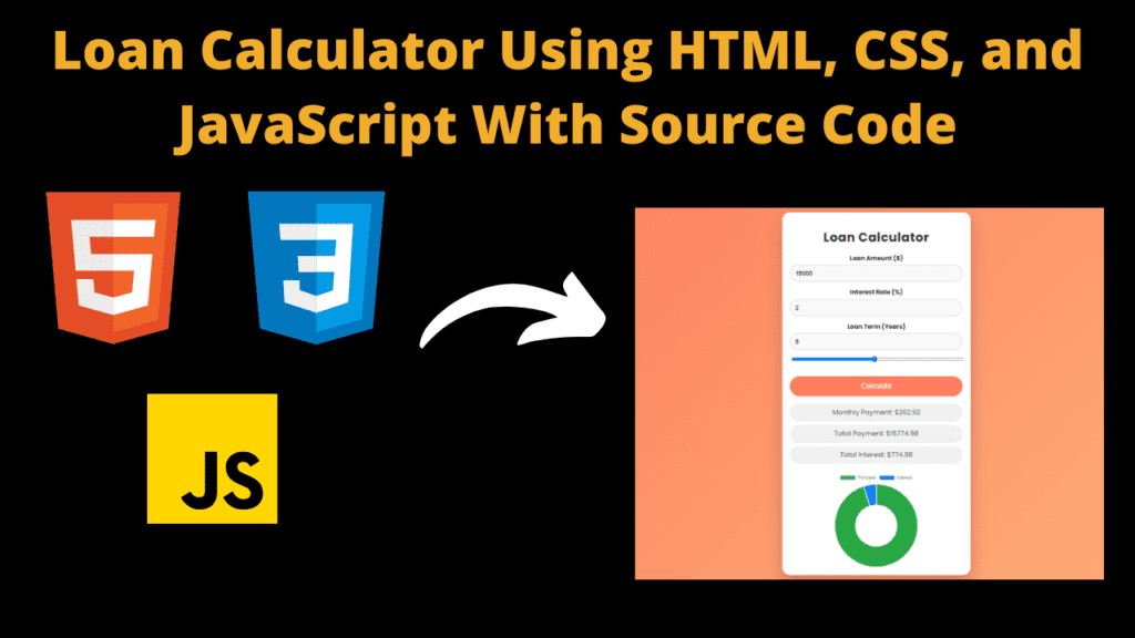
Loan Calculator Using HTML, CSS, and JavaScript With Source Code
Introduction
Hello friends my name is Gautam and you are all welcome to today’s beautiful blog post. Today I have created a beginner level project for you which you must use. This will improve your JavaScript skills and you will also get to learn a lot of other things. So the project you are going to have is a loan calculator using which a user can calculate the loan, like how much money, how much interest you can calculate in it. Friends I have called it a beginner project because creating this project is a very easy task. If you have knowledge of javascript then you can make this. When you are learning coding, you must create small projects like this. This gives you knowledge about coding, from which you also get knowledge about how to solve the errors. There are three parts to create this project, first html, then css and finally javascript which is an important part of our project. So let’s go now, let’s understand the code.
HTML (index.html)
Get Discount on Top Educational Courses
Friends, the code that you are getting to see is the HTML code which is part one of our project. With its help, we will first create the structure of our calculator. Creating a structure with the help of HTML is a very easy task. You do not need to work hard in this. So let us understand how and in what way we have written the code.
- <!DOCTYPE> This is the part of the HTML code by which we come to know that this code is of HTML
- <html lang=”en”> Friends, it does not mean much but this code is important because with its help we can set the language
- This is used to use this font, so that you can use Google’s font <link rel=”stylesheet” href=”https://fonts.googleapis.com/css2 family=Poppins:wght@400;500;600;700&display=swap”>
- To link the css file to HTML we have done something like this <link rail=”includesstyles” ref=”styles.css”> and it is important to link it
- We have created a button in the calculator to switch modes, and this is an important element of the button <div class=”dark-mode-toggle”>
- We have used <label> to create the mode switch button <label class=”switch”>
- To switch the mode as soon as the user clicks on the button, we have created a checkbox using the <input> tag <input type=”checkbox” id=”dark-mode-switch”>
- To create the calculator, we have created a container in which we have added all the code <div class=”container”>
- First of all, we have added a heading with the help of h1 heading <h1>Loan Calculator</h1>
- Then we have created another box to create some text boxes in the calculator <div class=”calculator”>
- We have created a box to hold the text box <div class=”input-group”> and named it Input Group
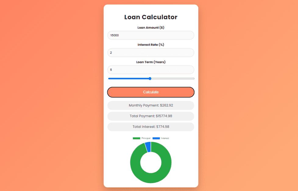
- Then we have added <label for=”amount”>Loan Amount ($)</label> text using <label> tag and we have also created an input box <input type=”number” id=”amount” placeholder=”Enter amount” /> so that user can enter the amount and we have done the same in other inputs.
- Then we have created a calculate button with the help of which we can calculate the entered amount <button id=”calculate”>Calculate</button>
- Then at last we have created a result box in which user’s result will be shown <div class=”results”>
- In the result box we have created three different <div> in which different results will be displayed <div id=”monthly-payment” class=”result-box”>Monthly Payment: $0.00</div> and these three will be parked like this
    <title>Loan Calculator</title>


    <div class="dark-mode-toggle">
        <label class="switch">

            <span class="slider"></span>
        </label>
    </div>
    <div class="container">
        <h1>Loan Calculator</h1>
        <div class="calculator">
            <div class="input-group">
                <label for="amount">Loan Amount ($)</label>

            </div>
            <div class="input-group">
                <label for="rate">Interest Rate (%)</label>

            </div>
            <div class="input-group">
                <label for="years">Loan Term (Years)</label>


            </div>
            <button id="calculate">Calculate</button>
        </div>
        <div class="results">
            <div id="monthly-payment" class="result-box">Monthly Payment: $0.00</div>
            <div id="total-payment" class="result-box">Total Payment: $0.00</div>
            <div id="total-interest" class="result-box">Total Interest: $0.00</div>
        </div>
        <div id="chart-container">

        </div>
    </div>
CSS (Style.css)
Friends, we have now completed part one, that is, we have created our structure with the help of HTML, but now we will have to design our calculator with the help of CSS, so let’s now understand our CSS code.
- First of all we have set the font in body in which we have used this font font-family: ‘Poppins’, sans-only;
- We have used linear color in the background of the body, you can use any other color as well background: linear-gradient(135deg, #ff7e5f, #feb47b);
- We have used black color for all the text we have used in the body. Color: #333;
- We have also used transitions which are like this transition: background-color 0.3s, color 0.3s;
- We have centered all the content of the body for which first we have used display: flex; then flexed the item flex-direction: column; and after this we have used align-items: center; or justify-content: center;
- Position of mode switching toggle button: Fixed; Key is Top: 20ps; and Right: 20ps; You can adjust it more or less
- The position is used in the mode switch button position: relative; width is kept like this width: 60px; and the height is kept less than the width height: 34px;
- We have used after and before css effect to switch mode. slider:before In this we have kept border-radius: 50%; and made the position absolute
- When user slides the switch button, this color will be displayed background-color: #f7f5f; you can apply any other color to it
- Then to create the calculator, we have added width like this width: 100%; We have used white color in the background of the calculator background: #fff; and have used padding padding: 20px;
- We have used shadow to give a good look to the calculator box-shadow: 0 20px 40px rgba(0, 0, 0, 0.2); and the text is centered text-align: center; and in this we have added transform which is like this transform: scale(0.95);
- We have used heading in calculator with bottom margin margin-bottom: 20ps; and font size is font-size: 2em;
- To space the heading text we have used this element in the text letter-spacing: 1ps;
- We have created three different text inputs in the calculator where we have set margin-bottom: 15ps; and positioned them as position: relative;
- We have made the input group label bold so that it is clearly visible to the user font-weight: bold;
- We have created three inputs in the input box in which we have added padding padding: 12px; and also kept the width 100%. We have added border to it border: 1px solid #ddd;
- We have added white color to the background of the input box background-color: #f9f9f9; or box-sizing: border-box; so that its width and height are set
- We have used shadow in the input box so when user enters any input then this shadow will be shown in it box-shadow: inset 0 4ps 12ps rgba(0, 0, 0, 0.2);
- In the button to calculate loan, we have used orange color in the background background-color: #ff7e5f; and the color is white color: #fff; in this we have used cursor pointer cursor: pointer;
- We have added hover effect to the button in which this color will be displayed on hovering background-color: #feb47b; And we have used transform in it so that the button will bounce transform: translateY(-3px);
In this way we have designed our calculator with the help of CSS in which we have used shadow, color and hover effect. When you practice this then you will not have any problem in creating projects of this type.
					body {
  font-family: 'Poppins', sans-serif;
  margin: 0;
  padding: 0;
  background: linear-gradient(135deg, #ff7e5f, #feb47b);
  color: #333;
  transition: background-color 0.3s, color 0.3s;
  overflow-x: hidden;
  min-height: 100vh;
  display: flex;
  flex-direction: column;
  align-items: center;
  justify-content: center;
}

.dark-mode-toggle {
  position: fixed;
  top: 20px;
  right: 20px;
}

.switch {
  position: relative;
  display: inline-block;
  width: 60px;
  height: 34px;
}

.switch input {
  opacity: 0;
  width: 0;
  height: 0;
}

.slider {
  position: absolute;
  cursor: pointer;
  top: 0;
  left: 0;
  right: 0;
  bottom: 0;
  background-color: #ccc;
  transition: .4s;
  border-radius: 34px;
}

.slider:before {
  position: absolute;
  content: "";
  height: 26px;
  width: 26px;
  border-radius: 50%;
  left: 4px;
  bottom: 4px;
  background-color: white;
  transition: .4s;
}

input:checked + .slider {
  background-color: #ff7e5f;
}

input:checked + .slider:before {
  transform: translateX(26px);
}

.container {
  width: 100%;
  max-width: 450px;
  background: #fff;
  padding: 20px;
  border-radius: 20px;
  box-shadow: 0 20px 40px rgba(0, 0, 0, 0.2);
  text-align: center;
  margin: 20px;
  transform: scale(0.95);
  transition: transform 0.3s ease-in-out;
  overflow: hidden;
}

h1 {
  margin-bottom: 20px;
  font-size: 2em;
  color: #333;
  letter-spacing: 1px;
}

.calculator {
  margin-bottom: 20px;
}

.input-group {
  margin-bottom: 15px;
  position: relative;
}

.input-group label {
  display: block;
  margin-bottom: 5px;
  font-weight: bold;
}

.input-group input[type="number"],
.input-group input[type="range"] {
  width: 100%;
  padding: 12px;
  border-radius: 30px;
  border: 1px solid #ddd;
  font-size: 1em;
  background-color: #f9f9f9;
  box-sizing: border-box;
  overflow: hidden;
}

.input-group input[type="number"]:focus {
    box-shadow: inset 0 4px 12px rgba(0, 0, 0, 0.2);
    outline: none;
}

.input-group input[type="number"]::-webkit-inner-spin-button,
.input-group input[type="number"]::-webkit-outer-spin-button {
  -webkit-appearance: none;
  margin: 0;
}

button {
  width: 100%;
  padding: 15px;
  border-radius: 30px;
  border: none;
  background-color: #ff7e5f;
  color: #fff;
  font-size: 1.2em;
  cursor: pointer;
  transition: background-color 0.3s ease, transform 0.3s ease;
}

button:hover {
  background-color: #feb47b;
  transform: translateY(-3px);
}

.results {
  margin-bottom: 20px;
}

.result-box {
  margin-bottom: 10px;
  padding: 10px;
  background-color: #f1f1f1;
  border-radius: 30px;
  font-size: 1.1em;
  color: #495057;
  animation: fadeIn 0.5s ease-in-out;
}

@keyframes fadeIn {
  from { opacity: 0; transform: translateY(20px); }
  to { opacity: 1; transform: translateY(0); }
}

#chart-container {
  width: 100%;
  height: 250px;
  animation: fadeIn 0.5s ease-in-out;
}

.dark-mode {
  background-color: #333;
  color: #f4f4f4;
}

.dark-mode .container {
  background-color: #444;
  box-shadow: none;
}

.dark-mode h1 {
  color: #f4f4f4;
}

.dark-mode input[type="number"],
.dark-mode input[type="range"],
.dark-mode button {
  background-color: #555;
  color: #f4f4f4;
  border: 1px solid #666;
}

.dark-mode button:hover {
  background-color: #feb47b;
}
Javascript (Script.js)
Friends, now the most important thing is this code which is a javascript code. With its help, we have made our calculator work, through which the user will be able to calculate the amount of his loan. In this, we have used a few lines of code which you will see in the highlight below. In this, we have simply created a function in which when the user adds his loan amount in the input box, as soon as the user clicks on the button to calculate, it will be calculated.
document.getElementById(‘calculate’).addEventListener(‘click’, function() {
In this, you have to create the function correctly and we have also created a mode switch button in which we have added dark and light mode. in this also we have created a function which is something like this document.getElementById(‘dark-mode-switch’).addEventListener(‘change’, function() {
					let paymentChart;

document.getElementById('dark-mode-switch').addEventListener('change', function() {
  document.body.classList.toggle('dark-mode', this.checked);
});

document.getElementById('calculate').addEventListener('click', function() {
    const amount = document.getElementById('amount').value;
    const rate = document.getElementById('rate').value;
    const years = document.getElementById('years').value;

    const principal = parseFloat(amount);
    const calculatedInterest = parseFloat(rate) / 100 / 12;
    const calculatedPayments = parseFloat(years) * 12;

    const x = Math.pow(1 + calculatedInterest, calculatedPayments);
    const monthly = (principal * x * calculatedInterest) / (x - 1);

    if (isFinite(monthly)) {
        const totalPayment = (monthly * calculatedPayments).toFixed(2);
        const totalInterest = (totalPayment - principal).toFixed(2);

        document.getElementById('monthly-payment').textContent = `Monthly Payment: $${monthly.toFixed(2)}`;
        document.getElementById('total-payment').textContent = `Total Payment: $${totalPayment}`;
        document.getElementById('total-interest').textContent = `Total Interest: $${totalInterest}`;

        updateChart(principal, totalInterest);
    } else {
        alert('Please check your numbers');
    }
});

document.getElementById('year-slider').addEventListener('input', function() {
    document.getElementById('years').value = this.value;
});

function updateChart(principal, interest) {
    if (paymentChart) {
        paymentChart.destroy();
    }

    const ctx = document.getElementById('payment-chart').getContext('2d');
    paymentChart = new Chart(ctx, {
        type: 'doughnut',
        data: {
            labels: ['Principal', 'Interest'],
            datasets: [{
                data: [principal, interest],
                backgroundColor: ['#28a745', '#007bff']
            }]
        },
        options: {
            responsive: true,
            maintainAspectRatio: false,
            legend: {
                position: 'bottom'
            }
        }
    });
}
Output:
Disclaimer: The code provided in this post is sourced from GitHub and is distributed under the MIT License. All credits for the original code go to the respective owner. We have shared this code for educational purposes only. Please refer to the original repository for detailed information and any additional usage rights or restrictions.
Top 5 Data Science Courses to Build a Strong Career in 2026 Data science is no longer limited to tech companies. Banks …
Free Things You Get With Your College ID 🎓 Free / Discounted Platforms with College ID Platform What You Get (Student Benefits) …
25 Best Free Great Learning Courses for CSE Students (With Certificates) – Start Learning Today! If you’re a CSE student, engineering fresher, …

Why Target Test Prep Is the Best GMAT/GRE Prep Platform in 2025? Preparing for the GMAT or GRE has changed drastically in …
Get Huge Discounts

More Python Projects