
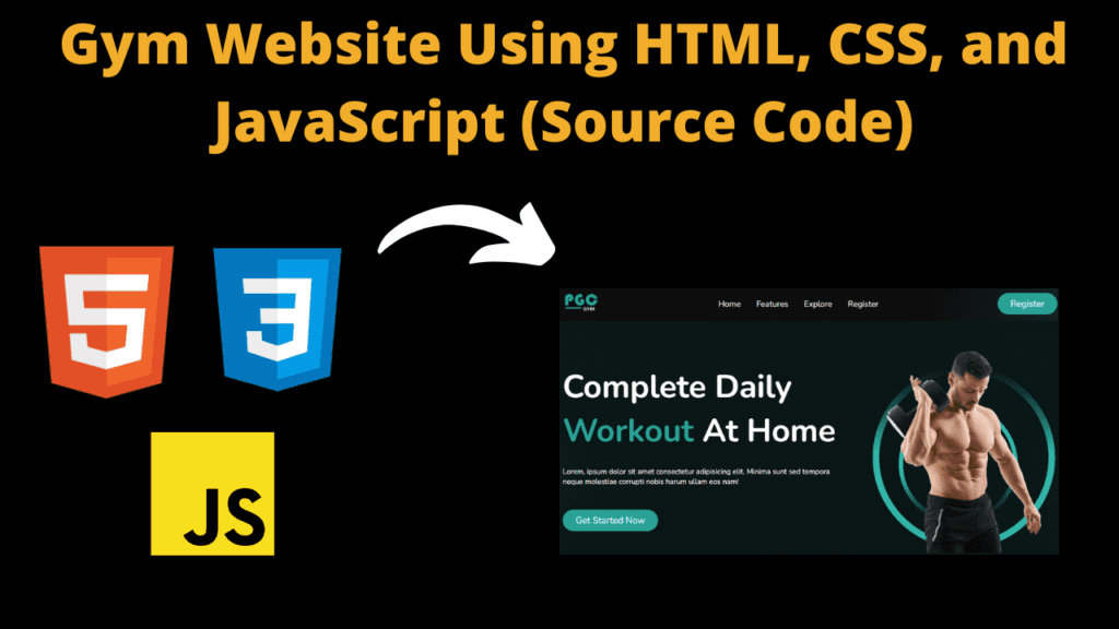
Gym Website Using HTML, CSS, and JavaScript
Introduction
Hello friends, all of you are welcome to today’s beautiful project. Today we have created a beautiful project for you which is a gym website and this website is completely responsive and runs on any device. We have created this gym website with the help of html CSS and JavaScript which is quite amazing and it is very easy to create this website. Friends, we have created four to five sections in this website, such as if a user wants to join a gym, he can join the gym or use the gym and similarly we have created some more sections. This website is of only one page which can be used by any beginner. It is possible that this will be beneficial for him as he will get knowledge about how to make a website and how to use coding.
HTML (index.html)
Get Discount on Top Educational Courses
This code is the code of HTML with which we first created a structure of our website and when we create the structure of a website with HTML, it does not look good at all. To make it look good, we have to use CSS. Then our website looks good and beautiful. Without CSS you cannot make a website good. We will see this further, so let’s understand the code of our HTML now.
- First of all we have added the title of our website <title>Gym Website Landing Page UI Design HTML CSS</title>
- To link the css file to html we have used this html link tag <link rel=”stylesheet” href=”./style.css”>
- This is the <body> tag of the HTML in which the HTML code is written.
- First we have created the menu section of our Gaiam website <div class=”menu”>
- In the menu of the website we have created a logo section <div class=”logo”> in which we have added a logo
- To add logo in menu section of website we have used img tag <img src=”image url” alt=””/>
- To create the Navbar of the header section, we have used the <ul> tag <ul class=”nav”>
- In the <ul> tag we have created a menu item using the <li> tag <li class=”nav-item”><a href=”#”>Home</a></li>
- In the navbar, we have created a button <a href=”#” class=”btn”>Register</a> which is the register button
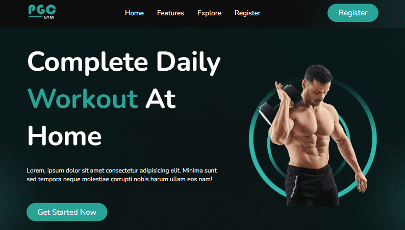
- We have created a hero section in the website which we have created using a <div> element <header class=”header”>
- In the hero section we have added some headings and also added paragraphs <h1 class=”mb”>
- We have also added a button in the hero section of the website from which the user can start the gym <a href=”#” class=”btn mt”>Get Started Now</a>
- We have created a separate section to add images in the hero section and in this we have added the image using the <img> tag <img src=”…” alt=”” />
- After opening <header> I have closed </header> and this is very important
- We have created another section on the website <div class=”section” id=”why-us”> In this we have added <h2> heading <h2 class=”primary mb”>Why Choose Us?</h2> and <h3>
- Friends, in this way we have left three or four sections whose format is exactly the same and we have also added some images.
- Then in the last we have created a footer section, for which we have used <footer class=”footer”> element
- And in this footer tag we have added a paragraph <p class=”tertiary”>© 2024 Developergtm Cloud. All Rights Reserved.</p>
<title>Gym Website Landing Page UI Design HTML CSS</title>
<title>PGC-GYM Landing Page</title>
<div class="menu">
<div class="container flex">
<div class="mobile-btn">
</div>
<div class="logo">
<img data-lazyloaded="1" src="data:image/svg+xml;base64,PHN2ZyB4bWxucz0iaHR0cDovL3d3dy53My5vcmcvMjAwMC9zdmciIHdpZHRoPSIzMDAiIGhlaWdodD0iMTc4IiB2aWV3Qm94PSIwIDAgMzAwIDE3OCI+PHJlY3Qgd2lkdGg9IjEwMCUiIGhlaWdodD0iMTAwJSIgc3R5bGU9ImZpbGw6I2NmZDRkYjtmaWxsLW9wYWNpdHk6IDAuMTsiLz48L3N2Zz4=" decoding="async" data-src="https://raw.githubusercontent.com/programmercloud/pgc-gym/main/img/logo.png" alt="" width="300" height="178" />
</div>
<ul class="nav">
<li class="nav-item"><a href="#">Home</a></li>
<li class="nav-item"><a href="#why-us">Features</a></li>
<li class="nav-item"><a href="#explore">Explore</a></li>
<li class="nav-item"><a href="#discount">Register</a></li>
</ul>
<a href="#" class="btn">Register</a>
</div>
</div>
<header class="header">
<div class="container flex">
<div class="text">
<h1 class="mb">
Complete Daily <br />
<span>Workout</span> At Home
</h1>
<p class="mb">
Lorem, ipsum dolor sit amet consectetur adipisicing elit. Minima
sunt sed tempora neque molestiae corrupti nobis harum ullam eos nam!
</p>
<a href="#" class="btn mt">Get Started Now</a>
</div>
<div class="visual">
<img data-lazyloaded="1" src="data:image/svg+xml;base64,PHN2ZyB4bWxucz0iaHR0cDovL3d3dy53My5vcmcvMjAwMC9zdmciIHdpZHRoPSI2NjAiIGhlaWdodD0iNzUzIiB2aWV3Qm94PSIwIDAgNjYwIDc1MyI+PHJlY3Qgd2lkdGg9IjEwMCUiIGhlaWdodD0iMTAwJSIgc3R5bGU9ImZpbGw6I2NmZDRkYjtmaWxsLW9wYWNpdHk6IDAuMTsiLz48L3N2Zz4=" decoding="async" data-src="https://raw.githubusercontent.com/programmercloud/pgc-gym/main/img/banner-img.png" alt="" width="660" height="753" />
</div>
</div>
</header>
<div class="section" id="why-us">
<div class="container flex">
<div class="text">
<h2 class="primary mb">Why Choose Us?</h2>
<h3 class="secondary mb">Consulatation with Expert.</h3>
<p class="tertiary">
Lorem, ipsum dolor sit amet consectetur adipisicing elit. Alias quos
maxime tempore?
</p>
<h3 class="secondary mb">Consulatation with Expert.</h3>
<p class="tertiary">
Lorem, ipsum dolor sit amet consectetur adipisicing elit. Alias quos
maxime tempore?
</p>
</div>
<div class="visual">
<img data-lazyloaded="1" src="data:image/svg+xml;base64,PHN2ZyB4bWxucz0iaHR0cDovL3d3dy53My5vcmcvMjAwMC9zdmciIHdpZHRoPSI2NjAiIGhlaWdodD0iNzIzIiB2aWV3Qm94PSIwIDAgNjYwIDcyMyI+PHJlY3Qgd2lkdGg9IjEwMCUiIGhlaWdodD0iMTAwJSIgc3R5bGU9ImZpbGw6I2NmZDRkYjtmaWxsLW9wYWNpdHk6IDAuMTsiLz48L3N2Zz4=" decoding="async" data-src="https://raw.githubusercontent.com/programmercloud/pgc-gym/main/img/why-us.png" alt="" width="660" height="723" />
</div>
</div>
</div>
<div class="section" id="explore">
<div class="container flex">
<div class="visual">
<img data-lazyloaded="1" src="data:image/svg+xml;base64,PHN2ZyB4bWxucz0iaHR0cDovL3d3dy53My5vcmcvMjAwMC9zdmciIHdpZHRoPSI1NjAiIGhlaWdodD0iNDQwIiB2aWV3Qm94PSIwIDAgNTYwIDQ0MCI+PHJlY3Qgd2lkdGg9IjEwMCUiIGhlaWdodD0iMTAwJSIgc3R5bGU9ImZpbGw6I2NmZDRkYjtmaWxsLW9wYWNpdHk6IDAuMTsiLz48L3N2Zz4=" decoding="async" data-src="https://raw.githubusercontent.com/programmercloud/pgc-gym/main/img/explore.jpg" alt="" width="560" height="440" />
</div>
<div class="text">
<h2 class="primary mb">
Explore Our Fitness <br />
Studio
</h2>
<p class="tertiary mb">
Lorem ipsum dolor sit amet consectetur adipisicing elit. Perferendis
esse vitae ratione quos maiores eveniet temporibus illum! Eligendi
amet officia unde sint totam ut optio. Molestiae, illo quia?
</p>
<a href="#" class="btn mt">Get Started Now</a>
</div>
</div>
</div>
<div class="section" id="trainer">
<h2 class="primary mb">Our Professional Trainers</h2>
<div class="container flex">
<div class="trainer">
<img data-lazyloaded="1" src="data:image/svg+xml;base64,PHN2ZyB4bWxucz0iaHR0cDovL3d3dy53My5vcmcvMjAwMC9zdmciIHdpZHRoPSIyNjkiIGhlaWdodD0iMjY5IiB2aWV3Qm94PSIwIDAgMjY5IDI2OSI+PHJlY3Qgd2lkdGg9IjEwMCUiIGhlaWdodD0iMTAwJSIgc3R5bGU9ImZpbGw6I2NmZDRkYjtmaWxsLW9wYWNpdHk6IDAuMTsiLz48L3N2Zz4=" decoding="async" data-src="https://raw.githubusercontent.com/programmercloud/pgc-gym/main/img/trainer1.jpg" alt="" width="269" height="269" />
<h3 class="secondary mb">Alan Smith</h3>
<p class="tertiary mb">
Lorem ipsum dolor sit amet consectetur adipisicing elit. Nulla.
</p>
<a href="#" class="btn-2">
</a>
</div>
<div class="trainer">
<img data-lazyloaded="1" src="data:image/svg+xml;base64,PHN2ZyB4bWxucz0iaHR0cDovL3d3dy53My5vcmcvMjAwMC9zdmciIHdpZHRoPSIyNjkiIGhlaWdodD0iMjY5IiB2aWV3Qm94PSIwIDAgMjY5IDI2OSI+PHJlY3Qgd2lkdGg9IjEwMCUiIGhlaWdodD0iMTAwJSIgc3R5bGU9ImZpbGw6I2NmZDRkYjtmaWxsLW9wYWNpdHk6IDAuMTsiLz48L3N2Zz4=" decoding="async" data-src="https://raw.githubusercontent.com/programmercloud/pgc-gym/main/img/trainer2.jpg" alt="" width="269" height="269" />
<h3 class="secondary mb">Alan Smith</h3>
<p class="tertiary mb">
Lorem ipsum dolor sit amet consectetur adipisicing elit. Nulla.
</p>
<a href="#" class="btn-2">
</a>
</div>
<div class="trainer">
<img data-lazyloaded="1" src="data:image/svg+xml;base64,PHN2ZyB4bWxucz0iaHR0cDovL3d3dy53My5vcmcvMjAwMC9zdmciIHdpZHRoPSIyNjkiIGhlaWdodD0iMjY5IiB2aWV3Qm94PSIwIDAgMjY5IDI2OSI+PHJlY3Qgd2lkdGg9IjEwMCUiIGhlaWdodD0iMTAwJSIgc3R5bGU9ImZpbGw6I2NmZDRkYjtmaWxsLW9wYWNpdHk6IDAuMTsiLz48L3N2Zz4=" decoding="async" data-src="https://raw.githubusercontent.com/programmercloud/pgc-gym/main/img/trainer3.jpg" alt="" width="269" height="269" />
<h3 class="secondary mb">Alan Smith</h3>
<p class="tertiary mb">
Lorem ipsum dolor sit amet consectetur adipisicing elit. Nulla.
</p>
<a href="#" class="btn-2">
</a>
</div>
</div>
</div>
<div class="section" id="testimonial">
<div class="container flex">
<div class="text">
<h2 class="primary">
That's What Our Super <br />
Client Says
</h2>
<br />
<br />
<br />
<div class="client">
<img data-lazyloaded="1" src="data:image/svg+xml;base64,PHN2ZyB4bWxucz0iaHR0cDovL3d3dy53My5vcmcvMjAwMC9zdmciIHdpZHRoPSI2MiIgaGVpZ2h0PSI2MiIgdmlld0JveD0iMCAwIDYyIDYyIj48cmVjdCB3aWR0aD0iMTAwJSIgaGVpZ2h0PSIxMDAlIiBzdHlsZT0iZmlsbDojY2ZkNGRiO2ZpbGwtb3BhY2l0eTogMC4xOyIvPjwvc3ZnPg==" decoding="async" data-src="https://raw.githubusercontent.com/programmercloud/pgc-gym/main/img/client1.jpg" alt="" width="62" height="62" />
<h2 class="secondary">Exelent Training</h2>
<p class="tertiary">
Lorem ipsum dolor sit amet consectetur adipisicing elit. Excepturi
quas voluptatem ad, repudiandae voluptates odio deleniti
reiciendis in veniam quidem expedita maxime error fugit. Pariatur
quasi sunt aut id. Lorem, ipsum dolor sit amet consectetur
adipisicing elit. Neque, officiis.
</p>
</div>
</div>
<div class="visual">
<img data-lazyloaded="1" src="data:image/svg+xml;base64,PHN2ZyB4bWxucz0iaHR0cDovL3d3dy53My5vcmcvMjAwMC9zdmciIHdpZHRoPSI2NjAiIGhlaWdodD0iNjQ3IiB2aWV3Qm94PSIwIDAgNjYwIDY0NyI+PHJlY3Qgd2lkdGg9IjEwMCUiIGhlaWdodD0iMTAwJSIgc3R5bGU9ImZpbGw6I2NmZDRkYjtmaWxsLW9wYWNpdHk6IDAuMTsiLz48L3N2Zz4=" decoding="async" data-src="https://raw.githubusercontent.com/programmercloud/pgc-gym/main/img/testimonial.png" alt="" width="660" height="647" />
</div>
</div>
</div>
<div class="section" id="discount">
<div class="container flex">
<div class="visual">
<img data-lazyloaded="1" src="data:image/svg+xml;base64,PHN2ZyB4bWxucz0iaHR0cDovL3d3dy53My5vcmcvMjAwMC9zdmciIHdpZHRoPSI2NjAiIGhlaWdodD0iODY5IiB2aWV3Qm94PSIwIDAgNjYwIDg2OSI+PHJlY3Qgd2lkdGg9IjEwMCUiIGhlaWdodD0iMTAwJSIgc3R5bGU9ImZpbGw6I2NmZDRkYjtmaWxsLW9wYWNpdHk6IDAuMTsiLz48L3N2Zz4=" decoding="async" data-src="https://raw.githubusercontent.com/programmercloud/pgc-gym/main/img/discount.png" alt="" width="660" height="869" />
</div>
<div class="text">
<h2 class="primary mb">
Fitness Classes This Summer, Pay Now And Get 25% Discount
</h2>
<p class="tertiary mb">
Lorem ipsum dolor sit amet consectetur adipisicing elit. Ab maxime
minus praesentium est et veniam voluptate alias excepturi minima
placeat amet nostrum, eligendi, quod cum ducimus nesciunt ipsa eum,
explicabo eaque obcaecati.
</p>
<a href="#" class="btn bt">Book Now</a>
</div>
</div>
</div>
<footer class="footer">
<div class="container flex">
<p class="tertiary">
© 2024 Developergtm Cloud. All Rights Reserved.
</p>
</div>
</footer>
CSS (Style.css)
This code is of CSS, with the help of which we have designed our gym website well and made it user friendly. Without CSS we cannot design a website, like we cannot add background color etc. What I mean to say is that CSS plays a very important role in designing a website.
- First of all we have added the font @import url(“https://fonts.googleapis.com/css2?family=Nunito:wght@200;400;500;700&display=swap”); which is very important
- We have kept the width of <body> as width: 100%; and set it to min-height: 100vh; so that all the content fits correctly The background color of the body is background: radial-gradient(#111, #071a1a);
- We’ve set the width of the menu section container to width: 80%; and margin: 0 auto;
- The menu items are centered align-items: center; and the content is centered justify-content: center;
- In menu section we have added some items in that we have given column-gap: 60ps;
- We have set the width of the hero section of the website to 100% and have padding: 40ps 0; and also overflow: hidden; so that the content does not overflow
- Friends, we have created a testimonial on the website whose width we have kept 90%
- In the testimonial section we have added some images with the background being background: #ffff;
- For the testimonial we have kept the color black color: #000;
- We have kept the padding padding: 20ps 10ps; We have then kept margin-right: 20ps; and centered the text text-align: center;
- In the client’s image we’ve used border-radius: 20ps; and margin-top: 20ps;
- Now coming to the footer, we have used a little padding in it padding: 30px 0; and border-top: 1px solid #fff; and also centered all the text text-align: center;
- Friends, we have also made this website responsive in which we have used media query @media (max-width: 768ps) {}
- First of all we have set our header section whose class name is “flex” in this we have set flex-direction: column; or centered the text text-align: center;
- Then we have set display: block; in the mobile-button and font-size: 35pts; and cursor: pointer; and right: 20pts; and 12pts from the top
					@import url("https://fonts.googleapis.com/css2?family=Nunito:wght@200;400;500;700&display=swap");
/* Base */
:root {
  --clr-primary: #29a396;
}

*,
*::after,
*::before {
  box-sizing: border-box;
  padding: 0;
  margin: 0;
  font-family: "Nunito", sans-serif;
}

html {
  scroll-behavior: smooth;
}

body {
  width: 100%;
  min-height: 100vh;
  background: radial-gradient(#111, #071a1a);
  color: #fff;
  overflow-x: hidden;
}

.container {
  width: 80%;
  margin: 0 auto;
}

.flex {
  display: flex;
  align-items: center;
  justify-content: center;
  column-gap: 60px;
}

.header,
.section {
  width: 100%;
  padding: 40px 0;
  overflow: hidden;
}

.header::after,
.header::before,
.section::after,
.section::before {
  content: "";
  background: url(https://raw.githubusercontent.com/programmercloud/pgc-gym/main/img/blur-1.png);
  position: absolute;
  width: 400px;
  height: 400px;
  background-position: center;
  background-repeat: no-repeat;
  background-size: contain;
  bottom: 0;
}

.header::after {
  left: -200px;
}

.header::before {
  right: -200px;
}

.mb {
  margin-bottom: 30px;
}

.mt {
  margin-top: 20px;
}

.section {
  background: #1d1f1e;
  position: relative;
  padding: 80px 0;
}

.section::after {
  left: -200px;
}

.section::before {
  width: 600px;
  right: -200px;
}

.section:nth-child(even) {
  background: #141615;
}

.section:nth-child(even)::after,
.section:nth-child(even)::before {
  display: none;
}

.primary {
  font-size: 35px;
  font-weight: 700;
}

.secondary {
  font-size: 25px;
  font-weight: 700;
}

.tertiary {
  font-size: 15px;
}
/* End Base */

/* Menu */
.menu {
  width: 100%;
  background: linear-gradient(to right, #0e0e0e 70%, #142d2a);
  padding: 12px 0;
}

.menu .container {
  justify-content: space-between;
}

.mobile-btn {
  display: none;
}

.logo {
  cursor: pointer;
}

.logo img {
  width: 80px;
  height: auto;
}

.nav {
  list-style: none;
}

.nav-item {
  display: inline-block;
  margin-right: 30px;
  font-size: 18px;
  font-weight: 400;
}

.nav-item a {
  text-decoration: none;
  color: #fff;
}

.nav-item:hover a {
  color: #29a396;
  transition: 0.3s linear;
}

.nav-item:last-of-type {
  margin-right: 0;
}
/* End Menu */

/* Buttons */
.btn {
  padding: 10px 28px;
  background: var(--clr-primary);
  border-radius: 40px;
  font-size: 20px;
  font-weight: 400;
  text-decoration: none;
  color: #fff;
  display: inline-block;
}

.btn:hover {
  transition: 0.3s linear;
  box-shadow: var(--clr-primary) 0px 5px 15px;
}

.btn-2 {
  font-size: 35px;
  text-decoration: none;
  color: #ccc;
  transition: 0.3s linear;
}

.btn-2:hover {
  color: #29a396;
}

/* End Buttons */

/* Header */
.text {
  width: 60%;
}

.visual {
  width: 40%;
}

.visual img {
  width: 100%;
}

.header h1 {
  font-size: 70px;
  font-weight: 700;
}

.header h1 span {
  color: var(--clr-primary);
}
/* End Header */

.section:nth-child(even) .visual {
  margin-right: 30px;
}

/* Trainer */
#trainer {
  text-align: center;
}

.trainer img {
  border-top-left-radius: 80px;
  border-top-right-radius: 20px;
  border-bottom-right-radius: 80px;
  border-bottom-left-radius: 20px;
  margin-bottom: 10px;
  outline: 2px solid #fff;
  padding: 14px;
}

.trainer .mb {
  margin-bottom: 10px;
}
/* End Trainer */

/* Testimonial */
#testimonial .visual img {
  width: 90%;
  display: block;
  margin-left: auto;
}

.client {
  background: #fff;
  color: #000;
  padding: 20px 10px;
  margin-right: 20px;
  text-align: center;
  border-radius: 20px;
  position: relative;
  margin-top: 20px;
}

.client img {
  width: 80px;
  height: 80px;
  border-radius: 50%;
  position: absolute;
  top: -40px;
  left: calc(50% - 40px);
}

.client h2 {
  margin: 20px 0 10px 0;
}
/* End Testimonial */

/* Discount */
#discount {
  padding: 40px 0;
}
/* End  Discount */

/* Footer */
.footer {
  padding: 30px 0;
  border-top: 1px solid #fff;
  text-align: center;
}
/* End Footer */

/* Responsive */

@media (max-width: 768px) {
  .flex {
    flex-direction: column;
    text-align: center;
  }

  .mobile-btn {
    display: block;
    font-size: 35px;
    cursor: pointer;
    position: absolute;
    right: 20px;
    top: 12px;
  }

  .menu.active .nav-item {
    display: block;
    margin: 30px 0;
  }

  .nav,
  .menu .btn {
    display: none;
  }

  .menu.active .nav,
  .menu.active .btn {
    display: block;
  }

  .menu.active {
    padding: 30px 0;
    width: 100%;
    transition: all 0.8s ease;
  }

  .text,
  .visual {
    width: 100%;
    margin-bottom: 20px;
  }

  .text h1 {
    font-size: 45px;
  }

  .primary {
    font-size: 28px;
  }

  .secondary {
    font-size: 22px;
  }

  .tertiary {
    font-size: 14px;
  }

  .trainer {
    margin-bottom: 20px;
  }

  .client {
    margin-bottom: 50px;
  }

  #discount .visual img {
    width: 70%;
    margin-bottom: 30px;
  }
}

@media (max-width: 530px) {
  .header::after,
  .header::before,
  .section::after,
  .section::before {
    display: none;
  }

  .primary {
    font-size: 25px;
  }

  .secondary {
    font-size: 20px;
  }

  .tertiary {
    font-size: 12px;
  }

  .text h1 {
    font-size: 34px;
  }

  .btn,
  .btn-2 {
    font-size: 16px;
  }
}

/* End Responsive */


.youtube {
  position: fixed;
  bottom: 40px;
  right: 70px;
  text-decoration: none;
  padding: 8px 12px;
  background: rgba(0,0,0,0.6);
  border-radius: 6px;
  box-shadow: 0 2px 2px 3px rgba(0, 0, 0, 0.2);
  color: #fff;
}

.youtube p {
  font-size: 22px;
}
Javascript (Script.js)
So let’s now talk about JavaScript. Friends, after seeing the code you must have understood that this is JavaScript code. We have not used much of JavaScript because we have kept this website completely user-friendly so that anyone can use it. Basically, if I tell you why JavaScript is used, it is done for this because when a user goes to the page, like on the login page, there is a button for login, so when the user clicks on that login button, then next he should be taken to a login page and if there is something wrong then it should show an error. All this happens with the help of javascript.
We have set only the navbar with javascript. When our website is opened in a mobile, the navbar also becomes responsive. Then a button is displayed there. When the user clicks on it, the menu item should be displayed. All this happens with the help of javascript.
					//Js
document.querySelector(".mobile-btn").addEventListener("click", function () {
  document.querySelector(".menu").classList.toggle("active");
});
Output:
Disclaimer: The code provided in this post is sourced from GitHub and is distributed under the MIT License. All credits for the original code go to the respective owner. We have shared this code for educational purposes only. Please refer to the original repository for detailed information and any additional usage rights or restrictions.
Top 5 Data Science Courses to Build a Strong Career in 2026 Data science is no longer limited to tech companies. Banks …
Free Things You Get With Your College ID 🎓 Free / Discounted Platforms with College ID Platform What You Get (Student Benefits) …
25 Best Free Great Learning Courses for CSE Students (With Certificates) – Start Learning Today! If you’re a CSE student, engineering fresher, …

Why Target Test Prep Is the Best GMAT/GRE Prep Platform in 2025? Preparing for the GMAT or GRE has changed drastically in …
Get Huge Discounts

More Python Projects